Timeless Color: How to Choose Ever‑lasting Hues for Your Home
Ever walked into a room and felt instantly at ease because the colours just felt right? That’s the power of a timeless colour palette – it works today, next year and even decades later. You don’t need a design degree to get it right; you just need a few simple rules and a bit of practice.
Why Some Colours Never Go Out of Style
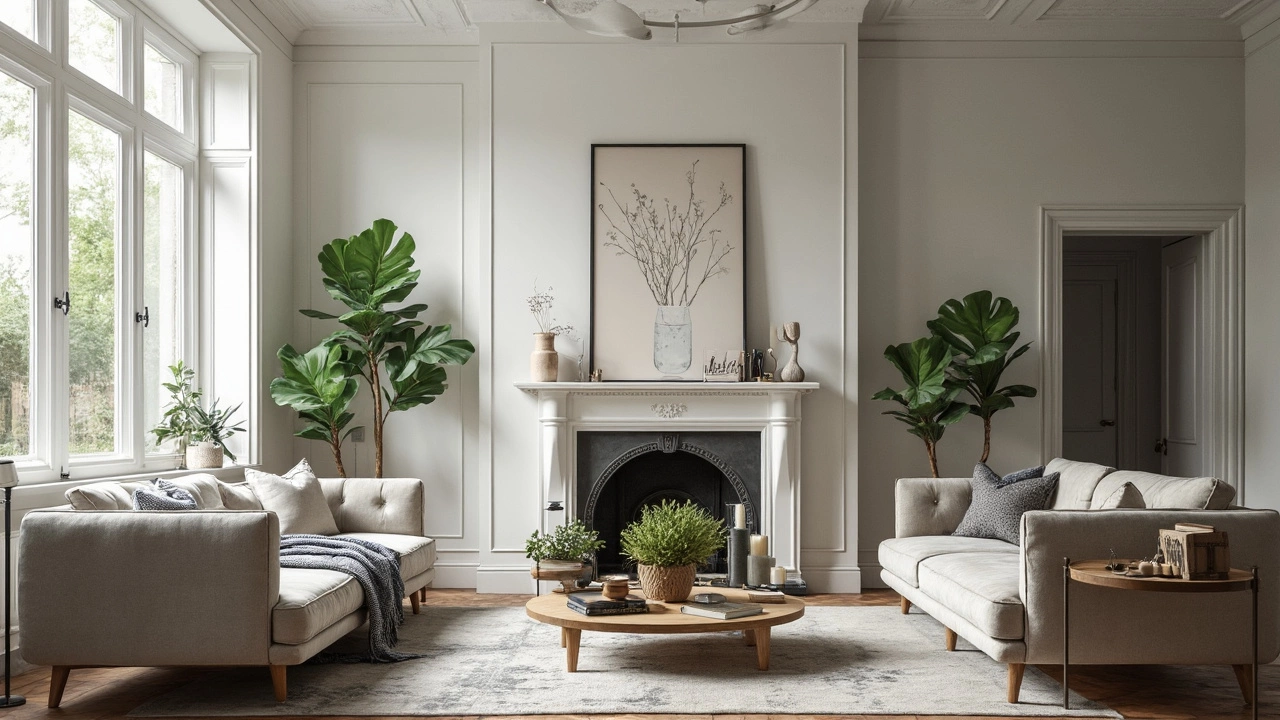
Classic shades like soft gray, warm beige, deep navy, and muted green have been popular for generations because they’re flexible. They blend well with different furniture, lighting, and textures, so you can change other elements without repainting the whole space. Natural tones also echo the world outside, which makes them feel less trendy and more grounded. That’s why they stay fresh no matter what the design magazines push.
Practical Tips for Picking Timeless Colours
Start with the big pieces – walls, flooring, and large furniture. Pick a neutral base colour for the walls; this creates a canvas that lets you switch out accents later. For flooring, look at medium‑tone wood or stone that won’t clash with a navy wall or a beige sofa. When adding colour, think of it in layers: a wall colour, a secondary colour for furniture or a rug, and a pop colour for accessories like cushions or artwork.
Use the 60‑30‑10 rule. Let 60% of the room be your neutral base, 30% a secondary, richer tone, and the remaining 10% a bold accent. For example, 60% white walls, 30% charcoal sofa, and 10% mustard‑yellow cushions. This balance keeps the space harmonious while still feeling interesting.
Test your colours under different lighting. Natural light in the morning can make a pale gray look cool, while evening light can warm it up. Grab a small paint sample, stick it on the wall, and watch it for a full day. If it stays pleasant both in bright sunlight and under warm bulbs, you’ve found a winner.
Don’t forget the colour of your flooring when you choose wall shades. A light oak floor pairs nicely with a soft greige wall, while dark engineered hardwood can handle a deep navy or charcoal hue without feeling heavy.
Finally, add texture to keep the palette from feeling flat. A velvet cushion in a rich emerald, a woven rug with subtle patterns, or a brushed metal lamp can give depth to a neutral colour scheme. Texture does the work that bright colours usually would, keeping the room lively without losing its timeless feel.
By following these steps, you’ll create rooms that look fresh now and stay appealing for years. The best part? When you decide to refresh the space later, you only need to swap out a few accessories, not repaint the whole house. That’s the real power of a timeless colour palette – it saves time, money, and the headache of chasing trends.
What Color Never Goes Out of Style? Timeless Hues for Modern Home Interiors
- Gavin Whitaker
- |
- |
- 0
Wondering which color stands the test of time in home interiors? This article breaks down why certain shades keep showing up in gorgeous, modern spaces year after year. Discover how these colors can work with any vibe or trend, and learn some practical design tips that make them work in real homes. If you love interiors that never look dated or tired, this guide is for you. Get ready for hands-on advice to update your place without worrying about chasing the next big thing.
View more