If you've ever kicked yourself for painting a wall a wild color only to regret it a year later, you're not alone. Color trends in home design come and go, but chasing them can leave you with a room that looks dated fast. People always want to know: is there a color that never goes out of style?
The honest answer? There’s more than one, but a handful truly last decade after decade. These aren't colors that scream for attention—they blend in, boost moods, and play well with just about any style. Popular designers and smart homeowners always come back to them, and there are some lived-in reasons why.
Before you grab a paintbrush or a swatch book, knowing which shades stand the test of time can save you a lot of second-guessing. Let's get into what actually works, why it works, and how you can use these choices to make your space feel always fresh, never fussy—and never stuck in the past.
- Why Color Choice Matters in Home Interiors
- The Timeless Power of Neutrals
- White—The Ultimate Classic
- Earth Tones and Their Comeback
- Making Timeless Colors Work for You
- Common Mistakes and Pro Tips
Why Color Choice Matters in Home Interiors
Color does way more than just fill space on your walls. The shades you pick can mess with your mood, mess with your sleep, and even mess with how big—or tiny—your room feels. That’s not marketing talk. The American Institute of Architects has pointed out that color can raise or lower energy in a space, and even change your sense of warmth, comfort, or alertness.
Plenty of research shows how timeless color choices impact the way we use our homes. For example, a 2023 study from the National Sleep Foundation found that bedrooms painted in soft, neutral shades helped people fall asleep faster compared to bright, energetic colors. That calm factor is one reason neutrals always come back in style.
And then—there’s resale value. According to Zillow, homes with neutral walls sell for up to $2,000 more than similar homes with bolder colors. That’s not pocket change! These safe bets make your home more appealing to buyers who want something fresh, but not trendy-to-the-point-of-weird.
| Room | Popular Color Type | Reported Effect |
|---|---|---|
| Living Room | Earth Tones | Feels cozy, welcoming |
| Bedroom | Soft Neutrals | Improves sleep quality |
| Kitchen | White, Light Gray | Feels clean and bright |
Bottom line: color choices in your home aren’t just about looks. They can help your mood, boost your home’s value, and make every room work better for everyday life. And if you want your place to look sharp for years, sticking to timeless shades is an easy win.
The Timeless Power of Neutrals
Neutrals are basically the MVPs in interior design. Ask any pro, and they’ll tell you—neutrals never look old or tired, and they can handle every design trend that comes and goes. These shades are the backbone of timeless color choices for homes, and it’s not just because they’re safe. They earn their spot because they’re ridiculously easy to live with and set the mood for literally any room.
Three colors always pop up in lists of forever-in-style shades: white, gray, and beige. These aren’t “boring.” They’re flexible—and there’s solid proof people love living in spaces that use them. For example, according to a 2023 National Association of Home Builders survey, over 74% of new homeowners said they preferred neutral walls when buying a home. That’s not a fluke. Neutrals let you change up your style with just a throw blanket or some pillows, instead of redoing everything.
Check out what makes neutrals so reliable with this quick side-by-side breakdown:
| Neutral Color | Why It Lasts | Best For |
|---|---|---|
| White | Makes rooms look bigger; goes with any color | All rooms, small spaces |
| Gray | Feels modern, suits both cool and warm decor | Living rooms, bedrooms, kitchens |
| Beige | Adds warmth without being flashy | Family rooms, entryways |
Neutrals also absorb light differently, making rooms feel cozier or brighter depending on what you want. And they hide wear and tear better than you’d think. Go with a slight off-white for less visible scuffs, or a greige (that’s gray + beige) if you just can’t decide. If you’re nervous about going “too plain,” remember most high-end homes with magazine-worthy interiors almost always use these as their base. Layer in color with your rugs, art, or plants. If you ever change your mind, there’s zero stress—swap the accents, not the walls.
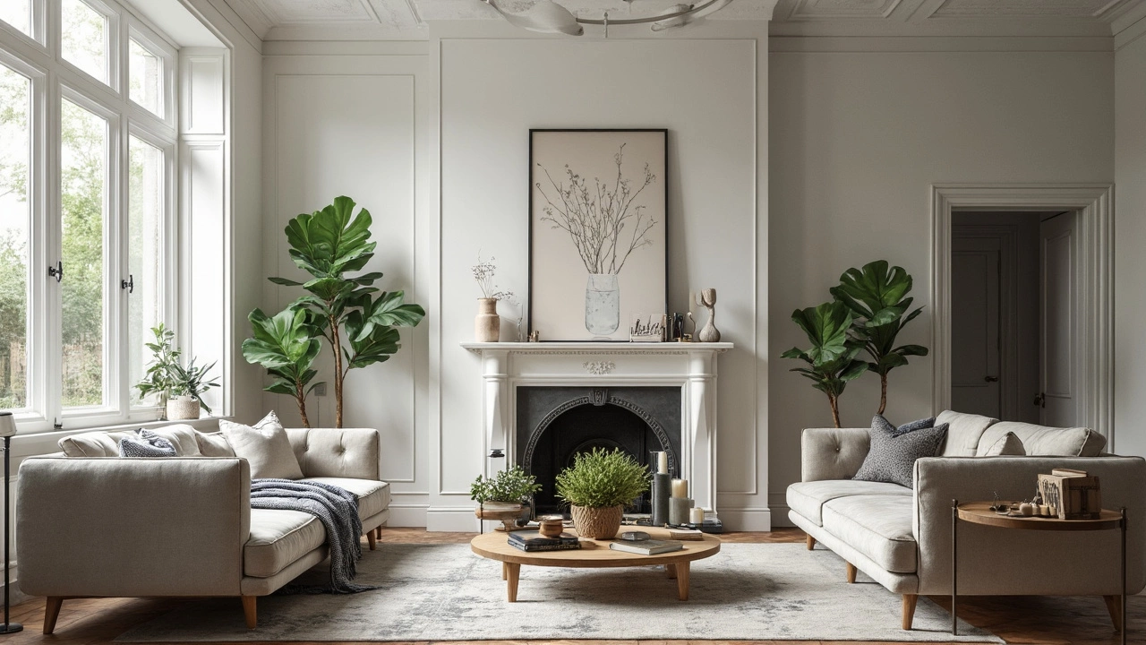
White—The Ultimate Classic
A fresh coat of white paint can seriously transform any space, and unlike most colors, it’s a no-brainer for pretty much every style out there. You walk into a home with white walls, and it instantly feels bigger, lighter, and less cluttered. That’s one of the main reasons real estate pros always tell people to go white before listing: according to a 2024 Zillow report, homes with white or off-white interiors sold, on average, five days faster than more colorful spaces.
It’s not just about looks—white is the blank canvas that lets you show off the cool stuff you actually own. If you have shelves stacked with books or art, nothing competes with them. And when you get the urge to shake things up, you can swap out pillows, rugs, or accents without worrying if they’ll match your backdrop. White never fights for attention, and that’s why designers keep coming back to it for timeless color in home design.
As Leanne Ford, well-known interior designer and TV host, put it:
“White works for every style, from modern lofts to old farmhouses. It’s like giving yourself permission to change your mind without having to repaint everything.”
But not all whites are created equal. There’s a big difference between sterile hospital white and warm, creamy white. You’ve got to pick the right one for your space and light. North-facing rooms often do better with warmer whites, while a bright south-facing room can handle crisp, cooler whites without feeling harsh.
| White Shade | Popular Use | Works Best In |
|---|---|---|
| Pure/Crisp White | Modern, minimalist spaces | Bright, sunny rooms |
| Warm White (Creamy, Soft) | Traditional, cozy vibes | Low-lit or north-facing rooms |
| Off-White (Ivory, Eggshell) | Transitional, flexible style | Most rooms, easy to mix |
Want to avoid that almost sterile look? Here are a few things that actually work:
- Layer different whites—mixing textures and shades keeps rooms feeling lived-in, not stiff.
- Pair white walls with natural wood, black accents, or metal fixtures for extra depth.
- If you’ve got kids or pets, go for a wipeable, satin or eggshell finish instead of plain matte—saves tons of hassle with scuffs and fingerprints.
White has staying power because it adapts, which means you don’t have to. It makes the house feel clean, open, and ready for anything—no matter how much your style changes over the years.
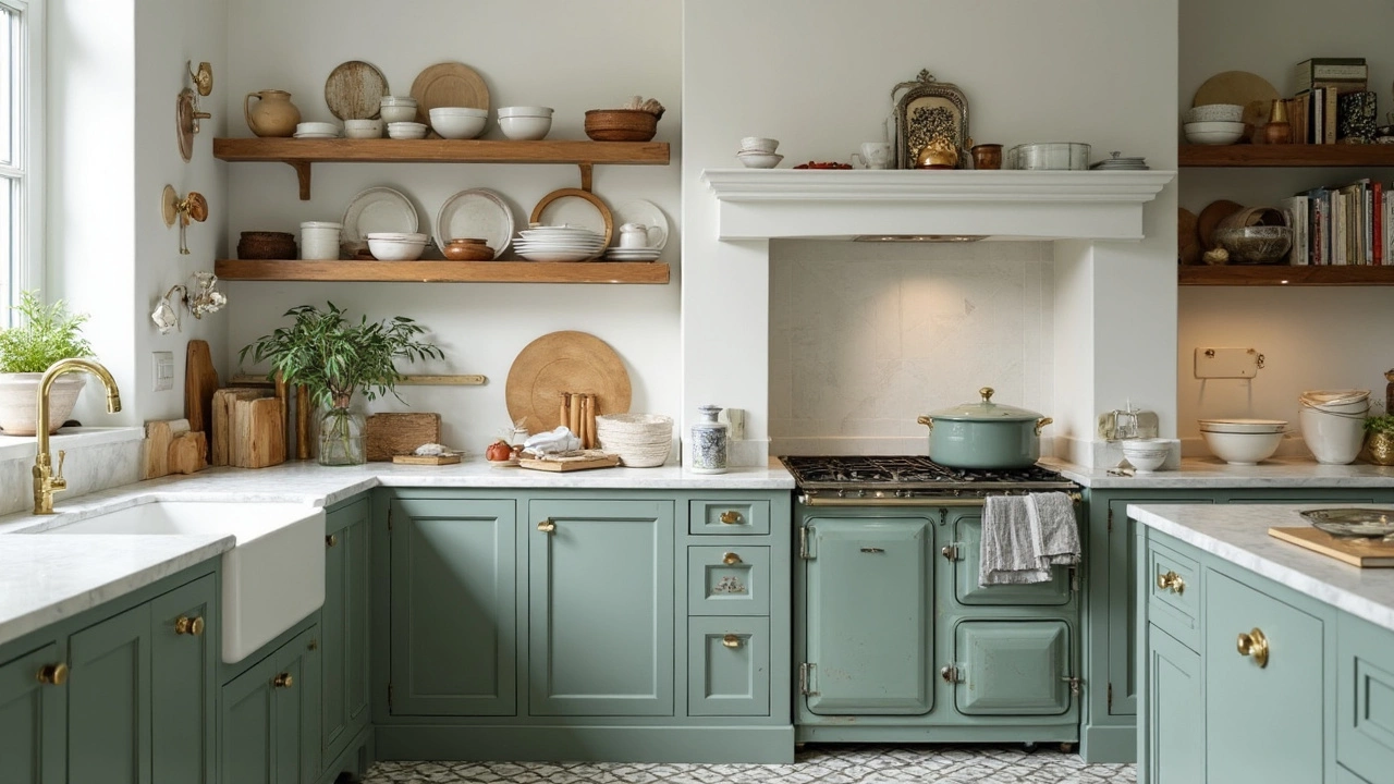
Earth Tones and Their Comeback
It’s tough to scroll through Instagram or open a design magazine these days without seeing more rooms colored in rich browns, terracottas, muted greens, and warm greys. Earth tones—those colors pulled straight from nature—are making a serious comeback in modern home interiors. They aren’t just back as a trend. They’ve shifted into the realm of forever-favorites because they're so easy on the eyes and instantly make a space feel relaxed and grounded.
Why do so many designers keep circling back to earth tones? First, these shades feel cozy but never overpower. They work well in both sleek modern apartments and older homes, tying rooms together with a kind of laid-back unity. According to data from the National Kitchen and Bath Association, nearly 60% of new renovation projects in 2024 featured at least one earth tone as a main color. That’s a big jump from ten years ago.
Earth tones have this magic way of balancing out modern interiors, softening sharp edges and adding warmth without clashing with other colors. You might notice top retailers highlight earth tone palettes every fall and spring, showing how versatile they are all year long. Real-life example? Olive green or clay can look just as good in a living room as in a small bathroom or bedroom.
| Popular Earth Tones (2024) | Average Use in Home Interiors (%) |
|---|---|
| Terracotta | 24% |
| Muted Olive Green | 18% |
| Clay Brown | 16% |
| Warm Taupe | 14% |
| Sand Beige | 10% |
If you want to work earth tones into your home, you don’t have to go all-in. Try these tips:
- Add pillows or throws in muted greens or browns.
- Paint one accent wall in rich clay or terracotta—it changes the vibe without too much commitment.
- Mix in wooden furniture or natural-fiber rugs to pull the look together.
Earth tones let you play with texture and pattern without things looking messy or noisy. That’s a big reason they keep sticking around, even as trends shift. People want homes that feel comfortable, not just stylish when company comes over.
Making Timeless Colors Work for You
So you want a place that stands out in a good way—without looking stuck in a specific year? First tip: use a timeless color as your base. That usually means whites, grays, beiges, or earth tones. These shades make a solid backdrop for anything else you want to do. For example, white walls let your favorite artwork or a bold rug take the spotlight. You can swap out furniture, pillows, or curtains when you feel like it, and the main room still looks polished.
Lighting is another big deal. Even a classic white can look dingy if the lighting's off. Natural light tends to bring out the best in these hues, but you want to check samples in the actual room, since bulbs and sunlight can totally change tone. I once tried a beige that looked warm in the store, but went weirdly pinkish in our living room—nobody wants that surprise.
If you're worried about things getting stale, add texture instead of more color. Think woven baskets, a chunky knit throw, or matte versus glossy finishes. Layering old and new stuff gives the room personality, without ruining the timeless look.
Here’s a quick way to start:
- Pick one timeless shade for walls and ceilings (white, taupe, or cool gray work pretty much everywhere).
- Use two to three accent shades in rugs, pillows, or art—stick to earth tones or soft blacks for a modern touch that won’t go out of style.
- Mix different materials, like wood, metal, and stone—it keeps things from looking too matchy-matchy or sterile.
The cool part? If you get bored, just swap out the little things—it’s a lot cheaper and less work than starting over. I learned this the hard way after repainting an entire bedroom one year just because I picked a short-lived trendy blue. Now, I let classic shades do most of the work, and our home always feels calm, up-to-date, and easy to refresh.
Common Mistakes and Pro Tips
Even people with great taste stumble when picking colors, especially those hunting for a timeless color. It’s way too easy to make a rookie move that leaves a room feeling “blah” or, even worse, out of step with your whole house. Why does this happen? Usually, it’s not about picking the wrong shade but about how that shade ends up getting used.
One big mistake: going all-in on a color without checking how it behaves in different lights. That creamy white you fell for at the store might look yellow or gray at home, depending on your bulbs and windows. Also watch out for using only one color everywhere—that can make the place feel flat and soulless.
- Ignoring undertones: Whites, grays, and even some beige tones can hide sneaky undertones (like pink, green, or blue) that show up when sunlight hits. Always grab test samples first.
- Forgetting about texture: Same color, but on different materials? They can look totally different. Walls, wood trim, tiles—they all absorb paint in unique ways.
- Chasing trends too hard: That very specific gray from 2015? Looks pretty dated now. Use trends for things you can swap out, like pillows or art, not big stuff like wall paint or sofas.
- No natural light check: Rooms facing north or south get very different sun exposure, which switches up how any color looks. Test paint on every wall if you can.
Want a room that really stands out but stays classic? Try mixing up your tones: use a deeper version of your main color on trim or an accent wall, then layer in other textures through rugs and throws. A little contrast keeps things interesting without losing that timeless vibe.
| Mistake | % of Respondents |
|---|---|
| Choosing Color Without Testing at Home | 58% |
| Overusing a Single Color | 44% |
| Ignoring Light Direction | 39% |
| Picking Trendy Colors for Large Surfaces | 37% |
| Disregarding Undertones | 32% |
If you want an easy tip: always get those $5 test pots and paint a good patch on every wall. Live with it for a few days. Lighting shifts, moods change, and you’ll spot if that so-called classic color is really just another fleeting trend. And if you’re ever unsure, snap a photo and ask a brutally honest friend (or Sophia, if she’s around—she never sugarcoats her advice!).