Colour Balance Made Easy: Quick Tips for a Cohesive Home
Ever walked into a room and felt something was off, even though you liked the pieces? Most of the time it’s the colour balance that’s missing. The good news? Fixing it doesn’t need a design degree – just a few simple steps.
Start with the Flooring
Flooring is the biggest visual element in a room, so it sets the tone for everything else. If you choose a light oak, it brightens the space and lets you play with deeper wall colours or bold accessories. Darker planks, like walnut, create a cosy backdrop that works well with lighter walls and soft textiles.
Before you buy, bring a sample home. Lay it on the floor, look at it in morning, afternoon and evening light. This tells you how the wood or tile will interact with the room’s natural light – a key factor in colour balance.
Use the Colour Wheel, Not a Math Test
Think of the colour wheel as a friendly cheat‑sheet. Colours opposite each other, like blue and orange, create contrast that feels lively. Colours next to each other, like green and teal, blend smoothly. Pick one dominant colour – usually the floor or a large piece of furniture – then choose two supporting colours from either side of the wheel.
For example, a charcoal floor can pair with a soft grey wall (neutral base) and a navy accent chair (deep contrast). The result feels intentional, not chaotic.
Play with Neutrals and Accents
Neutrals are the glue. White, beige, or taupe walls act like a canvas, letting you swap out accent pieces without repainting. Add colour in layers: a rug, cushions, artwork, or lampshades. This way the room stays balanced even when you change a single element.
A quick trick is the 60‑30‑10 rule – 60% of a room should be a dominant colour (often walls or floor), 30% a secondary colour (sofas, larger furniture), and 10% an accent (pillows, vases). It keeps the palette from feeling heavy or sparse.
Mind the Light
Light can turn a perfect palette into a mess. Natural light shows the true colour of paint and flooring, while artificial light can warm or cool tones. Test your paint swatches at different times of day. If you love a warm amber rug, make sure the room’s lighting won’t push it into an orange that clashes with cooler walls.
If you can’t control the light, use lamps with adjustable colour temperature. Warm bulbs (2700K) work well with earthy floors, while cooler bulbs (4000K) complement modern greys and blues.
Finish with Texture
Colour isn’t the only player – texture adds depth. A smooth marble floor paired with a plush rug creates a visual break that feels balanced, even if the colours are similar. Mix materials like wood, metal, and fabric to keep the eye moving.
When you’re picking décor, ask yourself: does this piece add a new texture, or just repeat what’s already there? A good rule of thumb is to have at least three different textures in a room.
Colour balance is less about strict rules and more about feeling right. Use the floor as your anchor, add neutrals for flexibility, sprinkle in accents that follow the colour wheel, check the light, and vary textures. Follow these steps and you’ll turn any space into a comfortable, well‑balanced room without hiring a pro.
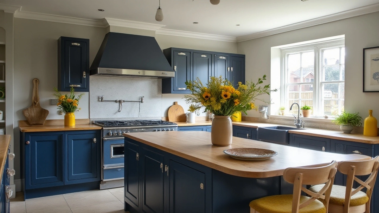
Understanding the 60-30-10 Rule for Kitchen Design Success
- Gavin Whitaker
- |
- |
- 0
The 60-30-10 rule is a timeless guideline in design, particularly useful in creating a harmonious color scheme in the kitchen. This principle suggests that 60% of the kitchen should be a dominant color, 30% a secondary color, and 10% an accent color. It's a strategy that helps balance the aesthetics of the space, making it both visually appealing and functional. By following this rule, homeowners can achieve a cohesive look that reflects their personal style while maintaining a practical environment.
View more