The 60-30-10 rule is a cherished guideline among designers, implying balance and coherence in a room's color scheme. In the kitchen, this method involves a thoughtful distribution of colors to create a space that feels both welcoming and vibrant.
Envision your kitchen as a canvas. The dominant color takes up 60% of the space, establishing the primary mood and tone. Secondary colors fill another 30%, adding depth and contrast. Finally, the remaining 10% comes forth in vivid accent hues, infusing personality and interest into the design.
This approach not only enhances aesthetic appeal but also aids in highlighting unique architectural features or cherished items. Whether revamping an old kitchen or designing anew, this rule offers simplicity and clarity in the often overwhelming world of color choices.
- Understanding the Rule
- Applying the Rule in Kitchens
- Color Choices and Combinations
- Practical Tips for Implementation
Understanding the Rule
The concept of the 60-30-10 rule in design isn't new, but it's a transformative guideline that has reshaped the aesthetics of countless kitchens. It provides a straightforward approach to color distribution, making spaces feel intuitive and cohesive without overwhelming the senses. By dividing the color into a dominant, secondary and accent trifecta, it cleverly balances the need for order and creativity in kitchen design. This rule is particularly helpful in interior design because it takes the guesswork out of color harmony, steering homeowners and designers clear of random and chaotic combinations that could lead to visual disarray.
At its core, the dominant color, representing 60% of the palette, serves as the foundation, setting the stage for the kitchen's ambiance. This color is often found on walls, large cabinetry, or flooring, providing a consistent backdrop that calms and unifies other design elements. The secondary color, at 30%, offers diversity without overpowering the space. It's usually applied to upholstery, window treatments, or smaller cabinets, giving depth and complexity. Finally, the accent color, a powerful 10%, injects interest and vitality via decorative accessories, backsplashes, or singular pieces like an island countertop or bar stools.
"Design is not just what it looks like and feels like. Design is how it works." - Steve Jobs
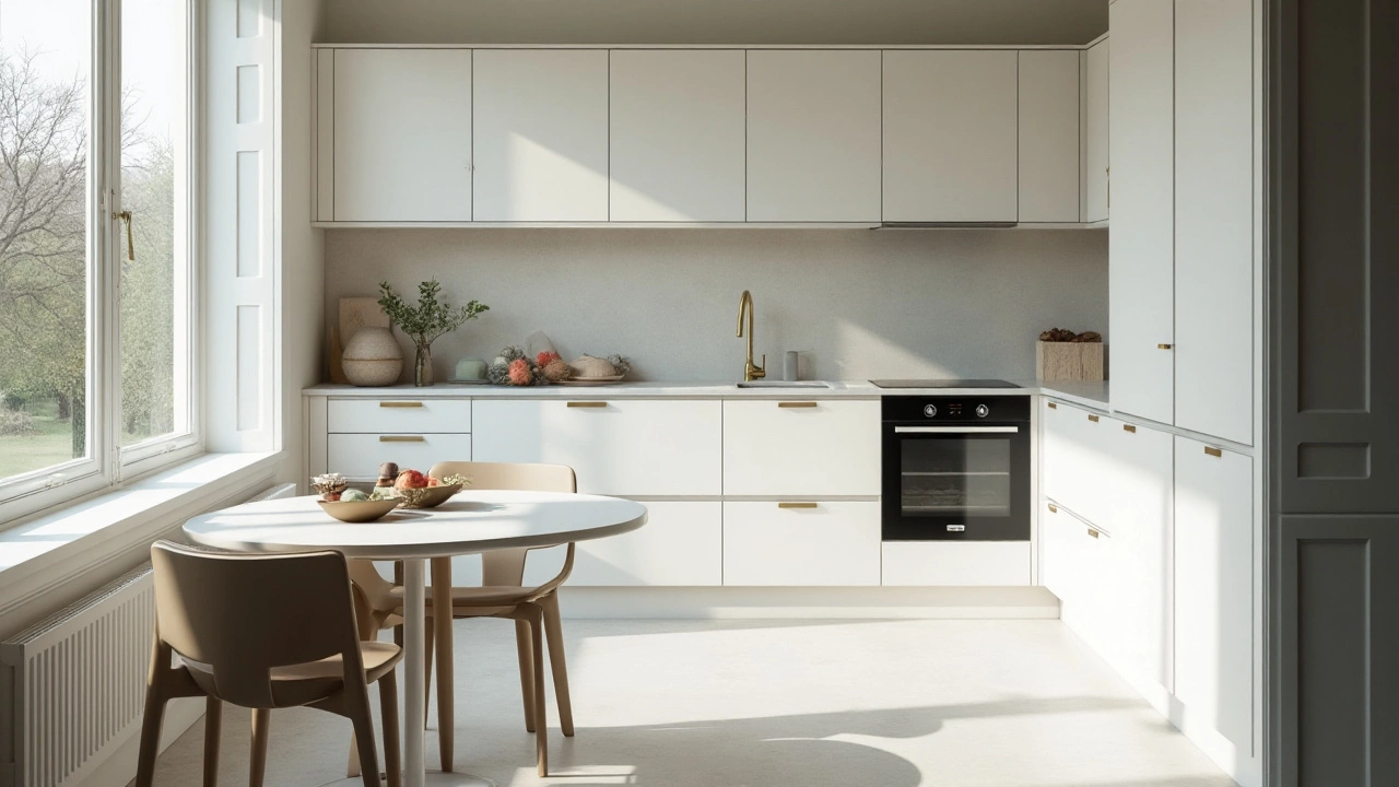
This rule's genius lies in its simplicity. Even for those new to the world of interior design, it provides a clear-cut formula for achieving a balanced and stylish kitchen. The predominant color ensures a seamless visual flow, the secondary color adds layers and intrigue, and accents pull everything together in a delightful surprise. For instance, in a modern kitchen, you might find sleek white cabinets dominating the scene while muted gray forms a secondary, contrasting shade. A vibrant accessory like a green plant or red kettle brings that essential 10% splash of color to life, making the kitchen not just a place to cook, but a room of character and warmth.
Moreover, this rule isn't confined to a particular style. Whether your kitchen is rustic farmhouse with earthy tones or ultra-modern with muted monotones, the 60-30-10 rule adapts to suit your vision and preferences. In practice, this means that homeowners can play around with textures and materials as well as colors—a glossy tile could serve as part of the dominant scheme, while a textured backsplash might take on a secondary role. The key is to maintain the proportioned balance that this rule dictates, ensuring the space never feels crowded or underwhelmed. It's this thoughtful allocation that creates an environment where one’s personality is allowed to shine through without getting lost in disarray or clutter.
Applying the Rule in Kitchens
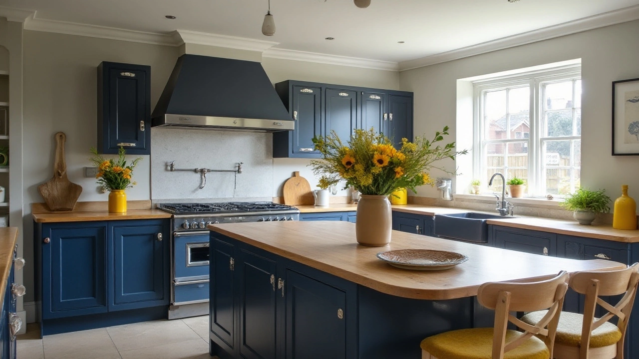
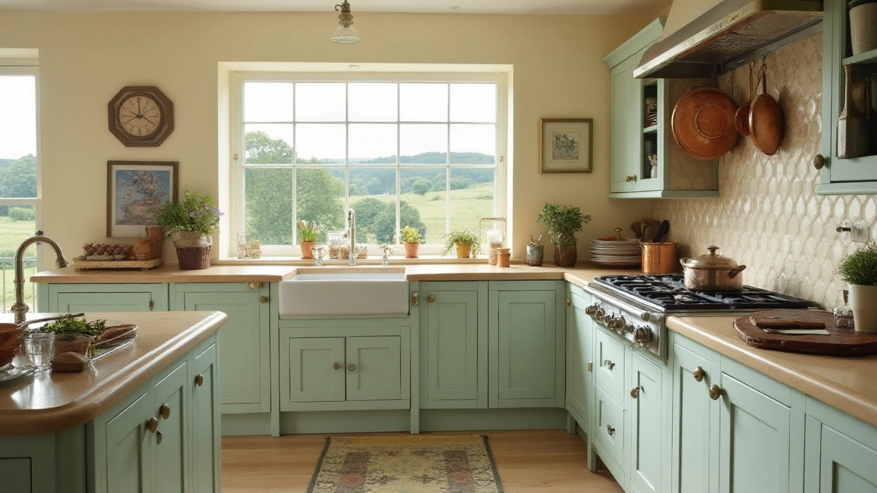
Applying the 60-30-10 rule in kitchen design can transform your cooking space into an artful haven, seamlessly blending aesthetics with functionality. When you think about stepping into a kitchen that visually appeals to your senses, you're often unknowingly experiencing this rule in action. This method is not only about choosing colors; it’s about how those colors interact, augment, and complement each other to produce a unified theme. Consider the dominant color that will cover 60% of your kitchen, setting the backdrop and the primary energy of the room. This often includes walls, cabinetry, and larger fixtures like kitchen islands. Classic choices include light neutrals such as whites or soft grays, but bold choices like deep blue or misty green have been gaining traction, adding modernity while keeping the space calming.
The next 30% involves choosing a secondary color to provide depth and interest. This part is where creativity blooms, allowing for contrasting yet harmonizing shades that can appear in backsplashes, smaller cabinetry, or open shelving. Earthy tones like taupe or muted terracotta often pair beautifully here, adding warmth and a touch of unexpected flair. For those seeking a more contemporary edge, satin black or sleek stainless steel tones may strike just the right chord. They provide a striking visual cue while maintaining elegance.
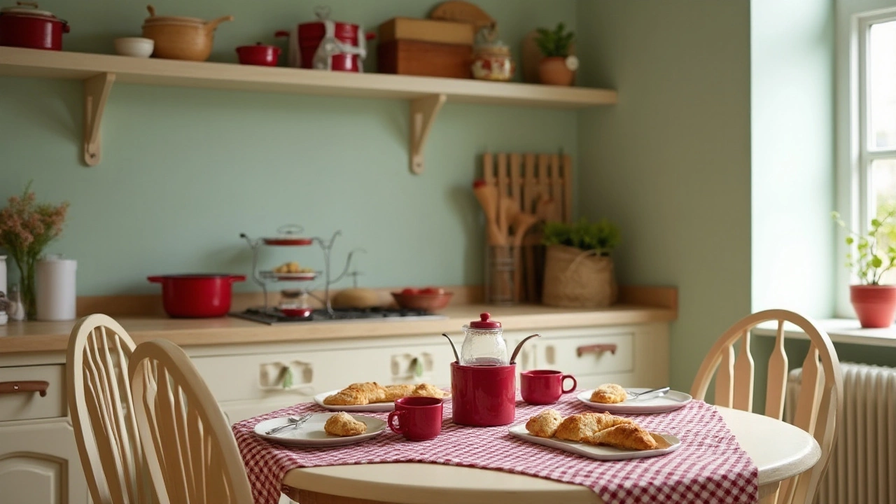
Finally, the 10% accent color is what personalizes the kitchen's palette, granting it character and uniqueness. Think of these as your room’s jewelry—little pops of color found in bar stools, decorative items, or even intricate tile work. Accent colors can be daring; imagine vibrant citrus orange or regal gold infusing life against a neutral backdrop – they're small but mighty in impact. It’s best to reflect your personality through these accents, choosing tones that resonate with moods you wish to evoke. "The right accent color can make a kitchen not just a place for cooking, but a place for memorable gatherings," notes renowned interior designer, Emily Henderson.
Once you've established your color palette, it's essential to consider the interplay between finishes and textures. A glossy finish might enhance the richness of a bold accent, while matte textures can soften it. This rule also encourages you to experiment with lighting. An abundance of natural light can make lighter colors appear airy and open, while strategic artificial lighting can cast ambient halos to emphasize your kitchen's highlights, making the design even more striking.
Let’s not forget about the psychological effects of color balance. Warmer shades can create a cozy, inviting atmosphere, ideal for kitchens that serve as the heart of the home, a gathering place for family and friends. Cooler shades and their sophisticated appeal can signify cleanliness and modernity, which might be suitable for more professional-looking kitchen designs. Pairing these with the vibrancy of an accent color can energize the space, making it not only appealing but also functional for both cooking and socializing.
An essential trick lies in maintaining the rule’s integrity. Sometimes, drawing a diagram or getting samples of color swatches can visually guide the application of this rule, ensuring a balanced color ecosystem. Use your phone or camera to take photos of sample areas during different times of the day, seeing how lighting affects the palette. Gradually layer each section of color to achieve a consistent flow throughout the kitchen, ensuring nothing feels out of place or overpowers another.
Before committing to a complete design overhaul, creating mood boards can help visualize the space. This approach not only ensures that each color holds its rightful place but aids in preemptively troubleshooting design mismatches. Ultimately, the 60-30-10 rule can simplify what might feel like an overwhelming design challenge into manageable, enjoyable parts. Success lies in mindful selection, letting your kitchen tell its own colorful story.
Color Choices and Combinations
Choosing the right colors for your kitchen design is much like painting a masterpiece. The palette you decide on not only sets the atmosphere but can influence the mood, functionality, and even the perception of space. In the realm of home decoration, color selection isn't arbitrary; it is a thoughtful process that intertwines personal taste with design principles. The brilliance of the 60-30-10 rule lies in its simplicity, but the art comes in finding colors that work in harmony within these proportions.
When considering color choices, start by evaluating the kitchen's overall style and feel. You might opt for a modern appearance that gravitates toward clean, muted tones or perhaps a classic style that embraces rich, timeless palettes. For a contemporary kitchen, shades of gray, white, or black often dominate, with pops of bright colors to break the monotony. In contrast, traditional and rustic kitchens might lean on warm earth tones like soft sage, terracotta, or sunflower yellow as their base.
Breaking it down under this rule: the dominant color should cover 60% of the room — think walls, cabinetry, and major appliances. It's often a neutral or soft tone that provides a backdrop for other design elements. The secondary color, at 30%, can be seen on furniture, backsplashes, or curtains, often providing a subtle contrast to complement the dominant hue. Lastly, the accent color accounts for 10%, which gives the space its flavor. Consider vibrant colors or metallic finishes for elements such as knobs, small appliances, or artwork.
“Color is a power which directly influences the soul.” — Wassily Kandinsky
When crafting these combinations, keep in mind the natural light dynamics of your kitchen. A sunny, open space can handle darker dominant tones, whereas smaller, north-facing kitchens might benefit from lighter shades to enhance brightness. Also, it's wise to consider the flow of colors into adjacent rooms, ensuring a seamless transition throughout your home. Kitchens are increasingly part of open-plan designs, making the integration of the kitchen's color scheme with the living and dining areas vital.
For those who enjoy data, color psychology provides some insight: colors like blue can be calming, influencing a relaxed cooking environment, whereas red can stimulate appetite. However, regardless of trends or theories, it’s crucial to choose colors that resonate personally; after all, it's your home. Experiment with sample swatches, peel-and-stick paint samples, or digital tools to visualize how each color balances before committing fully.
Finally, if you're hesitant about making bold choices, remember the flexibility of the 60-30-10 rule; it allows for updates and alterations. Changing the 10% accent color is as easy as switching out accessories or repainting small areas, offering the opportunity to refresh your kitchen's look regularly without a complete overhaul.
Practical Tips for Implementation
When it comes to embracing the 60-30-10 rule in your kitchen design, the journey begins with thoughtful planning. Start by examining the existing elements in your kitchen. Look at the color of the cabinets, countertops, and flooring. These are generally fixed and can dictate your dominant color. If you're starting from scratch, think about what mood you want to set for the space. A calm and serene environment might lean towards softer, neutral tones as your 60%, whereas a lively and energetic kitchen might benefit from brighter hues. The key is to choose a dominant color that will ground the space and provide a backdrop without being overpowering.
Your secondary color, taking up 30% of the space, is where you build on the foundation you've set. This color often appears in places like the kitchen backsplash, bar stools, or open shelving. It should complement the dominant color while adding depth and interest. Don't shy away from experimenting with textures and materials. For instance, if your dominant color is a cool, soothing blue, consider a warm gray or sandy beige for the secondary tone to introduce some warmth and contrast. A mix of textures in the same hue can also add dimension and richness, making them an integral part of an inviting and thoughtfully designed space.
The final 10%, your accent color, is the exciting part of the design process. This is your opportunity to express personality and flair, perhaps through smaller, easily changeable elements such as dishware, utensils, or a piece of art. It might be a bold red in a set of vintage canisters or a vivid emerald green in your kitchen plants. The idea is to use these accents sparingly but with enough presence to make a statement. To maintain balance, it's important not to let this color become too overwhelming; it should catch the eye and add interest without shouting for attention.
For those apprehensive about choosing colors, a simple palette can offer harmony and flexibility. An effective palette respects the space's lighting conditions; therefore, if your kitchen is north-facing with less natural light, opt for lighter shades which reflect light and can make the space seem larger and more inviting. On the other hand, warmer and darker hues can create a cozy, inviting atmosphere in a sunny, south-facing kitchen.
When applying this rule practically, remember the shift in trend towards personalization and sustainability. Consider upcycling old furniture or reimagining older decorations to fit your chosen scheme, saving them from the landfill while adding unique character to your design. As Sarah Richardson, a noted interior designer, once said,
"Design is not just what it looks like and feels like. Design is how it works."This highlights the crucial balance in achieving both aesthetic pleasure and functional form in your kitchen design.
Thinking about durability is also essential, especially in a heavily used area like the kitchen. Surfaces and finishes should match the style whilst being resilient against the wear and tear of daily activities. Choosing materials like quartz countertops, easy-to-wipe paints, or durable fabrics for upholstery can ensure your kitchen remains a joy to both see and use for years to come. Lastly, for those who love indulging in seasonal updates, your accent items are an easy way to refresh the space without committing to a full overhaul, keeping your kitchen evolving as your tastes and seasons change.