Bedroom Color Mood Finder
Select your room's primary light source and the mood you wish to cultivate to find the ideal paint shade.
Waiting for Selection...
Please select your preferences above to see recommendations.
You stare at the paint chip in your hand. It’s a cheerful yellow. You imagine waking up to it every morning. But then doubt creeps in: will this bright hue keep you awake at night? Or maybe you’re leaning towards blue because everyone says it’s calming, but does "calm" actually mean "happy"?
Here is the tricky part about choosing the happiest color for a bedroom: happiness isn’t just one shade. For some, joy looks like a sunny lemon wall. For others, it feels like a soft, dusty lavender that melts away anxiety. Your bedroom has a specific job. It needs to recharge you. If the color makes you feel agitated or sleepy in a bad way, it fails its primary function.
We aren’t just guessing here. Color psychology and interior design experts have spent decades studying how hues affect our brain waves and emotional states. Let’s break down which colors actually boost mood, which ones kill it, and how to pick the right one for your specific sleep habits and room lighting.
The Science Behind Mood-Boosting Hues
Before you buy a gallon of paint, you need to understand why certain colors make us feel good. It comes down to light wavelength and biological response. Warm colors (reds, oranges, yellows) have longer wavelengths. They stimulate energy and excitement. Cool colors (blues, greens, violets) have shorter wavelengths. They lower heart rate and promote relaxation.
Color Psychology is the study of how colors influence human behavior and emotion. In a bedroom context, the goal is usually to balance stimulation with rest. A color that is too stimulating prevents deep sleep. A color that is too dull can lead to feelings of lethargy or sadness upon waking.
Think about how you feel walking into a hospital room painted stark white versus a cozy café with warm amber walls. The white feels sterile and alerting. The amber feels safe and happy. Your bedroom should mimic the safety of the café but offer the restfulness of a quiet library. That sweet spot is where "happy" lives.
Top Contenders for the Happiest Bedroom Colors
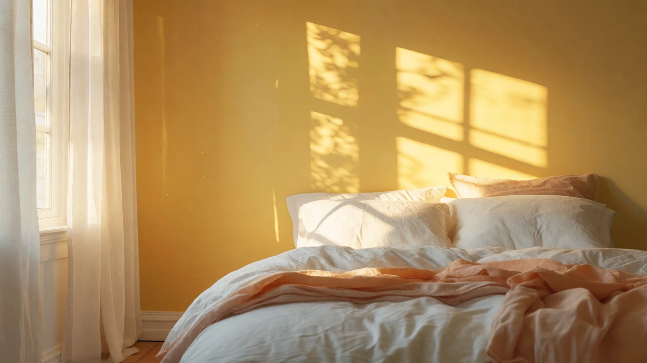
If we had to crown a single winner based on general consensus among designers and psychologists, it would be Soft Yellow. Why? Because yellow is universally associated with sunshine, optimism, and energy. However, the key word is "soft." A neon highlighter yellow will give you a headache. A pale buttercup or creamy vanilla yellow brings warmth without overwhelming your senses.
But yellow isn’t the only option. Here are the other top-tier contenders, depending on what kind of happiness you are looking for:
- Sky Blue: Best for reducing stress. If your happiness comes from feeling unburdened, blue is your friend. It lowers blood pressure and creates a sense of openness.
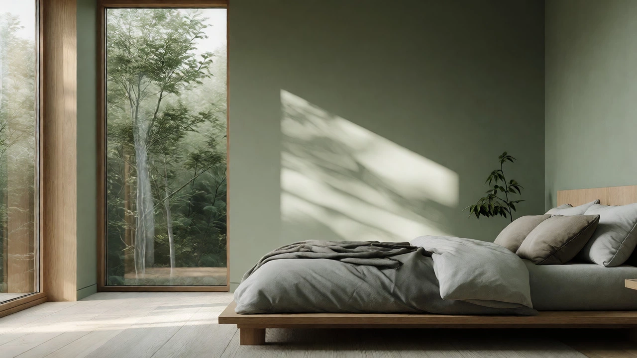
- Sage Green: Best for grounding. Green connects us to nature. It is restful for the eyes and promotes a balanced, steady mood.
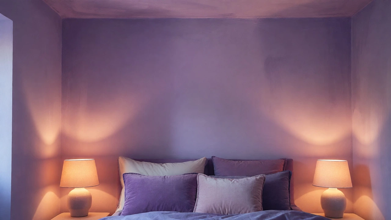
- Lavender: Best for emotional healing. Historically linked to calmness, lighter purples can soothe an overactive mind before bed.
- Peach or Coral: Best for social warmth. These are subtle warm tones that feel inviting and friendly without being aggressive like red.
Comparing Mood Effects by Color Family
To help you decide, let’s look at how different color families impact your daily routine. This table breaks down the pros and cons for each major group.
| Color Family | Emotional Effect | Best For | Potential Pitfall |
|---|---|---|---|
| Warm Yellows | Optimism, Energy, Cheer | Northern-facing rooms; people who struggle to wake up | Can cause eye strain if too saturated |
| Cool Blues | Calm, Trust, Peace | High-stress individuals; hot climates | Can feel cold or isolating in winter |
| Natural Greens | Balanced, Restorative, Fresh | Anyone seeking stability; nature lovers | Darker greens can feel heavy or gloomy |
| Soft Purples | Soothing, Creative, Spiritual | Meditative spaces; creative thinkers | Can appear artificial if not toned correctly |
| Neutral Beiges | Safe, Clean, Minimalist | Those who prefer clutter-free minds | Can feel boring or depressing if lacking texture |
How Lighting Changes Everything
You might love a color sample in the store, but your bedroom has unique lighting conditions. Light is the biggest variable in how a color is perceived. A color that looks happy in daylight might turn muddy under incandescent bulbs.
Check your window orientation:
- North-Facing Rooms: These get cool, indirect light. Walls tend to look bluish or grayish. To counteract this chilliness, choose warmer hues. A creamy yellow or a peach-toned beige will add the sunlight that the room lacks. Avoid cool grays or blues here, as they will make the room feel cavernous and sad.
- South-Facing Rooms: These get intense, warm natural light all day. You can handle cooler colors like sky blue or sage green because the sun will neutralize their chill. If you put a strong yellow here, it might become glaringly bright at noon.
- East-Facing Rooms: Morning light is soft and golden. This is perfect for energizing colors like light orange or soft coral. It helps you start the day with a positive burst of energy.
- West-Facing Rooms: Evening light is warm and red-heavy. Cool colors like blue or violet work well here to balance the heat of the sunset. They prevent the room from feeling overly hot and sticky in the evening.
Don’t forget artificial light. LED bulbs come in different color temperatures measured in Kelvin. For a happy, relaxing bedroom, stick to 2700K-3000K (warm white). Bulbs above 4000K (cool white) look clinical and can suppress melatonin production, making it harder to relax.
Avoiding the "Happy" Traps
Not every bright color belongs in a bedroom. Red is the classic example. While red is passionate and energetic, it raises blood pressure and heart rate. You want your body to wind down, not rev up. Using red as a dominant wall color often leads to restless sleep and irritability.
Black is another trap. While sophisticated, large amounts of black absorb light. In a small bedroom, this can create a cave-like atmosphere that feels oppressive rather than cozy. If you love dark colors, use them on accent walls or furniture, not all four walls.
Also, beware of pure white. It sounds clean, but in practice, it shows every scuff mark and shadow. It can feel stark and unforgiving. If you want a bright room, go for an off-white with a hint of cream or gray. This adds depth and warmth, making the space feel lived-in and welcoming.
Practical Steps to Choose Your Shade
Ready to paint? Don’t just trust the swatch card. Follow these steps to ensure you don’t regret your choice six months later.
- Buy Sample Pots: Never commit to a full gallon based on a tiny square. Buy three small pots of your top choices.
- Paint Large Swatches: Paint a piece of cardboard or poster board, not the wall directly. This lets you move the sample around the room.
- Test at Different Times: Look at your samples in the morning, afternoon, and evening under both natural and artificial light. Does the yellow still look cheerful at 8 PM when the lights are on? Or does it turn sickly?
- Consider Your Bedding: Your sheets and curtains interact with the wall color. If you have bold patterns, keep the walls simple. If your bedding is neutral, you have more freedom to play with wall color.
- Add Texture: Happiness isn’t just visual; it’s tactile. Pair your chosen color with soft textiles-linen throws, velvet cushions, wool rugs. A soft blue wall feels much happier when paired with a chunky knit blanket than when paired with slick leather.
Real-Life Scenarios: Which Happy Color Fits You?
Let’s apply this to real situations. Maybe you live in a city apartment with limited natural light. You work a high-stress job. You need decompression. In this case, Sage Green is likely your best bet. It mimics the outdoors, bringing a bit of nature inside, and its muted tone reduces visual noise.
On the other hand, consider a couple sharing a bedroom. One partner loves energy, the other needs calm. A compromise could be a Greige (gray-beige) base with accents of soft yellow in artwork or pillows. This keeps the main environment neutral and soothing while injecting pops of optimism where visible.
For students or young professionals, a Light Lavender can be surprisingly effective. It signals creativity and calm without being childish. Just ensure it’s a grayish-lavender, not a purple grape juice.
Frequently Asked Questions
Is blue really the happiest color for a bedroom?
Blue is widely considered the most popular color for bedrooms because it promotes calmness and lowers heart rate. However, "calm" is not always "happy." For many, true happiness involves warmth and energy. Soft yellow or peach may feel happier emotionally, while blue feels safer and more relaxed. The best choice depends on whether you associate happiness with peace or with vitality.
Should I avoid red in my bedroom?
Generally, yes, avoid using red as a dominant wall color in a bedroom. Red is highly stimulating and can increase heart rate and blood pressure, which interferes with falling asleep. If you love red, use it sparingly in accessories like throw pillows or art, or opt for softer shades like terracotta or blush pink instead.
What is the best color for a small bedroom?
Light, airy colors are best for small bedrooms to make the space feel larger. Soft whites, pale blues, light grays, and gentle pastels reflect light and create an illusion of openness. Avoid dark, heavy colors that absorb light and make the room feel cramped, unless you are aiming for a very specific dramatic effect.
Does ceiling color matter for mood?
Yes, ceiling color affects perceived height and mood. Painting the ceiling a lighter shade than the walls can make the room feel taller and more open. Some designers recommend painting the ceiling a very pale version of the wall color to blur the boundary between wall and ceiling, creating a seamless, enveloping, and calming effect.
Can I mix multiple colors in a bedroom?
Absolutely. In fact, mixing colors is often better than sticking to one flat shade. Use a dominant neutral color for the majority of the walls, then introduce a secondary color through an accent wall, bedding, or rugs. This adds visual interest and allows you to balance calming tones with energizing ones.