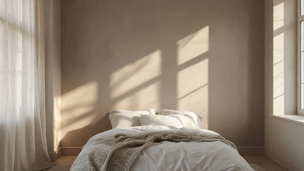
Cozy Bedroom Color Estimator
Find your ideal cozy palette by answering three simple questions about your space.
Recommended Palette
You know that feeling when you walk into a room and your shoulders instantly drop two inches? That’s not magic; it’s color psychology doing its job. Most people think "cozy" means slathering the walls in dark chocolate or burgundy. But here’s the twist: the most cozy bedroom colors often aren’t the darkest ones on the fan deck. They are the shades that mimic the warmth of sunset light, the softness of old linen, or the grounding nature of earth.
If you’re staring at a blank wall wondering what will actually help you sleep better and feel warmer without making the room look like a cave, this guide breaks down exactly which hues work, why they work, and how to pick the right one for your specific space.
The Science Behind Warmth and Calm
Before we pick a paint can, let’s talk about why certain colors feel cozy. It comes down to temperature and saturation. In color theory, warm tones (reds, oranges, yellows) advance toward the eye, making large spaces feel smaller and more intimate. Cool tones (blues, greens) recede, making small rooms feel larger but sometimes colder.
However, "warm" doesn't just mean red. It refers to the undertone. A gray with a brown or beige undertone feels warmer than a blue-gray, even if both are technically neutral. The goal for a bedroom is usually a balance: enough warmth to feel inviting, but low enough saturation to avoid over-stimulation. High-saturation colors raise heart rates; muted, dusty tones lower them. This is why a neon orange might be exciting in a kitchen but terrible for sleep.
Top Contenders for the Ultimate Cozy Vibe
So, what are the actual winners? If I had to recommend three specific directions based on current trends and timeless design principles, here is where you should look.
1. The New Neutrals: Greige and Taupe
Greige (gray + beige) has dominated interior design for a decade for a reason. It changes appearance depending on the light. In the morning, it looks crisp and clean. At night, under lamp light, it glows with a subtle warmth. It pairs effortlessly with wood furniture, which is naturally cozy. If you have limited natural light, a lighter greige prevents the room from feeling dim while still avoiding the sterile vibe of pure white.
2. Earthy Greens: Sage and Olive
Nature is inherently cozy. Think of sitting in a forest or a garden. Sage Green is a pale, grayish-green color inspired by the herb, known for its calming and restorative properties. It connects us to the outdoors without bringing the harsh brightness of lime green. Darker olive tones add depth and richness, making a room feel like a sanctuary. These colors work particularly well in bedrooms with wooden floors or rattan accents, enhancing the organic feel.
3. Soft Terracotta and Clay
This is for those who want more personality. Terracotta isn’t bright orange; it’s the color of sun-baked clay pots. It’s dusty, muted, and deeply warming. Psychologically, terracotta evokes feelings of safety and groundedness. It’s perfect for north-facing rooms that lack sunlight, as it artificially injects warmth into the space. However, use it carefully-if the room is small, keep the ceiling white to prevent the space from feeling compressed.
How Lighting Changes Everything
You cannot choose a cozy color in isolation. Light is the variable that dictates success. A color that looks cozy in the store may look cold in your home if your lighting is wrong.
- North-Facing Rooms: These get cool, bluish light all day. Avoid cool grays or blues, which will look icy. Go for warm whites, creams, or soft yellows to counteract the chill.
- South-Facing Rooms: You have plenty of warm sunlight. You can afford cooler tones like sage green or soft blues, which will balance the intense heat of the afternoon sun.
- East/West-Facing Rooms: These experience dramatic shifts. East gets bright morning light; West gets intense evening glow. Neutral taupes or warm grays adapt best here, shifting subtly with the time of day.
Pro tip: Always buy sample pots. Paint a large square on the wall (at least 2x2 feet). Watch it at 8 AM, 4 PM, and 9 PM. If it makes you feel anxious or tired during the day, it won’t help you relax at night.
Texture Matters More Than Hue
Here is a secret designers rarely tell beginners: a flat painted wall can never fully achieve "cozy" on its own. Texture completes the equation. A smooth, glossy surface reflects light sharply, creating visual noise. A matte or eggshell finish diffuses light, creating a softer atmosphere.
But beyond paint sheen, consider these elements:
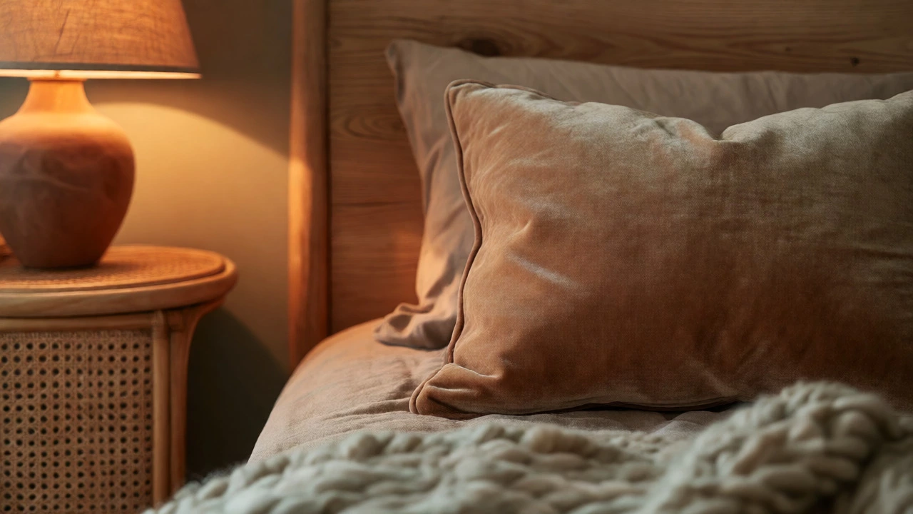
- Textiles: Heavy linen curtains, chunky knit throws, and velvet pillows absorb sound and light, physically dampening the room's energy.
- Furniture Finishes: Matte wood finishes feel warmer than high-gloss lacquer. Rattan and wicker add organic texture that complements earthy paint colors.
- Rug Pile: A high-pile wool rug underfoot anchors the space visually and thermally.
If you paint your walls a beautiful sage green but leave the windows bare and the floors shiny tile, the room will still feel cold. Pairing your chosen color with tactile materials amplifies the cozy effect.
Avoiding Common Mistakes
Many people try to make a room cozy by simply going darker. This is a trap. If you paint a small, windowless guest bedroom a deep charcoal, it might feel less like a hug and more like a closet. Darkness reduces perceived space, which can induce claustrophobia rather than comfort.
Another mistake is ignoring the undertones. A "white" paint can have yellow, pink, or blue undertones. In a bedroom, avoid stark blue-based whites unless you want a crisp, hotel-like feel. For coziness, look for whites with yellow or red undertones, often labeled as "cream," "ivory," or "bone." These reflect warm light rather than cool light, mimicking the glow of candlelight.
Comparison: Choosing Your Palette
To help you decide, here is a breakdown of popular cozy palettes against practical constraints.
| Color Family | Best For | Mood Created | Lighting Needs |
|---|---|---|---|
| Warm Neutrals | Small rooms, minimalists | Clean, airy, calm | Works in all lighting; enhances natural light |
| Sage/Olive Green | Natural lovers, larger rooms | Restorative, grounded | Needs some natural light to avoid looking muddy |
| Terracotta/Clay | North-facing rooms, boho styles | Inviting, energetic yet warm | Thrives in artificial warm light; needs contrast |
| Deep Blues | Large master suites, dark rooms | Sleep-inducing, serene | Requires ample ambient lighting to prevent gloom |
Practical Steps to Execute the Look
You’ve picked your color. Now, how do you apply it? Follow this simple checklist to ensure you don’t regret the decision six months later.
- Test Large Swatches: Never trust the tiny chip in the store. Apply samples to multiple walls.
- Check Undertones: Hold a piece of pure white paper next to your sample. Does the paint look yellow, pink, or gray compared to the paper? Ensure this matches your desired mood.
- Consider the Ceiling: Painting the ceiling the same color as the walls creates a "jewel box" effect, which is incredibly cozy but only works in rooms with high ceilings. Otherwise, keep the ceiling white or a very light tint of the wall color.
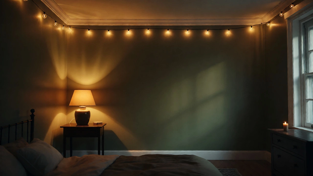
- Add Layered Lighting: Replace overhead bulbs with 2700K (warm white) LEDs. Use table lamps instead of big overhead fixtures to create pools of light.
- Balance with White Trim: Crisp white trim provides necessary contrast, preventing the cozy color from looking dirty or overwhelming.
Final Thoughts on Personal Comfort
There is no single "correct" answer to what is a cozy color. One person finds peace in a dark navy den; another feels suffocated and prefers a creamy off-white. The key is consistency between the color and your lifestyle. If you love reading in bed, ensure the color doesn’t cause eye strain under your reading lamp. If you wake up early, avoid colors that absorb too much light, making the room feel perpetually twilight.
Start with the emotional response. Walk into the room, close your eyes, and imagine the shade wrapping around you. If it feels heavy, go lighter. If it feels thin, add texture. Coziness is a feeling, not just a hex code.
Is black a cozy color for a bedroom?
Black can be cozy, but it is risky. It works best in large rooms with high ceilings and abundant warm lighting. In small spaces, black can feel oppressive rather than comforting. If you want drama without the weight, try charcoal or deep navy instead.
Do light colors make a bedroom feel less cozy?
Not necessarily. Light colors like cream, ivory, and soft beige can feel very cozy if they have warm undertones. Stark, cool whites can feel clinical, but warm whites mimic sunlight and create a soft, enveloping atmosphere, especially when paired with textured textiles.
What is the best color for a small bedroom?
For small bedrooms, stick to light, warm neutrals like taupe, greige, or soft peach. These colors reflect light, making the room appear larger, while their warm undertones maintain a sense of intimacy and comfort without closing in on you.
Should I paint all four walls the same color?
Painting all four walls the same color creates a cohesive, immersive environment, which enhances coziness. An accent wall can break the flow and draw attention to the size of the room. For maximum coziness, carry the color onto the ceiling or use consistent trim colors to blur boundaries.
How does lighting affect cozy bedroom colors?
Lighting changes how colors appear significantly. Warm bulbs (2700K-3000K) enhance warm tones like terracotta and yellow, making them richer. Cool bulbs (4000K+) can wash out warm colors, making them look gray or dull. Always test your paint color under the specific lighting conditions you plan to use at night.