Luxury Kitchen Color Visualizer
Select a color family below to see how it transforms the perception of a standard kitchen setup. Observe the changes in depth, warmth, and sophistication.
Select a Color
Click a button above to see the design secrets for that palette.
You walk into a friend’s new home, and the kitchen stops you in your tracks. It doesn’t just look clean; it looks expensive. You might assume they spent thousands on custom marble islands or gold-plated fixtures. But often, the secret isn’t the price tag of the hardware-it’s the paint.
Color is the most powerful tool in interior design for signaling value. A $20 can of paint can make flat-pack cabinets look like bespoke joinery, while a bad choice can turn solid oak into something that feels cheap and dated. As someone who has walked through hundreds of London properties, from Victorian conversions to sleek Shoreditch lofts, I’ve seen exactly which hues trigger that "luxury" response in buyers and guests.
So, what actually makes a kitchen look pricey? Is it always white? Do dark colors really work in small spaces? And how do you avoid looking like you’re trying too hard? Let’s break down the specific colors, finishes, and combinations that scream high-end without requiring a mortgage top-up.
The Psychology of Luxury: Why Certain Colors Feel More Expensive
Before we pick a swatch, let’s talk about why our brains equate certain colors with wealth. It’s not magic; it’s history and perception. Historically, pigments were expensive. Deep blues (ultramarine) and rich reds were once reserved for royalty because the materials to create them cost more than gold. Today, that subconscious association lingers.
Luxury also implies calmness and control. Bright, chaotic patterns feel busy and accessible. In contrast, muted, complex tones suggest sophistication and intentionality. When a room feels serene, it feels curated. Curated equals expensive.
There’s also the factor of light absorption. Darker, richer colors absorb light, creating depth and shadow. This adds dimension to cabinetry, making flat surfaces appear sculpted. Lighter, flat whites reflect everything, which can sometimes flatten a room and highlight imperfections if the lighting isn’t perfect. To get that expensive look, you need colors that play with light rather than just reflecting it.
Deep Greens: The Modern Status Symbol
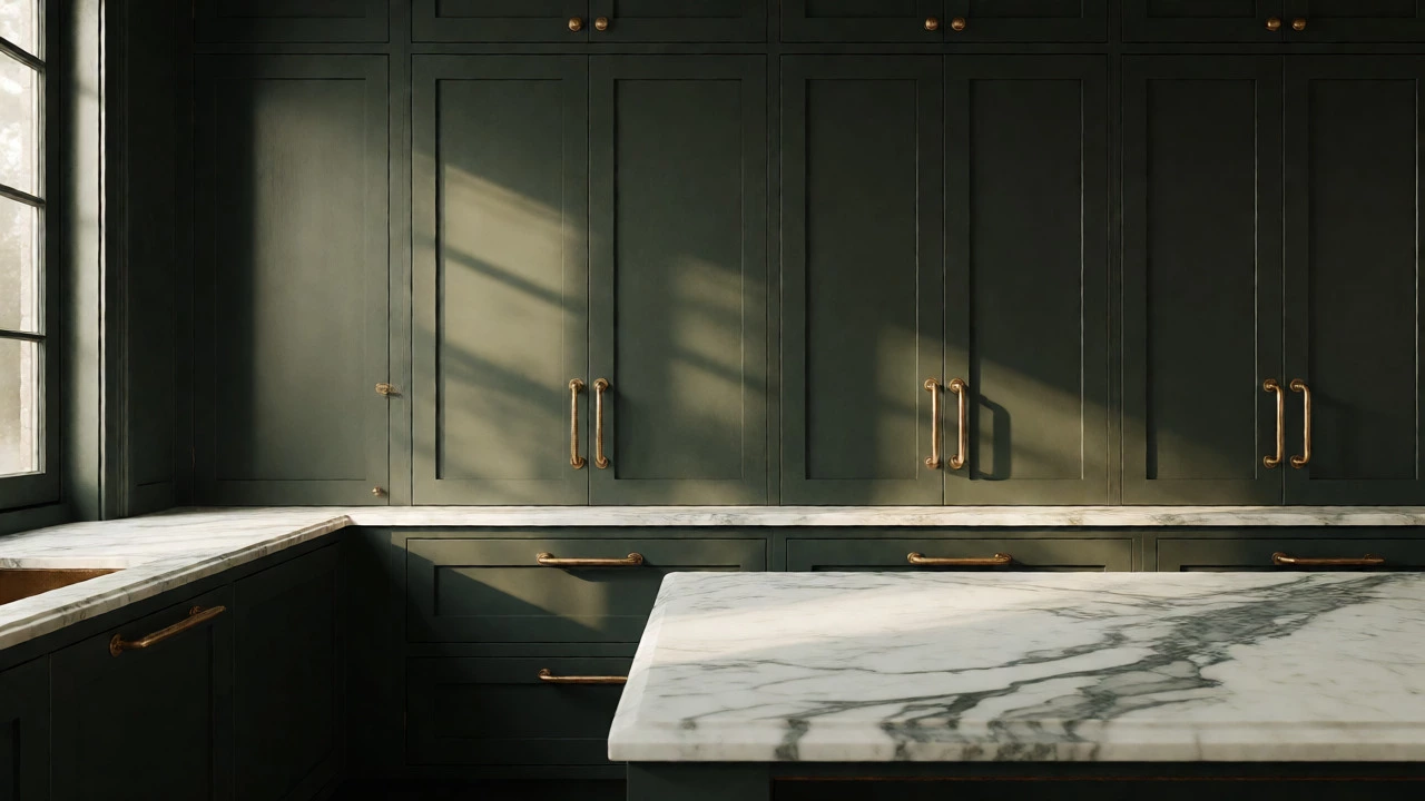
If you want to know what color kitchen looks expensive right now, look no further than green. Specifically, deep, moody greens. Think Forest Green, Emerald, or even a dusty Sage. These shades have taken over high-end interiors because they bridge the gap between nature and sophistication.
Sage Green is a muted, gray-toned green that offers a soft, organic elegance suitable for both traditional and modern kitchens. Unlike bright lime or grass green, sage doesn’t shout. It whispers. It pairs beautifully with unlacquered brass, which tarnishes over time to add character-a hallmark of aged luxury. If you have a smaller kitchen, sage reflects enough light to keep the space open but has enough pigment to feel grounded.
For larger spaces, go darker. Forest Green is a deep, saturated green that creates a dramatic, enveloping atmosphere when paired with metallic accents. Pair this with black iron handles or antique bronze pulls. The contrast between the deep green and the warm metal creates a visual richness that plastic-looking chrome simply cannot match. Avoid pure black hardware here; it can look too harsh against the organic tone of the green. Warm metals are key.
Navy Blue: Timeless Elegance That Never Dates
Navy blue is the safe bet for anyone terrified of making a mistake. It’s been a staple in luxury homes for decades, largely because it works everywhere. From coastal Hamptons-style homes to industrial New York lofts, navy fits in.
Why does it look expensive? Because it’s versatile. Navy acts as a neutral, much like charcoal grey, but with more personality. It provides a strong backdrop that allows other elements-like a white marble countertop or a wooden island-to pop. If you’re renting or worried about resale value, navy is arguably the safest "luxury" color you can choose. It appeals to almost every demographic.
The trick with navy is the finish. A glossy navy can look toy-like. A matte or eggshell finish absorbs light and looks velvety, adding weight to the cabinets. If you’re painting existing units, sand them back thoroughly before applying a high-quality primer designed for furniture. Cheap paint on old wood will show every brushstroke and dent, killing the illusion instantly.
Charcoal and Black: Bold Confidence
Some people shy away from dark colors, fearing their kitchen will feel like a cave. But when done correctly, black and charcoal are the ultimate power moves. They signal confidence. Only a designer who knows what they’re doing dares to use all-black cabinetry.
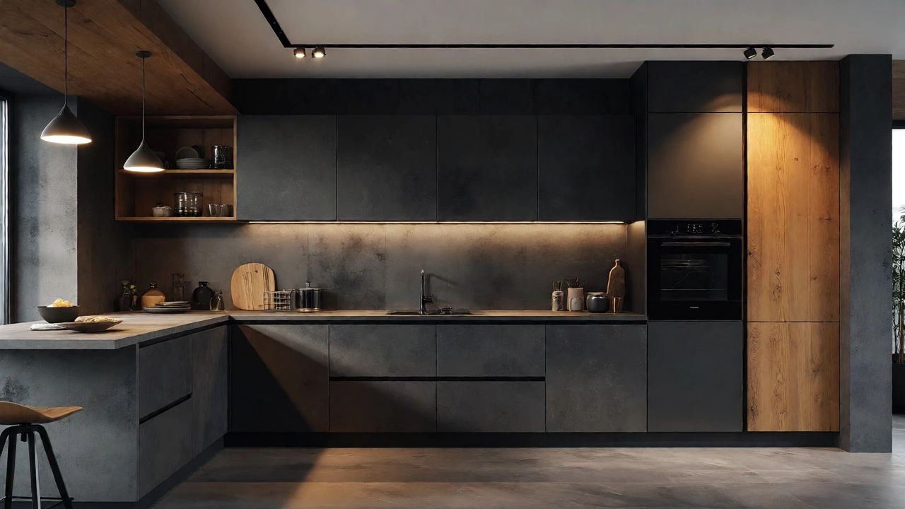
Charcoal Grey is a sophisticated dark grey that serves as a softer alternative to black, offering depth without overwhelming the space. Charcoal is easier to live with than pure black. It hides fingerprints better and feels less stark. Use charcoal for upper cabinets and a lighter stone for lower ones to balance the weight. Or, go full charcoal for a monolithic, minimalist look that rivals any high-end showroom.
Pure black is for those who love drama. It requires excellent lighting. If your kitchen lacks natural light, black walls and cabinets can close the space in. But if you have big windows, black frames the view like a picture. Pair black cabinets with warm wood tones-oak or walnut-to prevent the room from feeling cold. The warmth of the wood contrasts with the coolness of the black, creating a balanced, layered aesthetic.
Warm Whites and Creams: The Quiet Luxury Approach
White is tricky. Stark, brilliant white often looks clinical or cheap unless you have professional-grade lighting and flawless installation. High-end kitchens rarely use "pure white." Instead, they use off-whites, creams, and taupes.
Greige is a hybrid of grey and beige that provides a warm, neutral base that complements both cool and warm materials. Greige is the darling of current luxury trends. It’s warmer than grey but cleaner than beige. It makes a room feel inviting yet polished. When you walk into a hotel lobby, the walls aren’t usually stark white; they’re a subtle cream or greige. This softness reduces glare and makes the eye relax.
To make white look expensive, texture is non-negotiable. Flat white paint on smooth MDF looks flat. Add texture with a shaker profile cabinet door, or use a plaster-effect wall behind the stove. Combine warm whites with mixed metals-brass, copper, and steel together-to create interest. Monochromatic white-on-white can look expensive if the textures vary wildly, but it’s risky. Stick to two-tone: white uppers, colored lowers, or vice versa.
Comparison: Choosing Your Luxury Palette
Not sure which direction to take? Here is a breakdown of how these colors perform in different scenarios. This table helps you decide based on your kitchen size and style.
| Color Family | Best For | Lighting Needs | Complementary Materials | Vibe |
|---|---|---|---|---|
| Deep Green | Traditional & Transitional | Moderate Natural Light | Brass, Walnut, Marble | Organic, Sophisticated |
| Navy Blue | Cohesive & Resale-Friendly | High Ambient Light | Chrome, Quartz, Oak | Classic, Trustworthy |
| Charcoal/Black | Modern & Industrial | Strong Artificial Lighting | Oak, Concrete, Glass | Dramatic, Confident |
| Warm White/Greige | Small Spaces & Minimalist | Diffused Soft Light | Linen, Stone, Matte Metal | Airy, Clean, Calm |
It’s Not Just Paint: The Role of Finish and Hardware
You can pick the most expensive color in the world, but if your finish is wrong, it’ll look cheap. High-end kitchens rarely use high-gloss lacquer on entire walls. It shows every flaw. Instead, they use satin, eggshell, or matte finishes. These diffuse light, hiding minor imperfections in the cabinetry.
Hardware is the jewelry of the kitchen. Plastic knobs are dead. Even if you buy budget-friendly cabinets, replace the handles immediately. Go for solid brass, brushed nickel, or matte black. Weight matters. If the handle feels light and hollow, it detracts from the perceived value. Heavy, substantial hardware anchors the design and signals quality.
Consider the backsplash too. If your cabinets are dark, a light, textured backsplash (like zellige tile) adds reflection and breaks up the darkness. If your cabinets are white, a bold, patterned tile or a slab of book-matched stone adds the necessary focal point. Don’t be afraid of grout lines; contrasting grout can make simple tiles look intricate and handcrafted.

Common Mistakes That Kill the Luxury Vibe
I see these errors constantly in renovations that aim for high-end but miss the mark:
- Ignoring Undertones: Painting your cabinets a "white" that clashes with your countertops. Always test paint samples next to your stone or laminate under both day and night lighting. A pink undertone in your white paint will clash with a grey quartz counter, making both look cheap.
- Inconsistent Metals: Mixing five different metal finishes randomly. Pick two max. For example, brass taps and black handles. Three is pushing it. Random mixing looks cluttered, not curated.
- Over-Lighting: Relying solely on ceiling spotlights. Luxury kitchens use layered lighting. Under-cabinet LEDs, pendant lights over the island, and ambient wall washers. Harsh overhead lighting flattens the room and exposes dust.
- Cheap Countertops: If you can’t afford real stone, invest in high-quality quartz with realistic veining. Avoid laminates with obvious repeating patterns or overly thick edge profiles that look bulky.
How to Test Your Color Choice
Don’t trust the tiny chip in the store. Paint a large poster board (at least A4 size) with your chosen color. Move it around the kitchen throughout the day. Look at it in morning light, afternoon sun, and evening artificial light. Does it change drastically? Does it make the room feel smaller or larger?
Live with it for 48 hours. Put the board near your appliances and counters. Take photos with your phone camera (which often distorts color slightly, similar to how the eye perceives it). If the photo looks muddy or yellow, the color might be too warm. If it looks sterile, it might be too cool. Adjust until it feels right.
Frequently Asked Questions
Does white kitchen look expensive?
Yes, but only if it’s the right white and executed perfectly. Pure, bright white can look clinical or cheap if the lighting is harsh or the materials are low-quality. Warm whites, creams, and greiges tend to look more luxurious because they mimic the soft, diffused light found in high-end hotels and galleries. Texture and high-quality finishes are crucial to making white look expensive.
Are dark kitchens harder to keep clean?
Dark colors hide dust well but show water spots and fingerprints clearly. Matte finishes help mitigate this compared to gloss. Using microfiber cloths and keeping a small spray bottle nearby for quick wipes solves most issues. Many homeowners find that dark cabinets require less frequent deep cleaning than white ones, which show every spill and stain.
What is the most timeless kitchen color?
Navy blue and charcoal grey are considered the most timeless. They transcend fleeting trends and appeal to a broad range of tastes. While white is classic, it evolves in tone (from cool to warm), whereas navy and charcoal remain consistently sophisticated. These colors also pair well with changing accessories, allowing you to update the look without repainting.
Can I mix colors in my kitchen to look expensive?
Absolutely. Two-tone kitchens are very popular in luxury design. A common strategy is darker lower cabinets and lighter upper cabinets to ground the space while keeping it airy. Alternatively, you can paint the island a contrasting color to the perimeter cabinets. Ensure the colors share a similar saturation level to maintain harmony.
Do gold fixtures still look expensive?
Yes, but the type of gold matters. Polished, shiny yellow gold can look dated or tacky. Unlacquered brass, brushed gold, or antique bronze are currently preferred for a high-end look. These finishes develop a patina over time, adding character and authenticity that mass-produced chrome lacks. Pair them with matte or satin cabinet finishes for the best effect.