Kitchen Luxury Color Estimator
Select your planned kitchen elements to see how they stack up against designer standards for an expensive look.
Luxury Score
You walk into a friend’s new home. The kitchen is spacious, the appliances are top-tier, but something feels off. It looks… cheap. Then you visit another house with smaller cabinets and mid-range ovens, yet it screams luxury. What’s the difference? Nine times out of ten, it’s the color.
Color isn’t just decoration; it’s the first thing your brain processes before you even notice the marble countertops or the brass fixtures. As someone who has spent years navigating the interiors of London townhouses and modern builds alike, I’ve seen how the wrong shade can make a £50,000 kitchen look like a flat-pack nightmare, and the right one can elevate basic units to something bespoke.
If you want your kitchen to feel expensive, stop chasing the brightest white or the trendiest sage green for a second. Let’s talk about what actually signals value in 2026.
The Psychology of Luxury: Why Dark and Neutral Wins
Here is a controversial idea: bright, cheerful kitchens often read as "functional" rather than "luxurious." Think about high-end hotels or upscale restaurants. They rarely use primary reds or sunny yellows. Instead, they rely on depth, contrast, and subtlety.
Expensive-looking kitchens usually share two traits: depth and restraint. Depth comes from rich, saturated tones that absorb light rather than reflecting it harshly. Restraint means using a limited palette where every element works together. When you choose a color that adds weight to the room, you signal permanence and quality. Cheap materials often look thin and shiny; expensive materials look solid and matte.
This doesn’t mean you need to paint everything black. But understanding why certain hues work helps you pick the right finish for your specific space.
Top Colors That Signal High Value
Not all neutrals are created equal. A stark builder’s white can make a kitchen feel clinical and cold, which reads as budget-friendly. Here are the specific color families that consistently test well in high-end designs.
1. Deep Charcoal and Slate Grey
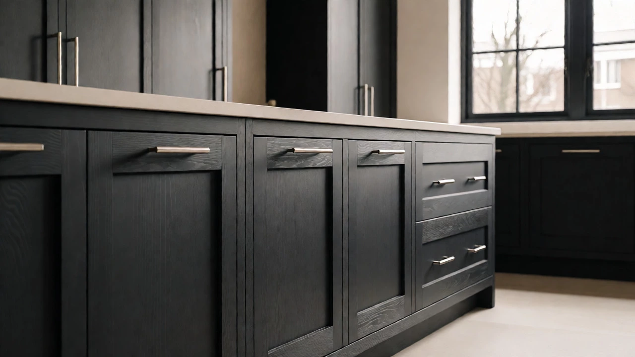
Grey has been around forever, but not all greys are luxurious. Avoid cool, blue-toned greys if you have warm wood floors-they clash. Instead, go for Charcoal, a deep, near-black grey with subtle undertones of brown or green. This color hides fingerprints better than pure black and reflects less light than medium grey, creating a moody, sophisticated atmosphere.
Pair charcoal cabinets with brushed nickel or matte black hardware. The key here is texture. If you go dark, ensure your surfaces have some grain or sheen variation. Flat matte charcoal on smooth melamine looks flat. Matte charcoal on textured wood veneer looks intentional.
2. Warm Cream and Greige
White is tricky. Pure white (like RAL 9010) can yellow over time or look too bright under LED lights. For an expensive look, opt for Greige, a blend of grey and beige. It has warmth without being yellow, and sophistication without being cold. Brands like Farrow & Ball offer shades like 'Elephant's Breath' or 'Skimming Stone' that add this exact nuance.
Why does this work? Because it mimics natural stone. High-end kitchens often feature marble or quartz. A warm cream cabinet complements these stones beautifully, creating a seamless flow. It feels organic, which humans subconsciously associate with quality.
3. Navy Blue and Midnight Green
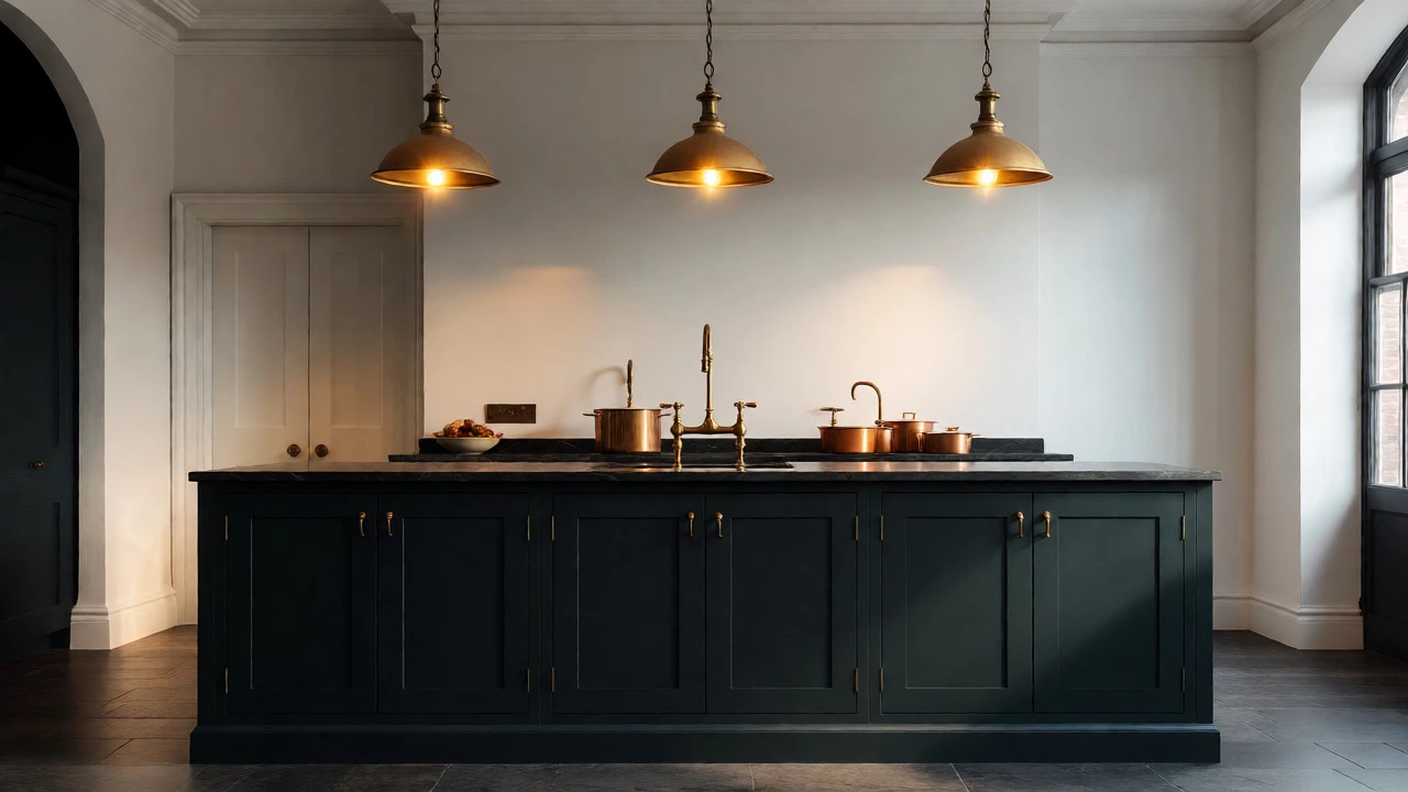
If you want color, don’t shy away from it-but keep it deep. Navy Blue is a classic choice for island bases or lower cabinets. It provides a strong anchor point in the room. Similarly, Midnight Green offers a similar effect with a more earthy vibe.
The trick with colored kitchens is contrast. If your walls are white, navy cabinets pop dramatically. This visual punch suggests confidence in design choices. Budget renovations often play it safe with beige everywhere; luxury renovations take calculated risks with deep jewel tones.
The Finish Matters More Than the Hue
You can buy the most expensive paint in the world, but if you apply it to cheap, glossy laminate, it will still look cheap. Conversely, a modest paint brand applied to real wood with a proper finish can look incredible.
| Finish Type | Perceived Value | Best For | Maintenance |
|---|---|---|---|
| Matte Lacquer | High | Modern, minimalist designs | Medium (shows oils) |
| Satin Wood Grain | Very High | Traditional or transitional styles | Low |
| High-Gloss Laminate | Low to Medium | Small spaces needing light reflection | High (shows smudges) |
| Flat Paint (DIY) | Variable | Budget renovations | High (chips easily) |
Notice that Matte Lacquer and Satin Wood Grain rank highest. Glossy finishes reflect light unevenly, highlighting imperfections in construction. Matte finishes diffuse light, smoothing out minor flaws and giving a velvety appearance. In London apartments, where lighting can be inconsistent, matte finishes provide a consistent, calm look that feels curated.
Lighting Changes Everything
A color is not static. It changes based on the light source. This is where many DIYers fail. They pick a paint chip under store fluorescent lights, then wonder why their kitchen looks muddy at night.
- Natural Light: North-facing rooms receive cooler, bluer light. Warm creams and woods help balance this. South-facing rooms get warm, golden light. Cool greys and blues prevent the room from feeling stuffy.
- Artificial Light: Most homes use LEDs now. Check the Kelvin rating. Anything below 3000K is very yellow; above 4000K is very blue. Aim for 3000K-3500K for a neutral, expensive feel. Pair this with dimmers. Dimmable lighting allows you to shift the mood from bright workspace to intimate dinner setting, adding layers of complexity that scream luxury.
Test your chosen color on large sample boards. Move them around the kitchen. Look at them in the morning, noon, and evening. If the color shifts drastically, it might be too sensitive for your lighting setup.
How to Combine Colors Without Looking Cluttered
One common mistake is trying to do too much. An expensive kitchen usually follows the 60-30-10 rule, adapted for interiors:
- 60% Dominant Color: Usually the cabinets or walls. Stick to neutrals or deep solids.
- 30% Secondary Color: Countertops, backsplash, or flooring. This should complement, not compete.
- 10% Accent Color: Hardware, stools, small appliances. This is where you can add personality-brass taps, copper pots, or a vibrant rug.
If you choose a bold cabinet color like forest green, keep the countertops simple. White quartz or honed granite works best. If your cabinets are plain white, you can afford a patterned tile backsplash or colorful bar stools. Balance is key. Chaos looks cheap; harmony looks expensive.
Common Pitfalls to Avoid
I see these mistakes constantly in renovation projects:
- Using Too Many Undertones: Mixing a yellow-based beige with a pink-based taupe creates a muddy mess. Stick to one family of undertones.
- Ignoring the Ceiling: Painting the ceiling a darker shade than the walls can make a low-ceiling kitchen feel cramped. Keep ceilings light unless you have high vaulted ceilings.
- Cheap Hardware: You can save on paint, but don’t skimp on handles. Heavy, solid metal pulls in brushed gold or matte black instantly upgrade the perception of the cabinets.
Final Thoughts: Trust Your Eyes, Not Trends
Trends change. Sage green was huge last year; terracotta is rising now. But expensive never goes out of style. If you stick to deep, muted tones, high-quality finishes, and thoughtful lighting, your kitchen will hold its value both financially and aesthetically.
Start with a swatch. Buy a quart of paint. Paint a poster board. Tape it to your cabinets. Live with it for three days. If it makes you feel calm and impressed, you’ve found your winner.
Does white always make a kitchen look bigger?
While white reflects light and can make a small room feel airier, it doesn't automatically make it look expensive. Stark, cool whites can feel clinical. Warm whites or creamy off-whites with subtle grey undertones create a softer, more inviting atmosphere that feels higher-end while still maximizing light.
Is matte or gloss paint better for expensive-looking kitchens?
Matte and satin finishes generally look more expensive because they hide surface imperfections and reflect light softly. High-gloss finishes can highlight unevenness in cabinet doors and show fingerprints, requiring more maintenance. However, high-gloss lacquer on perfectly flat, custom-built cabinets can look stunning in ultra-modern designs.
What is the most popular expensive kitchen color for 2026?
Deep, earthy tones remain dominant. Specifically, 'Mushroom' shades, deep olive greens, and charcoal blues are trending. These colors pair well with natural materials like wood and stone, reinforcing the desire for organic, grounded luxury in home design.
Can I mix wood tones and painted cabinets?
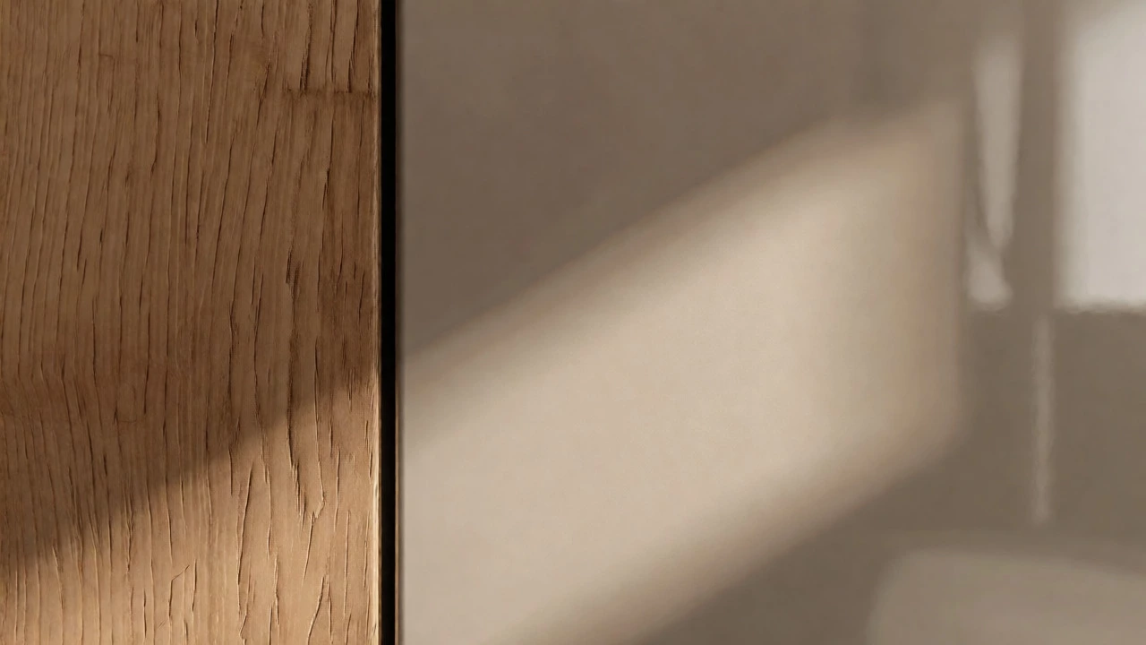
Yes, but proceed with caution. To make it look expensive, ensure the wood tone and paint color share similar undertones (e.g., warm oak with warm cream). Alternatively, use high contrast intentionally, such as dark walnut wood against crisp white, but keep other elements minimal to avoid clutter.
How does lighting affect my kitchen color choice?
Lighting alters color perception significantly. North-facing rooms with cool light may wash out warm colors, making them look greyish. South-facing rooms with warm sunlight can intensify yellow tones in paints. Always test samples under both natural daylight and artificial evening lighting before committing.