Timeless Bathroom Color Analyzer
Select a color palette below to analyze its timelessness score, recommended materials, lighting considerations, and resale potential.
Warm White & Cream
Soft off-whites with subtle warmth. The ultimate neutral canvas.
Greige Blend
Sophisticated grey-beige hybrid that adapts to any lighting.
Sage Green
Muted, dusty green evoking natural foliage and tranquility.
Soft Navy Blue
Deep, dramatic blue with historic roots and modern appeal.
Earthy Terracotta
Clay-like reddish-brown connecting to earth and pottery.
Pure Stark White
Bright, clinical white. Classic but potentially cold.
Walk into a bathroom painted in a bold, electric blue or a trendy neon accent wall, and you’ll feel the energy. Walk into one bathed in soft whites, warm greys, and natural stone tones, and you’ll feel calm. That feeling of calm is what makes a color timeless. Trends come and go like fashion seasons-what’s hot in 2024 might look dated by 2026. But a timeless palette feels right today, tomorrow, and ten years from now.
If you’re renovating your bathroom, choosing a color that stands the test of time isn’t just about aesthetics; it’s about protecting your investment. A timeless bathroom appeals to future buyers, resists visual fatigue, and serves as a versatile backdrop for changing accessories and lighting. So, what exactly makes a bathroom color timeless? It’s not just one shade. It’s a strategy rooted in neutrality, texture, and light.
The Power of Neutrality
When people ask, what bathroom color is timeless?, the answer almost always points toward neutrals. But “neutral” doesn’t mean boring beige or flat white. True timeless neutrals are complex shades with depth. Think of them as the canvas upon which the rest of the room is built.
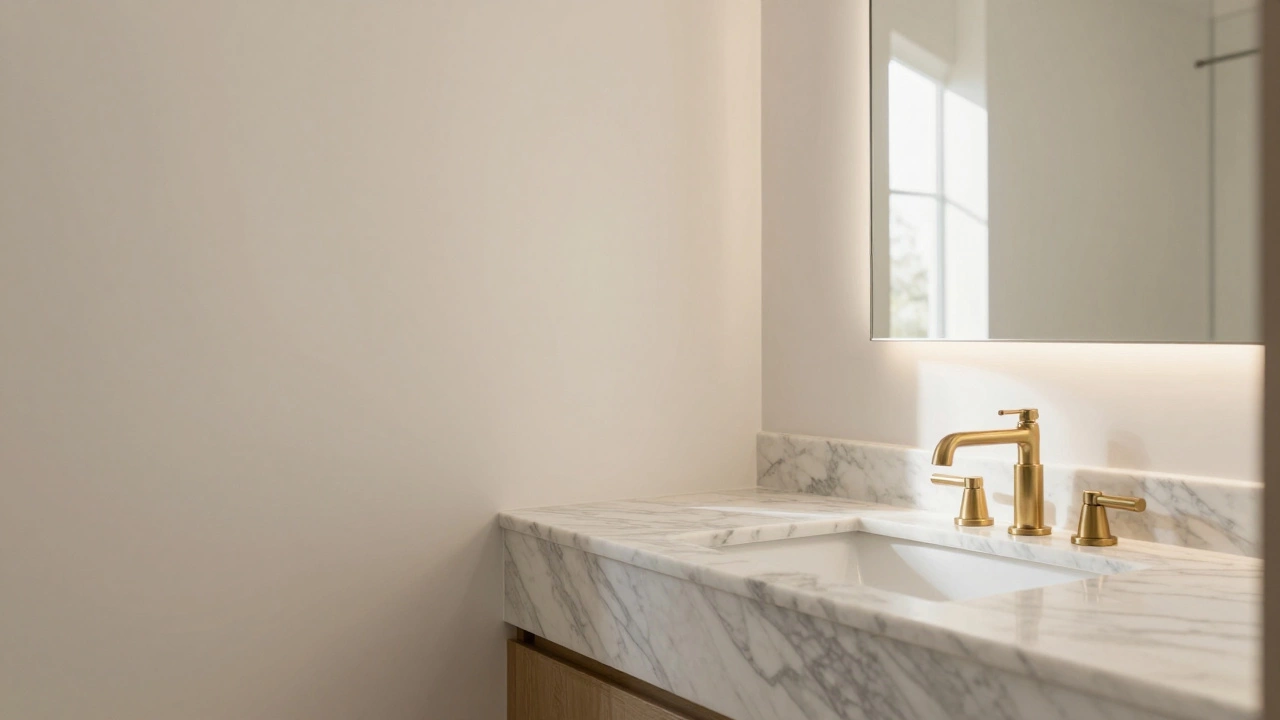
Warm White is a soft, creamy off-white that adds warmth without overwhelming the space. Unlike stark clinical whites, warm whites reflect light gently, making small bathrooms feel larger and cozier. Brands like Farrow & Ball’s "Pointing" or Benjamin Moore’s "White Dove" are staples in high-end interiors because they never look dated. They pair effortlessly with marble, wood, and metal fixtures.
Greige is a sophisticated blend of grey and beige that bridges cool and warm tones. This color became popular in the early 2010s but has remained relevant because it adapts to different lighting conditions. In morning light, it leans grey; in evening warmth, it leans beige. This flexibility ensures it never clashes with new hardware or textiles you might introduce later.
Why do these colors work? Because they don’t shout. They let the materials speak. A timeless bathroom relies on the contrast between smooth paint, rough stone, and polished metal. Neutral walls provide the quiet background needed for those textures to shine.
Nature-Inspired Hues That Last
While pure neutrals are safe, nature-inspired hues add character without sacrificing longevity. Humans are drawn to organic colors because they mimic the environment we evolved in. These colors feel familiar and comforting.
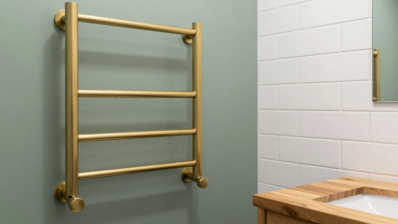
- Sage Green: A muted, dusty green that evokes foliage. It brings a sense of tranquility and spa-like serenity. Sage pairs beautifully with brass fixtures and white subway tiles. It’s vibrant enough to be interesting but subdued enough to remain classic.
- Soft Navy Blue: Deep blues have been used in nautical and traditional designs for centuries. A soft navy (not a bright royal blue) adds drama and depth. It works exceptionally well in powder rooms or smaller bathrooms where a bold statement is desired. Pair it with white trim and gold accents for a look that feels both modern and historic.
- Earthy Terracotta: While brighter oranges fade quickly, terracotta-a clay-like, reddish-brown-has staying power. It connects to earth and pottery, creating a grounded, rustic elegance. Use it sparingly, perhaps on an accent wall or through ceramic tiles, rather than painting all four walls.
These colors work because they are desaturated. High-saturation colors (like bright red or electric purple) tend to feel loud and temporary. Desaturated tones have grey mixed in, which tones down the intensity and allows the eye to rest.
The Role of Lighting in Color Perception
You can choose the most timeless color in the world, but if the lighting is wrong, it will fail. Light changes how we perceive color dramatically. A color that looks perfect under store fluorescent lights might appear muddy or too dark in your bathroom.
Natural light is your best friend. If your bathroom has windows, observe how the light changes throughout the day. North-facing rooms receive cooler, bluer light, so warmer neutrals (like cream or greige) balance this out. South-facing rooms get warm, yellow light, so cooler neutrals (like soft grey or sage) prevent the space from feeling too orange.
Artificial lighting matters just as much. Most homes use warm white bulbs (2700K-3000K). Under this light, cool greys can look dull or even slightly green. Always test paint samples on the actual wall. Paint a 1-foot square and live with it for three days. Look at it in the morning, afternoon, and night. If it still feels right after 72 hours, you’ve found a winner.
Texture Over Trend: Why Material Matters
A timeless bathroom isn’t just about paint color; it’s about how that color interacts with material. Flat paint on a wall can look cheap if there’s no texture to break it up. Conversely, textured surfaces like brick, stone, or wood grain add visual interest that transcends color trends.
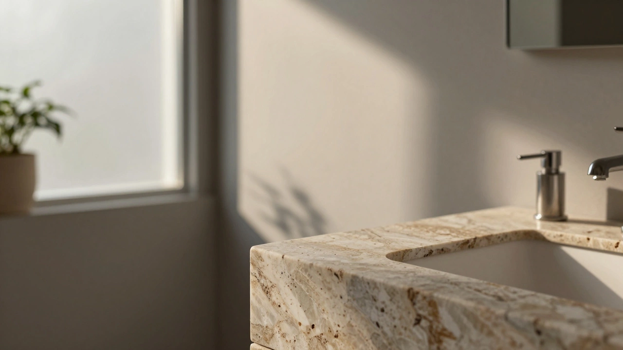
Consider using Natural Stone such as Marble or Travertine. These materials come in neutral palettes naturally-whites, creams, greys, and browns. Their veining and variation ensure no two pieces are alike, adding uniqueness without relying on trendy colors. Even if you change your towel sets or mirror frames every few years, the stone remains elegant.
Wood elements also contribute to timelessness. Teak, oak, or walnut vanities bring warmth and organic texture. Wood ages gracefully, developing a patina that enhances its beauty over time. Combine wood with neutral paint and stone countertops, and you create a layered look that feels curated, not copied from a magazine spread.
Comparing Timeless vs. Trendy Choices
| Feature | Timeless Palette | Trendy Palette |
|---|---|---|
| Color Range | Neutrals, muted greens/blues | Bright primaries, pastels, neons |
| Lifespan | 10+ years without feeling dated | 2-5 years before looking outdated |
| Resale Appeal | High - appeals to broad audience | Low - may deter some buyers |
| Flexibility | Easily updated with accessories | Requires repainting to update |
| Maintenance | Hides minor scuffs better | Show wear more noticeably |
This comparison highlights why investing in timeless choices saves money and stress in the long run. You won’t need to repaint every time a new trend emerges. Instead, you can refresh the space with new towels, plants, or artwork.
Practical Tips for Choosing Your Palette
So, how do you apply this knowledge? Here’s a step-by-step approach to selecting a timeless bathroom color scheme:
- Start with Fixed Elements: Look at your countertops, flooring, and cabinetry. These are expensive to change. Choose a wall color that complements them. If you have dark wood cabinets, opt for lighter walls to create contrast. If you have white quartz counters, you have more freedom to experiment with soft greys or greens.
- Test Samples: Never buy paint based on a swatch card. Buy sample pots and paint large sections of the wall. Observe them at different times of day.
- Consider Ceiling Color: Don’t forget the ceiling. Painting it the same color as the walls creates a seamless, expansive feel. Alternatively, a crisp white ceiling adds brightness and definition.
- Add Interest with Accessories: Once your base is set, introduce color through textiles, art, and plants. This allows you to change the mood seasonally without touching the paint.
- Focus on Quality: Invest in high-quality paint. Cheaper paints lack depth and durability. Premium paints offer richer pigmentation and better washability, crucial for humid bathroom environments.
Remember, a timeless bathroom is a sanctuary. It should feel relaxing, clean, and inviting. By sticking to proven palettes and focusing on quality materials, you create a space that endures beyond fleeting trends.
Is white really the most timeless bathroom color?
Yes, but with nuance. Stark, bright white can feel cold and clinical. Warm whites or off-whites (like cream or ivory) are more timeless because they add comfort and blend well with various lighting conditions. They also hide minor imperfections better than pure white.
Can I use bold colors in a timeless bathroom?
You can, but use them strategically. Instead of painting all walls, consider an accent wall in a deep navy or forest green. Alternatively, use bold colors in tiles within a niche or shower area. Keep the main walls neutral to maintain balance and longevity.
How does lighting affect my choice of bathroom color?
Lighting drastically changes color perception. Natural north light cools colors, while south light warms them. Artificial warm bulbs make cool greys look dull. Always test paint samples in your specific bathroom’s lighting conditions before committing.
What materials complement timeless bathroom colors?
Natural materials enhance timeless palettes. Marble, travertine, wood vanities, and brass or chrome fixtures add texture and depth. These materials age gracefully and pair seamlessly with neutral wall colors, creating a cohesive and enduring design.
Will a timeless bathroom appeal to potential home buyers?
Absolutely. Real estate experts consistently report that neutral, timeless bathrooms attract more buyers. They allow purchasers to visualize themselves in the space without being distracted by overly personalized or trendy color choices. This broad appeal can increase resale value.