Wall Art Placement Calculator
Stop guessing where to hang your pictures. Use this tool to determine the optimal center point for your artwork based on standard interior design guidelines.
Result & Visual Guide
Recommended Center Point:
--
from floor
Select a room type to see specific guidelines.
Walk into any room where the wall art feels off. You can’t quite put your finger on it, but something nags at you. Maybe a painting is too high. Maybe a gallery wall looks chaotic. Or perhaps there’s just empty space screaming for attention. The culprit? Usually, it’s a violation of the single most important principle in interior styling: balance through proportion and visual weight. This isn’t about following rigid rules that stifle creativity; it’s about understanding how the human eye processes space so you can create environments that feel calm, intentional, and genuinely beautiful.
You don’t need an expensive degree to get this right. You need to understand one core concept: the golden rule for home decor is not a single measurement, but a mindset of equilibrium. It dictates that no single element should dominate unless intentionally designed to do so, and every object must relate harmoniously to its surroundings. When applied to wall art and general styling, this means balancing size, color, texture, and height. If you’ve ever felt like your living room looks "unfinished" despite buying all the right furniture, you’re likely missing this connective tissue.
Understanding Visual Weight and Proportion
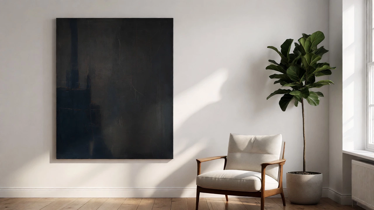
Think of a room as a scale. On one side, you have heavy elements-dark colors, large furniture pieces, dense textures. On the other, you have light elements-pastel walls, airy fabrics, negative space. The goal is equilibrium. If you hang a massive, dark abstract canvas on one wall but leave the opposite wall bare and painted white, the room tilts. Your eye gets pulled aggressively to the dark spot, creating tension rather than comfort.
This is where the concept of visual weight comes in. Darker colors appear heavier. Larger objects appear heavier. Intricate patterns appear heavier. To achieve balance, you distribute these weights evenly across the room. For example, if you place a heavy velvet sofa (high visual weight) on the left, you might balance it with a large, bright piece of wall art or a tall plant on the right. They aren't identical, but they carry equal perceptual mass.
A common mistake is assuming symmetry equals balance. Symmetry is mirror-image balance-identical lamps on either side of a fireplace. It’s formal and traditional. Asymmetrical balance is more dynamic and modern. It uses different objects that share similar visual weight. A large mirror on one side can balance a bookshelf on the other because both reflect light and occupy significant vertical space. Understanding this distinction allows you to move beyond cookie-cutter layouts.
The 57-Inch Rule for Wall Art Placement
If there is one specific metric people ask about when applying the golden rule to wall art, it’s height. Where do you hang it? The standard answer, endorsed by galleries and museums alike, is the 57-inch rule. This states that the center of your artwork should sit exactly 57 inches from the floor. Why 57? Because that’s the average eye level of a standing adult. Hanging art at eye level creates an immediate connection between the viewer and the piece.
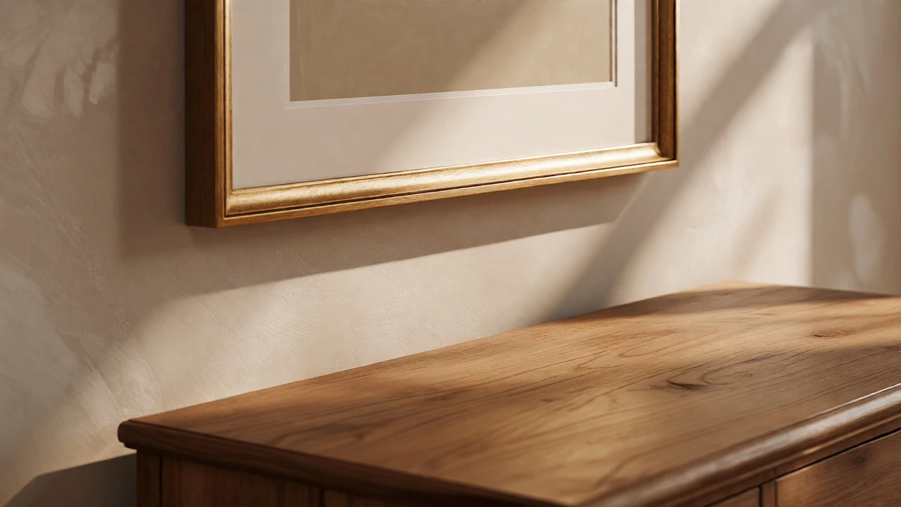
However, context matters. In a living room where you spend most of your time sitting, eye level drops. Here, you should lower the center point to around 48-50 inches from the floor. If you’re hanging art above a console table or a mantelpiece, the relationship changes. The bottom edge of the frame should sit 6-8 inches above the furniture. This gap prevents the art from looking like it’s floating away while keeping it visually anchored to the surface below.
| Room Context | Center Height from Floor | Reasoning |
|---|---|---|
| General/Hallway | 57 inches | Standard standing eye level for quick viewing. |
| Living Room (Sitting) | 48-50 inches | Aligns with seated eye level for relaxed viewing. |
| Above Furniture | Bottom edge 6-8 inches above top | Anchors art to the furniture piece without crowding. |
| Gallery Wall | Center of cluster at 57 inches | Treats multiple frames as one cohesive unit. |
Don’t let the number paralyze you. Use it as a starting point, then adjust based on ceiling height. In rooms with 10-foot ceilings, 57 inches might feel low. In those cases, raising the center to 60 inches often feels more proportional. Trust your eye, but start with the math.
Distribution and the Rule of Thirds
Once height is sorted, look at horizontal distribution. The Rule of Thirds, borrowed from photography, works wonders for room layout. Imagine dividing your wall into three equal vertical sections. Placing a focal point directly in the center is safe but static. Shifting it slightly to one of the third-lines creates energy and interest.
When arranging multiple pieces, avoid uniform spacing. Instead, vary the gaps. Tight groupings create intensity; wider gaps allow breathing room. This variation mimics natural landscapes, which are rarely perfectly symmetrical. If you have a large sofa, consider splitting the wall art into two or three smaller pieces rather than one giant canvas. This breaks up the monotony of the long horizontal line of the couch and adds rhythm to the wall.
Consider the flow of traffic. In high-traffic areas like hallways, art needs to be legible quickly. Bold, simple shapes work better here. In slower zones like bedrooms or reading nooks, intricate details invite lingering. Match the complexity of the art to the speed at which you experience the space. A busy hallway with complex, tiny details causes visual fatigue. A serene bedroom with aggressive, high-contrast pop art disrupts rest.
Color Harmony and Contrast
Balance isn’t just physical; it’s chromatic. The golden rule demands that colors in your wall art converse with the rest of the room. You don’t need to match paint swatches exactly-that looks dated. Instead, pull out one dominant color from the artwork and echo it elsewhere. If your painting features deep teal accents, add throw pillows or a rug with hints of teal. This creates a subtle thread that ties the room together without forcing a theme.
Contrast is equally vital. A monochrome room benefits from a splash of color in the art. Conversely, a colorful bohemian space might need neutral-toned art to prevent sensory overload. Think of art as punctuation in a sentence. If the room is already shouting with patterned rugs and vibrant sofas, the art should whisper. If the room is quiet and neutral, the art can shout. Always ask: does this piece relieve tension or add to it?
Texture plays a role here too. Smooth, glossy surfaces reflect light and feel lighter. Matte, textured surfaces absorb light and feel heavier. Mixing these finishes adds depth. A matte black frame against a white wall pops sharply. A gold frame blends softly. Choose based on whether you want the art to stand out as a statement or blend into the background as ambiance.
Common Pitfalls to Avoid
Even with good intentions, people fall into traps. The biggest one is "floating art." This happens when pictures are hung too high, disconnected from furniture or architectural features. It makes the room feel ungrounded and cold. Always anchor art to something-a sofa, a bed, a console, or even a chair.
Another trap is overcrowding. Less is often more. If you cover every inch of wall space, the eye has nowhere to rest. Leave negative space. It gives each piece room to breathe and lets the architecture shine. If you’re unsure, remove one item. Does the room feel calmer? Keep it removed. Does it feel sparse? Add it back.
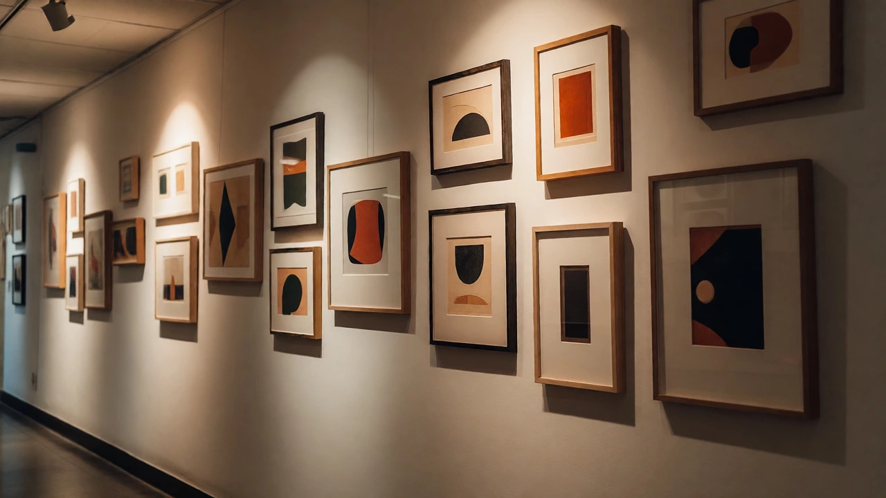
Finally, ignore trends at your peril. While minimalism is popular, forcing a minimalist aesthetic onto a collection of sentimental, eclectic family photos will feel disjointed. Curate your collection first. Group similar styles together. If you have mixed media, use consistent framing to unify them. Uniform frames act as a visual binder, allowing diverse content to coexist peacefully.
What is the exact golden rule for hanging wall art?
While there is no single law, the most widely accepted guideline is the 57-inch rule: the center of the artwork should be 57 inches from the floor. This aligns with average standing eye level. Adjust downward for seating areas (48-50 inches) and ensure art is anchored to nearby furniture by leaving a 6-8 inch gap above tables or consoles.
How do I balance a large piece of art in a small room?
Use asymmetrical balance. Pair the large art piece with another substantial object of similar visual weight on the opposite side, such as a tall mirror, a large plant, or a substantial piece of furniture. Ensure the art's colors complement the room's palette to prevent it from feeling overwhelming. Light-colored mats or frames can also help reduce perceived bulk.
Should I match my wall art to my curtains?
No, direct matching often looks staged. Instead, aim for harmony. Pull one accent color from the art and incorporate it into the curtains, or vice versa. This creates a cohesive look without being overly literal. Focus on sharing tones or moods rather than identical patterns.
Is symmetry outdated in home decor?
Not outdated, but less common in modern interiors. Symmetry feels formal and traditional. Asymmetrical balance is preferred for contemporary spaces because it feels more organic and dynamic. However, symmetry still works well in classic settings or when you want to emphasize a central focal point like a fireplace.
How many pieces of art should be on one wall?
It depends on the wall size and furniture. Above a standard sofa, one large piece or a triptych (three panels) usually works best. For gallery walls, odd numbers (3, 5, 7) tend to look more balanced than even numbers. Ensure the total width of the art arrangement is roughly two-thirds the width of the furniture below it.