Ever find yourself staring at a blank wall wondering how high to hang that new picture? You're not alone! The golden rule for hanging pictures is simple yet often overlooked: center your art at eye level, typically around 57 to 60 inches from the floor. This approach not only makes the picture easily viewable but also offers a cohesive look throughout your home.
When talking height, consider the average eye level in most homes. Mounting your pictures within this range creates a comfortable viewing experience and helps flow from room to room without jarring changes. Remember, it's about showcasing the art, not craning your neck!
- Understanding the Golden Rule
- Optimal Height and Placement
- Common Mistakes to Avoid
- Tips for Perfect Picture Hanging
Understanding the Golden Rule
Alright, let's break down the golden rule of picture hanging. This guideline is all about ensuring the center of your artwork is at eye level, which is typically around 57 to 60 inches from the floor. Why this specific range? Well, it's the average eye level for most people, making it perfect for both standing views and seated environments like living rooms or galleries.
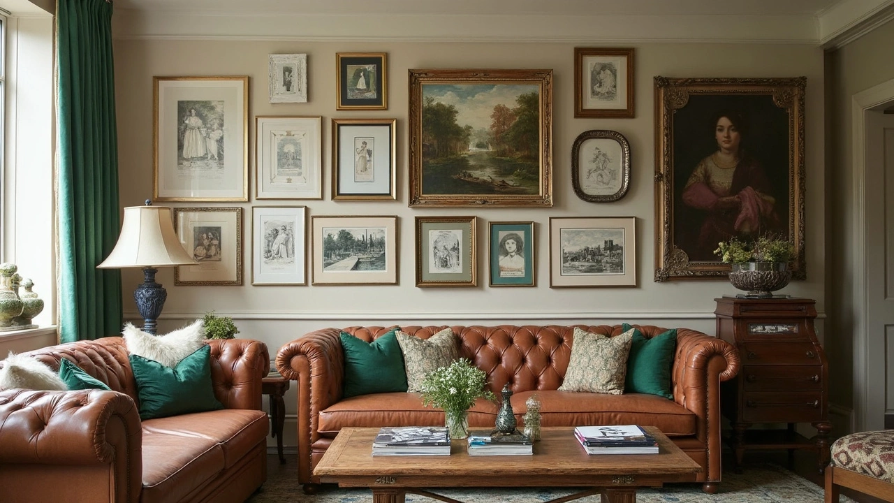
While the 57 to 60-inch rule is a great start, it isn't a one-size-fits-all. For example, if you're hanging a series of pictures or creating a gallery wall, the middle point of the entire grouping should be at eye level. This creates a balanced and harmonious look, preventing any awkward visual disruptions as you move through the room.
The Science Behind Eye Level
The idea behind hanging at eye level isn’t just a design trend. Studies show that people naturally gravitate to visuals that are comfortably placed within their line of sight. When art is hung too high or too low, it creates discomfort and lessens the intended impact of the piece.
Exceptions to the Rule
Of course, there are exceptions! For instance, if you have very high ceilings, you might want to adjust slightly higher to complement the vertical space. In contrast, if you’re placing art above furniture like a sofa or console table, it might be best to adapt the golden rule to the furniture height; a common suggestion is to leave about 8 to 10 inches between the top of the furniture and the bottom of the frame.
Here’s a quick tip: For a room used mainly for sitting, such as a family room, hang pictures a bit lower than standard eye level, which engages directly with seated eye lines.
Optimal Height and Placement
Getting the height right is crucial in making your pictures look like they belong and aren't just afterthoughts. The golden rule suggests hanging your art at a height of about 57 to 60 inches from the floor. This height represents the average human eye level and gives a pleasing visual balance.
Why Eye Level?
When pieces are hung at an average eye level, it fits naturally within the space and creates a uniform look throughout. Next time you're visiting a gallery, look around. You'll notice the professionals use the same trick—art is centered for easy viewing. It’s not just about aesthetics; it enhances how your home feels.
Consider the Room
The type of room can influence placement. For instance, in rooms where people are often seated, like the living room, consider lowering art a little to align better with a seated eye level. It’s all about comfort and viewability.
Align with Furniture
If you’re hanging art above furniture, like a couch or a mantle, there’s a little different guideline. Place the bottom edge of the frame about 8 to 12 inches above the furniture piece. This creates a connection between your art and furniture, making the decor look intentional.
- Living Rooms: Adjust the height closer to where seated eye level would be.
- Hallways and Galleries: Stick to the 57 to 60 inches formula for a consistent gallery-like look.
- Above Furniture: Keep a gap of about 8 to 12 inches from tabletops or couch backs.
Common Mistakes to Avoid
Hanging pictures seems easy until you realize it’s a balancing act. It’s tempting to just hammer in a nail and be done, but if you’ve ever stood back and felt something was off, you’re not alone. Here’s a rundown of common slip-ups you’ll want to dodge when placing your wall decor.
Crowding: Too Much on One Wall
A wall full of art can look like a gallery or a mishmash; it all depends on spacing. Piling too many pieces together without considering the visual flow creates a cluttered look. Stick to the golden rule spacing—leave at least 2 inches between smaller items and up to 5 inches for larger artwork to let each piece breathe.
Ignoring the Room’s Purpose
Different rooms call for different artwork. What works in the living room might not suit a bedroom. Picture placement choices should complement the room’s purpose. For example, heavy, dramatic art may feel oppressive in a cozy reading nook but might be perfect for a formal dining room.
Using the Wrong Hanging Tools
Ever heard a crash from the next room only to remember you once thought 'it's fine' with those hooks? Make sure you’re using the right tools for the job. For heavier artwork, opt for anchored nails or picture hanging strips rated for the artwork’s weight. This not only protects your art placement but also your walls.
Not Considering Light Sources
This one often slips under the radar. Light can transform art, either enhancing or detracting from it. A common mistake is placing your pictures where light either overexposes or creates glares. Test a spot throughout the day—you may need to relocate artwork to avoid sparing details or reflecting harsh lights.
Take note of these little things the next time you’re hanging pictures, and watch how a few tweaks can elevate the aesthetic of your home.
Tips for Perfect Picture Hanging
Let's get into the nitty-gritty of making your walls look like they belong in a gallery. With these straightforward tips, you'll easily master the art of hanging pictures like a pro.
Choose the Right Hardware
First things first, using the right hooks and nails matters more than you think. For heavier frames, opt for wall anchors or picture hooks that can hold a good deal of weight. Nothing ruins a wall like having a piece fall down because it wasn’t secured properly.
Consider Frame Size and Weight
Larger art pieces can act as a statement piece, while smaller frames work well in groups. When creating a gallery wall, mix different sizes and keep heavier frames at the bottom for balance.
Lighting Matters
Good lighting can elevate the look of your wall decor. Use natural light where possible, but don't shy away from spotlights or picture lights to highlight a cherished piece.
Maintain Consistency
If you’re adding art in multiple rooms, stick with a golden rule approach to keep consistency. Similar spacing and height can create cohesiveness throughout different spaces.
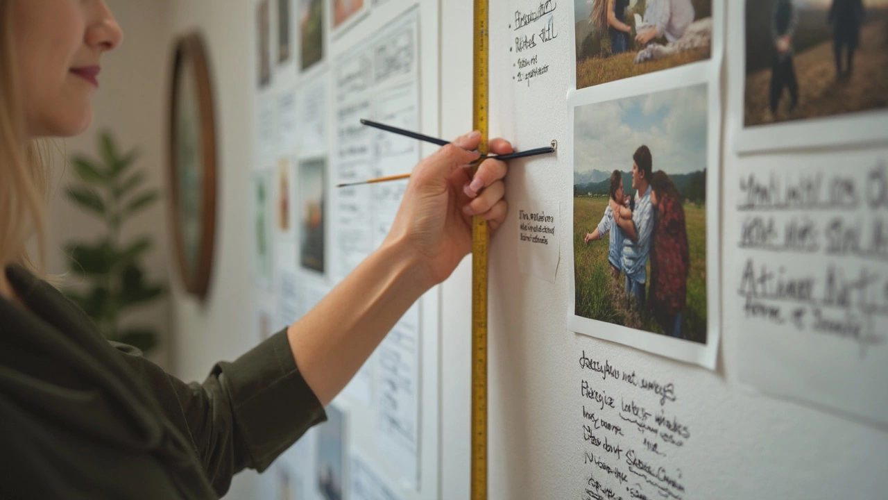
Test Before You Hang
One of the best tricks? Use paper cutouts the size of your frames and tape them to the wall first. It’s a foolproof way to visualize and make adjustments without the commitment of a nail.
Make It Level
Once you've found the perfect spot, make sure your frame hangs flat and straight. A small level will be your best friend here. Even a perfect picture looks off if it's tilted.
For context: a study by interior design experts shows that art placement is one of the top factors influencing room ambience. So, these little details go a long way.
| Room Type | Suggested Art Height | Lighting |
|---|---|---|
| Living Room | 58 inches from floor | Natural + Spotlights |
| Hallways | 60 inches from floor | Overhead Lights |