Colour and Pattern Mix: Easy Ways to Upgrade Your Space
If you think colour and pattern are too risky, think again. With a few simple rules you can mix bold hues and prints without ending up with a clash. The goal is to make the room feel balanced, not chaotic.
Start with a Neutral Base
Pick a neutral floor or wall colour as your anchor – think light grey, warm beige, or soft white. This gives the eye a place to rest and lets the patterned pieces stand out. A neutral base also makes it easier to swap out accents later on.
When choosing flooring, a plain engineered hardwood or a subtle vinyl plank works great. If you love pattern, go for a low‑contrast stripe or chevron that still blends with the neutral tone.
Add One Bold Accent
Choose a single element to carry the colour or pattern you love – a rug, a wall tablet, or a set of tiles. Keep everything else simple so the accent can shine. For example, a deep navy rug on a light grey floor adds depth without overwhelming the space.
Match the accent colour to something you already have, like throw pillows or artwork. This ties the room together and prevents the mix from feeling random.
Scale matters. Large‑scale prints work best on big walls or floors, while small‑scale patterns are ideal for accessories and textiles. If your floor has a wide plank, try a small‑scale geometric rug to add interest without competing.
Test your combo before committing. Lay floor samples side by side, or tape a piece of patterned fabric to the wall and live with it for a day. Seeing it in natural light will reveal any clash you missed online.
Lighting can change how colours appear. Warm lights make reds and yellows feel cozier, while cool lights highlight blues and greens. Adjust your bulbs if the mix feels too harsh.
Layering works well when you keep each layer in a different texture. A smooth wood floor, a plush patterned rug, and a matte painted wall create depth without extra colour.
Don’t forget transitional pieces. Simple wood trim, metal brackets, or plain door frames can bridge the gap between bold patterns and neutral backgrounds.
Finally, keep the overall vibe in mind. If you want a modern feel, stick to black, white, and gray patterns with a pop of primary colour. For a cozy cottage look, use earthy tones and floral prints.
Mixing colour and pattern doesn’t have to be scary. Start with a neutral base, pick one bold accent, respect scale, test in real life, and let lighting do the rest. Follow these steps and you’ll have a stylish, balanced space that feels uniquely yours.
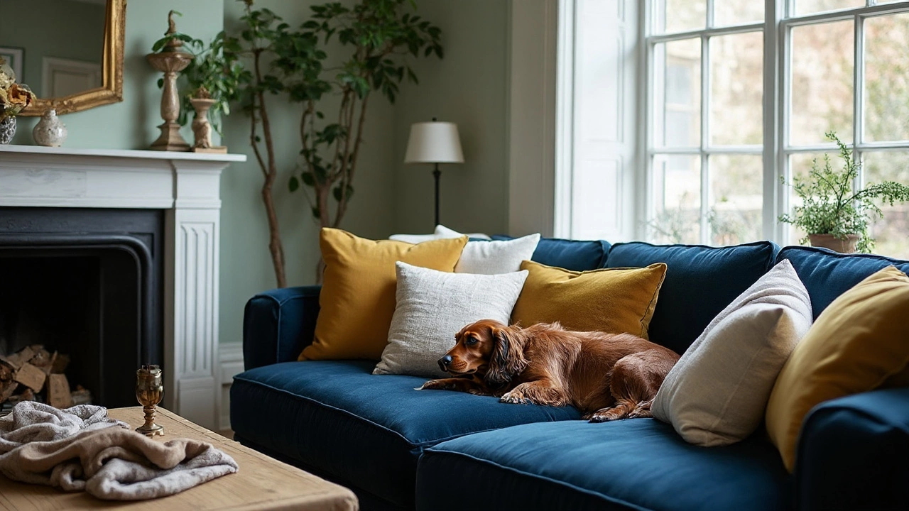
Scatter Cushion Rules: How Many, What Size, and How to Arrange on Sofas and Beds
- Gavin Whitaker
- |
- |
- 0
The clear rule for scatter cushions: how many to use, what sizes to pick, and how to arrange them on sofas and beds. Simple formulas, examples, and cheat-sheets.
View more