Bathroom Colors: Top Trends & How to Choose the Perfect Palette
Staring at plain white walls can make a bathroom feel bland. A fresh splash of colour instantly lifts the mood and can even make a tiny room look bigger. Below you’ll get straight‑forward tips to pick the right shade, see what’s hot right now, and avoid common mistakes.
Choosing the Right Shade for Your Space
First, think about the amount of natural light. Sun‑lit bathrooms handle deep hues like navy or forest green without feeling dark. If you only have a window or a skylight, stick to lighter tones – soft blues, pale greys, or warm whites – because they reflect what little light you have.
Next, consider the size of the room. Light colours reflect more light, which tricks the eye into seeing a larger space. Dark colours absorb light, so use them on a feature wall or in a bathroom that’s already spacious. A simple trick is to paint the ceiling a shade lighter than the walls; it adds height without extra work.
Don’t forget the fixtures. Chrome, brushed nickel, or matte black countertops and taps will look different against warm vs. cool paint. If you love cool metal finishes, cooler paint tones like greys or blues will blend nicely. Warm metallics pair well with warm shades like terracotta or creamy beige.
Popular Color Trends for 2024‑2025
2024 is all about nature‑inspired hues. Think muted sage, gentle oat, and dusty lavender. These colours bring a calming vibe and work well with both classic tiles and modern board‑up walls.
Another trend gaining traction is “two‑tone” walls. Split the bathroom in half – a subtle pastel on the lower half and a crisp white on top. It adds visual interest without overwhelming the eye.
For a bold statement, try a deep charcoal or navy accent wall behind the vanity. Pair it with bright white vanities and light accessories to keep the look balanced. The contrast makes the bathroom feel sleek and contemporary.
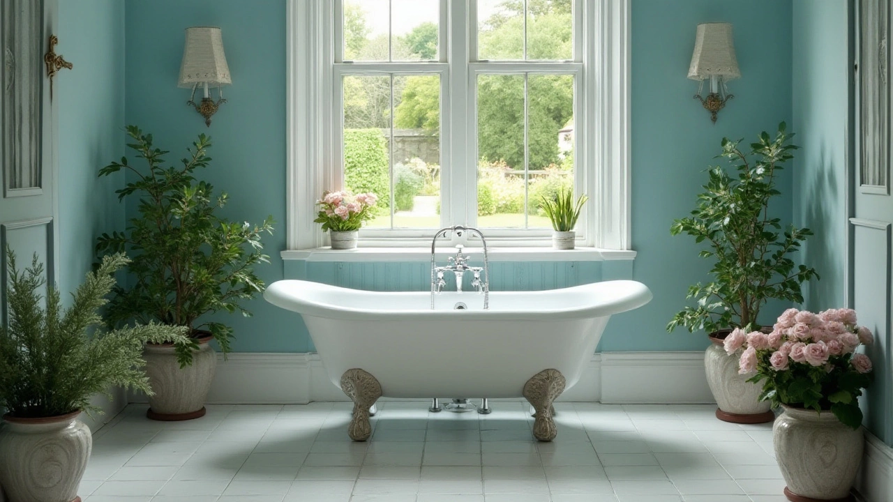
If you love a spa feel, go for soft aqua or sea‑foam. These shades work especially well with marble or stone tiles, creating a fresh, resort‑like atmosphere.
Finally, don’t ignore the power of accent accessories. A coaster, towel bar, or a small art piece in a pop colour can tie the whole palette together without the need for a full‑room makeover.
When you decide on a colour, always test a sample on the wall. Paint a 12‑inch square, live with it for a day, and look at it under both daylight and artificial light. If the sample feels right, you’re ready to roll.
Remember, the goal isn’t just to follow trends – it’s to pick a shade that makes you feel good every time you step in. Use these tips, play with a few samples, and turn your bathroom into a space you actually enjoy.
Choosing the Perfect Relaxing Bathroom Color for Serenity
- Gavin Whitaker
- |
- |
- 0
Creating a serene and calming space in your bathroom can be greatly influenced by the color you choose. Understanding the psychology behind colors like soft blues, greens, and whites can help you craft a relaxing haven. Consider the influence of lighting and how different shades can alter the overall feel of the space. Explore ways to incorporate these colors into various bathroom elements, from walls to accessories. This article provides tips on achieving the ultimate relaxation experience in your bathroom by selecting the best color palette.
View more