The 2/3 Rule – Your Quick Cheat Sheet for Better Home Design
Ever feel like a room just looks off, even though you like the colours and furniture? Chances are the proportions are wrong. The 2/3 rule is a simple way to fix that. It tells you to let two‑thirds of a space be covered by the main element and the remaining third stay open or be filled with accents. It works for anything from a sofa layout to a floor finish.
What the 2/3 Rule Actually Means
Think of a living room. If your rug takes up about two‑thirds of the floor area, the rest of the floor stays visible and the room feels balanced. The same idea applies to wall colour: two‑thirds of the wall can be a neutral tone, while the remaining third gets a bold accent or a piece of art. This split keeps the eye from wandering too much and makes the space feel calm.
In practice, you don’t need exact measurements. Just eyeball it: choose a dominant piece – a sofa, a floor, or a wall colour – and let it dominate roughly 66% of the visual field. Then add secondary items – cushions, lamps, plants – to fill the rest. The rule is flexible, but the ratio gives you a quick check before you buy or move anything.
Easy Ways to Use the Rule in Any Room
Start with your sofa. The popular scatter cushion rule (the “how many cushions” guide) actually follows the 2/3 principle – the cushions should cover about two‑thirds of the sofa back, leaving the rest clear for sleek lines. Pick two large pillows and one smaller accent, and you’ll hit the sweet spot without overcrowding.
If you’re updating a boring bathroom, lay a new tile that covers two‑thirds of the floor and use the remaining third for a decorative mat or a bold paint splash on the wall. This tiny change can make the bathroom feel fresh without a full remodel.
When it comes to storage, the 2/3 rule helps you avoid clutter. Use built‑in shelves or cabinets to store the bulk of your items (about two‑thirds of the wall height) and leave the top third open for decorative boxes or plants. The open area keeps the room airy and makes it easier to find what you need.
Flooring trends for 2025, like engineered hardwood and luxury vinyl plank, also benefit from the rule. Choose a floor finish that dominates most of the room, then add a runner or a rug that occupies roughly one‑third of the space. This layering adds texture without breaking the visual flow.
Finally, think about lighting. A main overhead light should cover two‑thirds of the ceiling area, while the rest can be filled with task lights or floor lamps. This mix gives you both even illumination and focused light where you need it.
Applying the 2/3 rule isn’t a strict math test – it’s a mental shortcut. Next time you plan a redesign, pause and ask: does the main element fill about two‑thirds of the view? If yes, you’re on the right track. If not, shift a piece, add a rug, or pull back a colour. You’ll notice the room feels more put together in minutes.
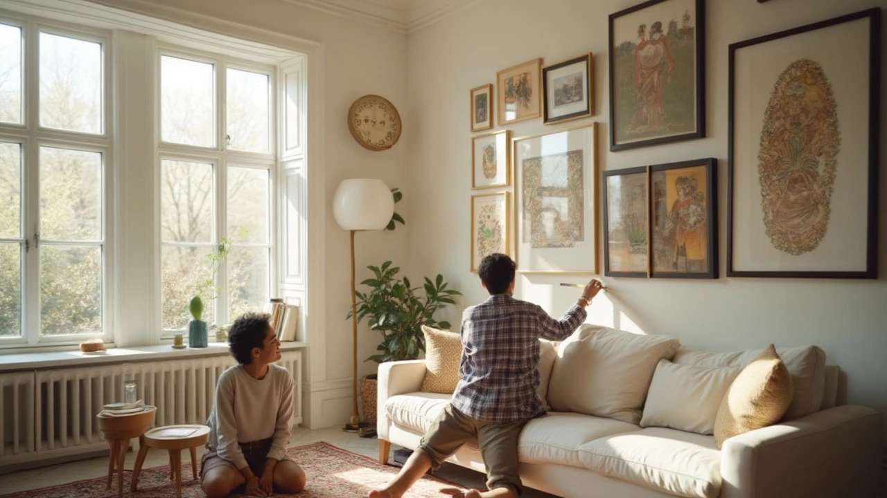
2/3 Rule for Hanging Pictures: The Simple Secret to Perfect Wall Art Placement
- Gavin Whitaker
- |
- |
- 0
The 2/3 rule for hanging pictures is a straightforward yet genius trick that takes the guesswork out of where your art should go. This article unpacks how it really works, why it's so effective, and how to use it for picture-perfect walls every time. Expect practical tips, easy-to-follow advice, and some clever fixes for tricky spots. You'll find answers to common wall art mistakes and learn how to create a balanced, stylish look. By the end, hanging art that looks professionally placed will feel easy.
View more