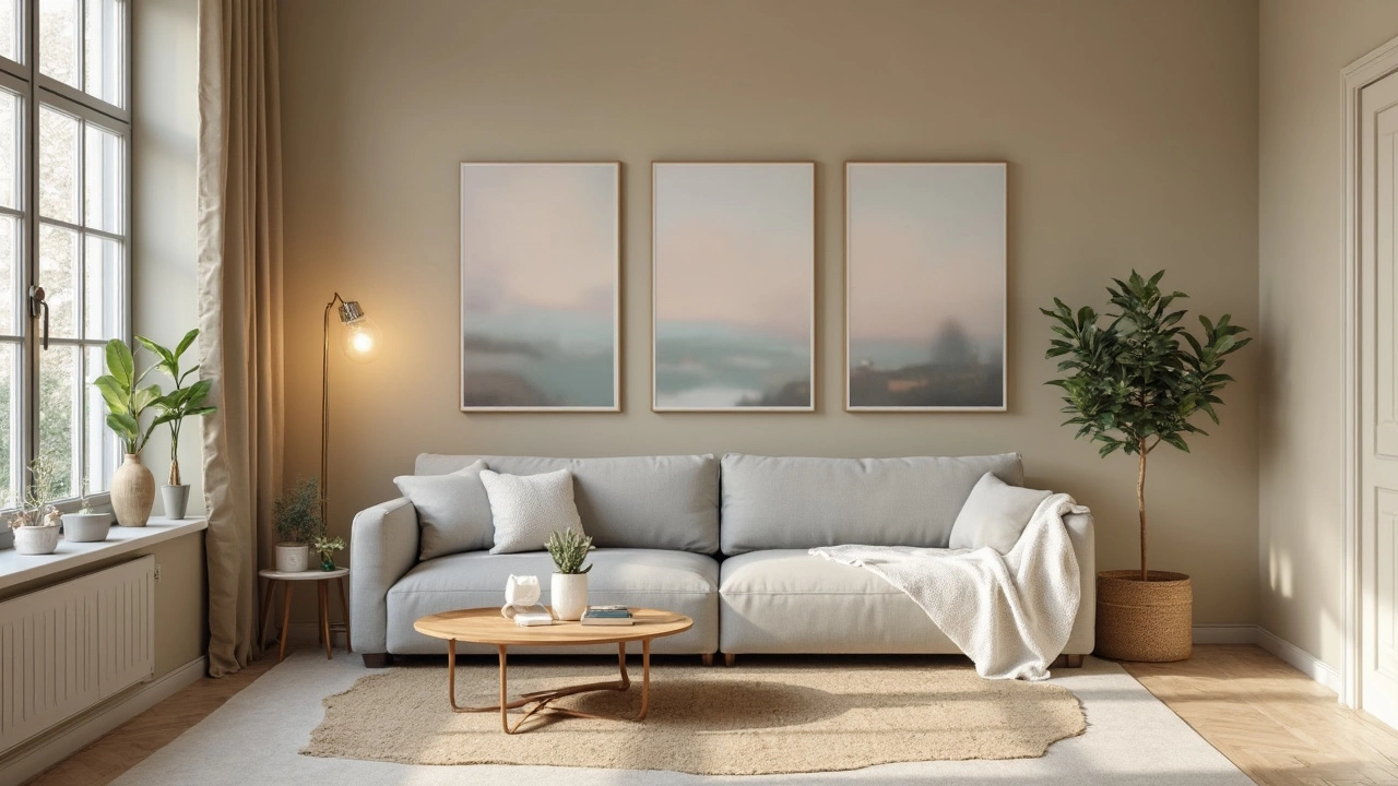
So, you're thinking about giving your living room a fresh lick of paint but can't quite decide on the color? You're not alone. One of the most common choices folks opt for is neutral tones like beige, gray, or even a muted off-white. Why, you ask? Well, these colors can do wonders when it comes to making a space feel larger and more inviting. Plus, they act as a perfect backdrop, giving you the freedom to play around with colorful furniture and accessories.
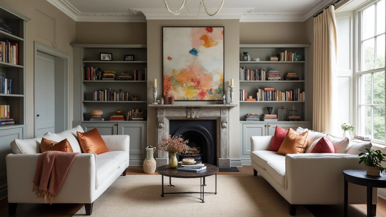
But hang on, can we step outside the lines a little? Of course! If you're someone who loves a bit of drama, dark colors like navy or charcoal can add depth and a certain coziness, while vibrant shades bring energy and zest into the room. The trick is to balance it out with lighter furniture or splashes of decor that keep it from becoming too intense.
Remember, the color you choose should not only fit your style but also complement the existing elements in your room. Whether it’s matching with an heirloom sofa or that abstract art piece you adore, keeping the overall vibe cohesive is the key. Want to stay on-trend? Blues and earth tones are all the rage in 2025, offering both style and elegance without straying too far from the classics.
- Why Color Matters in Living Rooms
- The Reigning Champ: Neutral Tones
- Bold Choices: When to Go Dark or Bright
- Complementing Your Existing Decor
- Trendy vs. Timeless: What’s Right for You?
- Tips for Making Your Decision
Why Color Matters in Living Rooms
Color isn't just about making your living room decor look good. It's a powerful tool that can change the entire mood of a space. The right color can make a room feel cozy, bright, and even larger than it actually is. Now, who doesn't want their place to feel more inviting?
Impact on Mood and Space
Believe it or not, colors affect our emotions and perceptions. Soft, neutral colors like beige or grey can create a calm atmosphere, which is perfect if you use your living room for relaxation. Want a bold vibe? Deep hues like navy can add a sense of depth and elegance. Or maybe a splash of red to energize the space? Each color brings something unique to the party.Coordination and Cohesion
Choosing the right color also impacts how well your furniture and decor items pop. Neutral tones can provide a seamless harmony, letting special pieces like artwork or a vintage couch stand out. Bright or dark colors can highlight specific areas, all while keeping everything balanced. It's a bit like an orchestra, where each instrument must play in harmony.Practical Considerations
Before you rush off to buy that can of paint, think about the natural light in your room. Bright spaces can handle darker colors more easily, whereas dim rooms might need lighter shades to stay cheerful. Check testers at different times of the day to see how the color looks in various lighting conditions. This trick will save you regrets later on.Studies show that people spend about 22 hours a week in their living rooms. So why not make it a place you genuinely love? From mood effects to blending with current interior design trends, color is a small change with big impacts.
The Reigning Champ: Neutral Tones
Neutral tones, like beige and gray, have long been the go-to choice for living rooms. These shades are all about creating a versatile canvas that can adapt to just about any living room decor. This makes them a favorite among homeowners and designers alike.
Why Neutrals Rule
Neutral colors are like the Swiss Army knife of the color wheel. They offer simplicity and flexibility, two qualities that come in handy when you're trying to nail that perfect look. A neutral tone won't clash with your existing furniture, and it allows you to easily switch up styles with just a few seasonal accent pieces.
The Science Behind Color Perception
Here's some cool science: neutrals are perceived as calming and safe, which is why they're often suggested for living spaces. Our brains usually find these colors less distracting, making it easier for us to relax and unwind. Perfect for those lazy Sunday evenings, right?
Effortless Pairing and Styling
One of the big benefits of going with neutral tones is that they can pair seamlessly with almost any color on the spectrum. Thinking about a teal couch or a set of sunflower-yellow cushions? No problem. Neutrals will happily act as a balanced backdrop, pulling your whole design together with minimal effort.
Trend-Proof Your Iinterior
Another fantastic perk? Neutrals are practically timeless. While other colors come and go with fleeting interior design trends, neutral shades have a staying power that's hard to beat. This makes them a smart long-term investment for anyone looking to keep things fresh without frequent repainting.
So, if you're in search of a color choice that offers endless adaptability and a classic feel, neutral tones are the reigning champs you might want to consider for your living room.
Bold Choices: When to Go Dark or Bright
Thinking about going bold with your living room decor? It’s a thrilling idea! Dark and bright colors can add personality and style to your space. But how do you know when it's the right move? Let’s dive in.
Dark Shades like deep blues, rich charcoals, or even a moody green can create an intimate and cozy ambiance. These hues are perfect for large rooms that could use some warmth or if your living room gets a lot of natural light. They make a space feel sophisticated and are great for showing off metallic accents or wooden furniture.
But remember, dark colors can make small spaces feel even tinier if you’re not careful. Use them wisely by balancing with lighter elements—a white ceiling, large mirrors, or bright art can keep it from feeling boxed in.
When to Go Bright
If you're leaning towards bright colors, think vivid yellows, vibrant reds, or even a playful teal. These colors inject energy and fun into a room, ideal for lively households or if you just love the idea of a statement wall. They work wonders in dimly lit rooms, reflecting whatever light there is to make the space look more open and airy.
Here’s a pro tip: bright colors are great for accent walls. They draw the eye without overpowering the entire room. Plus, it’s easier to change if you ever feel like dialing it back.
Quick Comparisons
- Dark shades add depth and coziness but may shrink a room.
- Bright colors energize and enlarge spaces but can be overwhelming if overdone.
- Balance is key: Pair dark walls with light accents and vice versa.
Still on the fence? If statistics help, a 2024 survey by HomeColor Trends found that 60% of interior designers love using dark or bright tones to set a mood. It’s all about finding what makes you feel at home while keeping the flow right with the rest of your decor.
Complementing Your Existing Decor
Ever walked into a room where the wall color seems to clash with everything else? Not ideal, right? When it comes to your living room decor, the goal is to create a harmonious look. And trust me, anyone can do it with a few smart choices.
First off, take a good look at your existing furnishings. Do you have a dominant color theme going on? Your wall color should ideally work with what's already there, not against it. For rooms with bold furniture, a neutral wall color like beige or gray can balance things out nicely. On the other hand, if your furniture is more subdued, feel free to experiment with louder wall colors to liven things up.
Finding Color Inspiration
Need some ideas? Consider the artwork hanging on your walls. Is there a color within the frame that could tie your room together? Using a color that appears in your favorite piece of art is a clever way to bring cohesion to your space.
Consider the Flooring
Another thing to think about is your flooring. Hardwood floors, especially those with warm undertones, pair wonderfully with whites and creams. If you’ve got carpet or tiles, their color should also play into your decision. The idea is to ensure nothing sticks out like a sore thumb but instead flows seamlessly.
Lighting Matters
Natural light or lack thereof plays a crucial role, too. A bright living room can handle bolder shades, whereas a darker room benefits from a lighter wall color to avoid feeling too closed in.
| Element | Considerations |
|---|---|
| Furniture | Match or complement existing colors |
| Flooring | Choose colors that work with wood or tile tones |
| Lighting | Use lighter shades for dim spaces |
And remember, sample before you commit! Grab those paint samples and test them in different lights and times of day. It's astonishing how colors can shift based on the clock and light source, so it's worth the extra effort to get it right.
Trendy vs. Timeless: What’s Right for You?
Deciding between a trendy color for your living room decor and something more timeless can feel like picking between today's Instagram spotlight or tomorrow's lasting classic. It all boils down to your comfort with change and how often you enjoy updating your space.
Riding the Trend Wave
Trendy colors often make a room pop. For example, rich jewel tones and pastels have seen a surge in recent years, breathing life into spaces. The downside? Trends can flicker out as fast as they appeared. If you're someone who loves riding the wave of the new and exciting, hopping on the seasonal color code won't feel risky. Just remember that embracing the trend means you might be revamping your room sooner than expected.
Timeless Elegance
Timeless colors, on the other hand, provide a sense of stability and continue to look chic year after year. Think simple whites, beiges, or grays. These choices not only create a neutral backdrop but also allow your quirky art pieces or that bold rug to stand out.
Here's a nugget of reassurance: a timeless palette is unlikely to clash with changing decor-charming focal points you may add later on.
Finding Your Balance
Want the best of both worlds? You can achieve a balanced look by blending trends into a timeless foundation. Opt for a neutral base color on walls and spice up with trendy accents like cushions, throws, or even artwork. This way, you can easily swap out pieces as trends evolve without breaking the bank.
Extra Tip: Listen to Your Space
Take a moment to really 'listen' to your space. Are you drawn to the serenity of timeless hues, or does a burst of trendy flair ignite your creativity? Your living room should reflect something about who you are, after all.
Remember, the goal is to create a space you and your family love to spend time in. At the end of the day, whether you go trendy or timeless, what's important is that your color choice brings a smile to your face every time you walk in.
Tips for Making Your Decision
Deciding on the perfect color for your living room decor can feel overwhelming, but don't stress. There are a few simple steps to make it easier.
Step 1: Start with What You Love
First things first, think about the colors you're naturally drawn to. Got a favorite sweater or a piece of art you love? That might be a good starting point. Trust your gut; your living room should be a reflection of your personality.
Step 2: Consider the Room’s Lighting
One of the key aspects of picking a paint color is lighting. Natural light can make colors look different than they do under artificial lighting. Test a small patch first. You might be surprised how different a color choice can look depending on the time of day!
Step 3: Play It Neutral or Go Bold
If you're playing it safe, neutral tones like gray or beige are solid picks. They're versatile and can easily be updated with trendy accessories. For those wanting a bolder look, consider dark or rich hues, but be cautious not to make the space feel cramped.
Step 4: Test Multiple Samples
Paint samples are your best friends. Choose a few tones that excite you and splash them on your walls. Live with them for a bit. See how they play with your furniture and the overall vibe of the room.
Step 5: Match with Your Decor
Take a good look around your living room. The color should harmonize with your existing decor. That doesn't mean everything has to match perfectly. Sometimes contrasts can be exciting but do aim for a cohesive look.
Some Extra Tips
- Always consider the mood you want to set. Calming? Go for cool blues or soft greens. Dynamic? Bright yellows or reds could do the trick.
- Think about how the color will transition into other rooms. Open concept spaces benefit from a unified color scheme.
- Don't be afraid to bend the rules. If you love it, that's reason enough.
No need to rush the process. Take your time, and your living room will soon feel like the perfect expression of you.