Muted, nature-first palettes are winning bathrooms in 2025. Think sunlight-friendly warm whites, stone-like greiges, spa greens, and a confident hit of navy or charcoal for contrast. This shift isn’t random-it follows what major color institutes and paint brands have been pushing since late 2024: calm, textured, and human.
Bathroom color trends 2025 are the dominant palette directions shaping residential bathroom design in 2025, centered on warm, desaturated neutrals, muted greens, moody blues, and matte black accents that emphasize texture and natural light.
TL;DR
- bathroom color trends 2025: warm white + greige base, sage/eucalyptus accents, navy/charcoal contrast, matte black or brushed brass hardware.
- Textures matter: zellige tile, terrazzo, limewash, microcement. They make pale colors look rich.
- Pick by light first: north rooms go warmer (mushroom/greige), bright rooms can take cool sage or navy.
- For resale: warm white walls, soft greige tile, brushed nickel. For personality: clay/terracotta or deep blue vanity.
- Undertones rule: match paint to tile/grout and metal finishes, or you’ll see clashing pink/yellow casts.
What “latest” really means in 2025
Bathrooms are moving away from icy grays. The new baseline is warm, earthy, and low-contrast-then grounded with a dark accent. The aim is spa, not showroom. In forecasts from color authorities like the Pantone Color Institute a color standards organization known for annual color selections and trend research across industries and big paint houses-Sherwin-Williams a U.S. paint manufacturer known for annual Colormix forecasts that emphasize desaturated, nature-inspired palettes, Benjamin Moore a North American paint brand recognized for balanced, architectural neutrals and yearly Color of the Year announcements, and Behr a paint company noted for accessible trend colors and a strong neutral spectrum for DIY audiences-the through line is softness with depth. That translates perfectly to bathrooms where tile, light, and scale are unforgiving.
So the “latest” isn’t a single color. It’s a palette logic: warm white or mushroom base, a muted botanical note (sage, eucalyptus), a reliable deep anchor (navy or charcoal), and metal that adds intention (brushed brass for warmth, polished nickel for calm, matte black for graphic clarity).
The 2025 bathroom palette, color by color
Here’s the short list dominating real projects and showrooms right now, with where each shines.
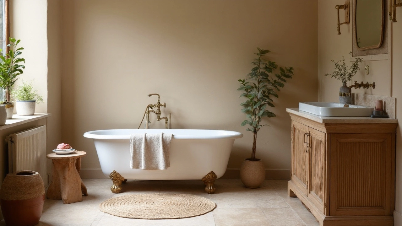
Warm white a soft white with creamy or beige undertones that avoids stark blue or gray casts; ideal for small bathrooms and low-light spaces: Picks up natural light, keeps spaces feeling larger, and flatters skin tone in mirrors. Works everywhere-from rentals to high-end builds. Pairs cleanly with brushed nickel or brass.
Greige a mix of gray and beige, often called mushroom or taupe when warmer; reads like stone and hides water spots (also called mushroom/taupe): The tile workhorse. It makes grout look intentional, not dirty, and plays nice with oak or walnut vanities.
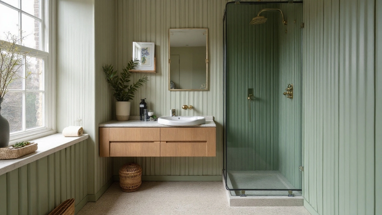
Sage green a muted, gray-leaning green associated with eucalyptus leaves; calming and spa-like in bathrooms / eucalyptus green: Spa in a can. Gentle enough for walls or cabinetry. Best with warm whites and light travertine-look porcelain.
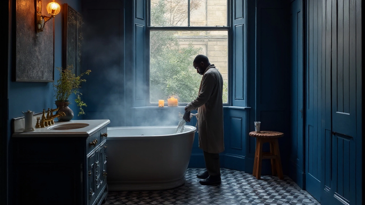
Deep navy a saturated, near-indigo blue often used for vanities or accent walls to add depth and contrast / indigo: Adds tailored weight under warm light. Great for a vanity or niche wall behind a mirror. Choose a satin enamel for durability.
Charcoal a dark neutral near black with soft undertones; provides contrast without the starkness of pure black / near-black: Works as accent trim, shower frames, or hex floor tile. Crisp against warm walls; timeless with white tile.
Terracotta an earthy red-orange inspired by fired clay; reads as a warm accent in modern bathrooms / clay: A pinch of terracotta tile or a blush-clay paint on a niche warms up cooler stones and metals.
Soft blush a pale pink-beige that adds warmth without feeling overtly feminine; best in powder rooms: Lovely in powder rooms with unlacquered brass hardware and marble.
Spa blue a misty, green-leaning light blue associated with coastal and wellness aesthetics; works best in bright rooms: Keep it grayed down to avoid looking baby blue; pair with polished nickel to lean classic.
How to pick the right palette for your space
Don’t start with a color chip. Start with light, fixed finishes, and how much contrast you can live with.
- Map your light. North-facing or windowless bath? Go warmer (mushroom/greige walls, creamier white ceilings). South-facing or skylight? You can handle sage, spa blue, or crisp white tile without going cold.
- Audit fixed materials. Tile, stone, vanity wood, and floor set undertones. If your floor tile skews pink-beige, a cool sage may look sour; if your quartz is cool, warm paint prevents it from reading blue.
- Choose your base. If you need forgiving walls: greige/mushroom. If the room is tiny: warm white. If the tile already dominates: use a low-contrast wall close to the tile’s lightest tone.
- Add one accent. Navy vanity, charcoal metal frames, or terracotta towels/rug. One bold move is enough in a tight space.
- Match metals to undertones. Warm whites, mushroom, and clay love brushed brass. Sage and spa blue lean polished nickel. Charcoal and navy sharpen with matte black.
- Test large samples. Paint two coats on A3 sheets, tape near shower/tile, and check morning, noon, and night. Water and steam deepen colors by one half-step in perception.
Texture and materials: what makes these colors sing
Color is half the story. Texture makes these soft hues feel rich instead of flat.
Zellige tile a hand-crafted, glossy Moroccan tile with tonal variation and wavy surfaces that bounce light turns warm white walls into a statement because each tile edge catches light differently. A simple 2x6 zellige in off-white next to a mushroom wall looks boutique-hotel without trying.
Terrazzo a composite material with chips of marble, quartz, or glass set in cement or resin; offers speckled, forgiving surfaces vanity tops hide water marks and let you pull accent colors from the chips-navy flake equals navy vanity; warm flake backs clay towels.
Quartz an engineered stone countertop material valued for stain resistance and consistent undertones with gray veining pairs best with sage or spa blue; warmer veining wants mushroom/taupe walls.
For metals, think finish temperature and sheen. Brushed brass a warm, low-sheen gold-toned metal finish that adds warmth and patina over time juices up warm whites and clay. Polished nickel a cool, reflective silver-toned finish similar to chrome but warmer and more refined is clean with sage and spa blue. Matte black a deep, non-reflective black metal finish used for faucets, frames, and pulls to create modern contrast draws crisp lines around soft neutrals without going industrial.
Finish is a design decision
Same color, different finish, totally different bathroom.
Limewash paint a mineral paint with a velvety, cloud-like texture that softens edges and adds movement makes warm whites and sages feel artisanal, great for powder rooms away from direct splash zones. For full baths, keep limewash on higher walls and use tile where water hits.
Microcement a thin cement-based coating applied over surfaces to create seamless, plaster-like walls and floors in mushroom or greige creates a spa envelope-no busy grout lines, just soft, stone-like color everywhere. Seal it well, and you’ll love the maintenance.
On cabinets, go satin or semi-gloss for scrub-ability. On walls, matte hides imperfections but choose a high-quality scrubbable matte (most premium lines have them now). Tile sheen matters too: glossy brightens small rooms; honed porcelain reads calm and upscale.
Real-world palettes that work
Here are tried-and-true combos using widely recognized shades so you can visualize undertones. Always sample, because lights, tile, and even mirror glass shift perception.
- Sunny modern classic: Walls-Benjamin Moore "White Dove" (OC-17). Vanity-deep navy (BM "Hale Navy" HC-154). Metal-polished nickel. Tile-off-white zellige. Floor-light oak-look porcelain.
- Soft spa: Walls-Sherwin-Williams "Sea Salt" (SW 6204). Counter-white quartz with cool veining. Metal-polished nickel. Accent-eucalyptus towels. Floor-warm greige porcelain.
- Warm minimal: Walls-Sherwin-Williams "Alabaster" (SW 7008). Floor-to-ceiling microcement in mushroom tone in the shower. Metal-brushed brass. Vanity-white oak with clear matte finish.
- Graphic boutique: Walls-greige/mushroom (try BM "Edgecomb Gray" HC-173). Accent-Behr "Cracked Pepper" (PPU18-1) on the vanity. Metal-matte black frames and pulls. Tile-small-format terrazzo.
- Earthy modern Mediterranean: Walls-soft clay/terracotta limewash (subtle). Tile-cream zellige wainscot. Metal-brushed brass. Counter-warm-vein quartz. Rug-rust pattern.
- Light coastal: Walls-muted spa blue (de-saturated). Tile-white stacked rectangle. Metal-polished nickel. Vanity-painted sage, very grayed. Art-linen textures.
Comparison: which color family suits your bathroom?
| Color family | Vibe | Best with light | Pairs with metals | Tile/material picks | Watch-outs |
|---|---|---|---|---|---|
| Warm white | Airy, clean | Any, great for low light | Nickel, brass | Zellige, white quartz | Can go yellow if lighting is very warm; balance bulbs |
| Greige/mushroom | Stone-like, calm | Any, hides shadows | Brass, black | Honed porcelain, microcement | Pick undertone carefully (green vs pink) |
| Sage/eucalyptus | Spa, botanical | Bright to balanced | Nickel, brass | Travertine-look, oak | Can look gray in dim rooms |
| Deep navy | Tailored, dramatic | Medium to bright | Nickel, brass | White tile, marble | Shows lint/dust on matte; use satin on vanities |
| Charcoal/near-black | Graphic, modern | Medium to bright | Black, brass | Hex floors, frames | Too much can shrink space; keep to accents |
| Terracotta/clay | Warm, grounded | Any with neutral bulbs | Brass | Limewash, textured tile | Pick desaturated tones to avoid orange |
| Soft blush | Elegant, subtle | Warm or neutral | Brass, nickel | Marble, brass hardware | Avoid cool grays nearby; can look flesh-toned |
| Spa blue | Fresh, coastal | Bright | Nickel | White stacked tile | Keep gray in the mix to avoid baby blue |
Lighting, bulbs, and undertones
Bulbs can wreck a perfect palette. Use 2700-3000K LED for warmth that flatters skin and keeps warm whites from going sterile. If your tile has a pink-beige undertone, push your wall paint slightly greener/earthier to balance. If your quartz veins are cool gray, avoid blue-leaning whites or everything reads chilly.
Gloss reflects; matte absorbs. A glossy white tile under bright vanity lights doubles perceived brightness. That’s great in a tiny powder room, less so if you already have skylight glare.
Resale vs personality: pick your lane
Resale-safe path: warm white walls, mushroom/greige tile, polished nickel faucets, and a wood vanity. This crowd-pleaser travels well from starter condos to luxury flips because it photographs clean and doesn’t spook buyers.
Personality without regrets: keep the envelope neutral, then add a deep navy vanity, matte black shower frames, or terracotta textiles. You get impact, but swapping a vanity color or rug is painless later.
Maintenance you won’t hate
Water leaves marks. Colors that hide them: mushroom tile, terrazzo counters, honed porcelain floors, satin vanities. High-contrast black floors look killer but show lint; pick a charcoal speckle or textured finish if you’re a neat freak but not a daily vacuum-er.
Connected topics worth your time
This color conversation sits inside a larger bathroom design cluster. If you’re planning a remodel, dig into:
- Grout color selection and maintenance (warm gray vs bright white)
- Vanity lighting placement and Kelvin temperature
- Tile layout patterns (stacked vs brick vs herringbone) and how they change color perception
- Ventilation and humidity control (protects limewash and wood finishes)
- Water-resistant paint technologies (scrubbable matte, enamel for cabinets)
Interior design the practice of planning and executing functional, aesthetic interior spaces, including bathrooms where color, light, and material interact tightly and Color theory principles describing how colors mix, contrast, and influence perception; essential for balancing warm and cool undertones in bathrooms tie these decisions together into something that feels intentional, not accidental.
Frequently Asked Questions
What is the single biggest bathroom color trend for 2025?
A warm, nature-led palette anchored by greige or warm white, layered with muted greens, and grounded with a navy or charcoal accent. This combo photographs well, flatters skin tone, and works across styles-from modern to traditional. It also aligns with late-2024 forecasts from major paint brands that leaned warm and desaturated.
Are gray bathrooms out?
Cold, blue-leaning grays have faded. But complex warm grays-mushroom and taupe-are very in. If you already have gray tile, warm it up: switch bulbs to 2700-3000K, add a wood vanity, and paint walls a soft greige to bridge the gap.
What metal finish pairs best with sage green?
Polished nickel if you want calm and classic; brushed brass if you want warmth and a touch of luxury. Both play nicely with sage’s cool base. Matte black can work too, but keep other elements lighter to avoid a heavy look.
How do I choose paint for a small, windowless bathroom?
Go warm and light: creamy white or mushroom with high-CRI (90+) LEDs at 2700-3000K. Use glossy or zellige tile as a light-bouncer, keep the floor slightly darker for grounding, and limit high-contrast accents to one element (like a black shower frame).
Can I mix matte black and brass in one bathroom?
Yes-just define rules. For example: matte black for frames and pulls, brushed brass for faucets and sconces. Keep counts balanced and repeat each finish at least twice so it looks intentional, not random.
Which paint sheen should I use on bathroom walls and vanities?
Walls: durable matte or eggshell if you want less sheen; both are scrubbable in premium lines. Vanities and trim: satin or semi-gloss for wipe-ability. In shower rooms, rely on tile where water hits, and use mildew-resistant primers.
What’s an easy update if I can’t repaint or retile?
Swap textiles and metals to the 2025 palette: terracotta or eucalyptus towels, a walnut-framed mirror, and either brushed brass or matte black hardware. Add a textured shower curtain and a warm LED bulb change. Small moves-big visual shift.
Which grout color works best with warm whites and greige tile?
A warm light gray or mushroom grout keeps lines clean without the starkness of bright white. It also hides soap and hard water better. If your tile has heavy variation (like zellige), choose a mid-tone that blends rather than outlines every edge.