You’re picturing 70s swirls and dust-trap borders, right? Fair. But the stuff on walls in 2025 isn’t your nan’s living room. Textured wallpaper can look sharp, calm, and very now-if you choose it like you would a great jacket: tailored, simple, and appropriate for the room. I live in a London terrace with slightly wonky plaster and a cat called Whiskers. Texture has saved my hallway from looking bumpy under harsh light, survived a few paw swipes, and made a small bedroom feel warmer without piling on patterns.
Here’s the deal. You’re not here for nostalgia. You want to know: does texture look dated, what styles feel current, which rooms suit it, how to install it without swearing, and what it costs. This guide covers that, with a quick verdict, a step-by-step plan, real examples with UK costs, a handy checklist, and fast answers to the questions people actually ask.
Is Textured Wallpaper Old Fashioned? TL;DR and What’s Actually Trending
Short answer: no, not if you choose the right version and place it well. The dated look comes from heavy, shiny, swirly textures and busy embossing that scream past decades. The modern take is subtle, tactile, and often tone-on-tone.
- Use texture to add depth, hide minor wall flaws, or soften echo-without loud pattern.
- Stick to natural-feel textures (linen, raffia-look, grasscloth-look, micro-plaster) in calm, matte finishes.
- Keep it refined: think micro-ridges, woven looks, brushed plaster effects, or paintable low-relief.
- Go bold only where it makes sense: a ribbed hallway, a headboard wall, or a snug with a chunky weave.
- Modern lighting seals it. Grazing light across texture creates shadow and depth that reads “considered,” not “dated.”
What’s current in 2025? Major design forecasters (like WGSN’s interiors outlook and the Pinterest Predicts reports) have pushed “tactile calm” for a while now-more texture, less gloss. Houzz UK trend summaries through 2024 show homeowners adding wall texture as an alternative to busy pattern and decorative panelling. The message is consistent: texture isn’t a fad; it’s part of slow, comfortable design.
When does it look old? When it’s floral-embossed, very shiny, or trying too hard to mimic stone or wood with obvious faux effects. If you hold a sample and it looks like a plastic costume of a real material, walk away.
Rule of thumb: If the texture disappears from three steps back and just makes the wall feel richer under light, it’s modern. If you can spot a swirling motif across the room, it’s probably dated.
How to Use Textured Wallpaper in 2025: A Simple, No-Regrets Plan
Here’s a clean, practical way to decide if-and how-you should use it. Treat this like a decision tree you can run in ten minutes.
Start with the problem you’re solving.
- If your walls are slightly imperfect: choose a matte, fine texture (linen, cork-look, paintable anaglypta). It forgives more than flat paint.
- If your room feels cold or echoey: texture helps scatter sound. It won’t soundproof, but it softens sharp echoes better than a plain emulsion.
- If your space lacks interest but patterns feel too busy: use a micro-texture in the same colour family as your paint.
- If you rent: try high-quality peel-and-stick, but test adhesion on a discreet patch for 48 hours.
Pick the right family of texture.
- Micro-weaves (linen, canvas): calm, hotel feel; great for living rooms and bedrooms.
- Ridges/corduroy/pleats: more shadow play; brilliant on a feature wall or slim hallway.
- Grasscloth (real): incredible depth, but seams are visible and it’s delicate; best for low-traffic, dry rooms.
- Textured vinyls: durable, wipeable, and many now look convincingly natural; ideal for busy homes, pets, and hallways.
- Paintable textures (anaglypta, low-relief): customise colour, hide minor damage; keep patterns minimal to avoid the “retro” trap.
Choose finish and colour like a pro.
- Sheen: go matte to satin. High gloss on texture looks plastic and shows seams.
- Colour: match the wall paint or go one tone deeper for subtle contrast. Warm greige, olive, tobacco, and soft stone read current in the UK light.
- Scale: the smaller the room, the finer the texture. Large textures in tight spaces can feel busy.
Lighting makes or breaks it.
- Side light (wall lights, windows) grazes the surface and shows texture beautifully.
- Downlights straight onto the wall can exaggerate seams and bumps. Position fittings to wash the wall, not spotlight it.
- Dim-to-warm LEDs make textured walls feel soft at night.
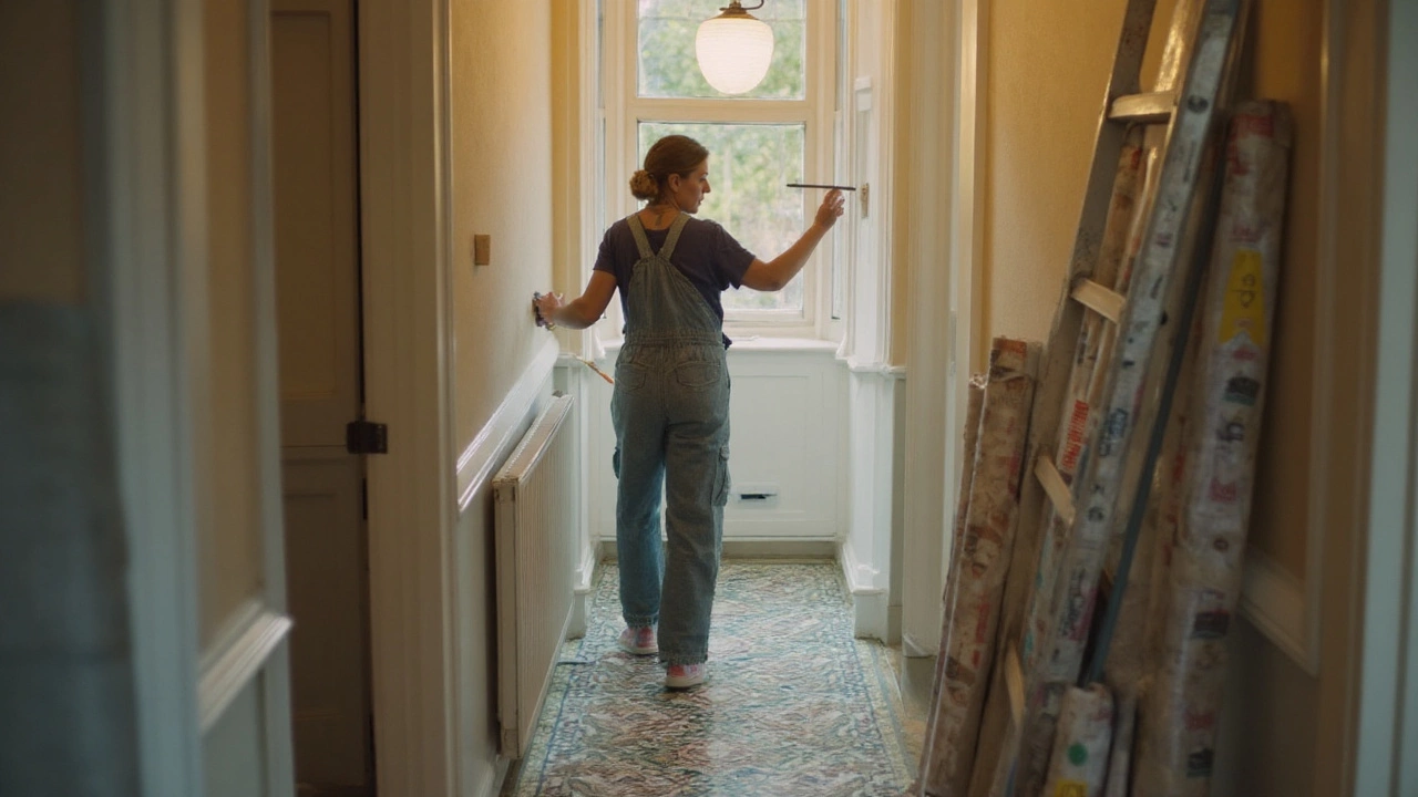
Installation rules that save time and stress.
- Prep matters more with texture. Fill, sand, and line if your plaster is rough. A smooth base stops shadows reading as defects.
- Prime if the wall is thirsty. This gives you more slip time to align seams.
- Use the right paste. Non-woven “paste-the-wall” papers are easier and cleaner. Vinyl-backed needs a strong adhesive. Follow the manufacturer’s spec.
- Work away from the main light source. Seams are less visible this way.
- Book time (rest time after pasting) matters, especially with paintable papers. Do not skip it, or you’ll fight bubbles.
- Roll seams lightly with a seam roller. Too much pressure squeezes adhesive and creates shine lines.
- Let it cure before painting (if paintable)-usually 24-48 hours; check the roll. Use a short-nap roller to avoid flooding the texture.
Maintenance and life with kids/pets.
- Choose scrubbable or washable ratings for hallways, kitchens, and kid zones. UK wallcoverings often label these clearly.
- Actual grasscloth stains; avoid near cooking zones and kids’ art stations. Fake grasscloth vinyls look convincing and wipe clean.
- Pet claws: Whiskers tested mine. Real grasscloth was too tempting; textured vinyl shrugged it off. If you’ve got a scratchy cat, go vinyl or very fine texture.
Safety and indoor air quality.
- Use low-VOC adhesive and paint; UK products commonly state compliance with the EU Decopaint Directive (2004/42/EC).
- For rentals or listed homes, avoid anything that might damage old plaster on removal. Line first, or use strippable/non-woven types.
Decision cheat: If you want a modern look with zero risk, pick a fine linen-texture non-woven in a warm neutral, light it with wall washers, and keep it to one or two walls.
Modern Ideas and Real-World Examples (With Costs and Use Cases)
Below are practical ways I’ve used or specified texture that feel right for 2025 homes in the UK, with who it suits and what to watch out for.
- Soft linen-texture in a north-facing living room: makes the space warmer without adding pattern. Pair with wool throws and matte paint. Cost mid-range, low maintenance.
- Paintable low-relief in a Victorian hallway: hides hairline cracks under a durable coat of eggshell. Lighting turns shadows into character. Easy to repaint in a weekend.
- Ribbed texture behind the bed: hotel feel on a budget. Keep bedside sconces soft and grazing. Avoid shiny brass directly pointed at the wall.
- Faux grasscloth vinyl in a busy home office: laptop cameras love the subtle texture; it looks professional on calls. Wipes clean after coffee meets wall.
- Real grasscloth in a quiet dining nook: stunning, earthy, but treat it like a silk blouse-no ketchup, no steam, and dim the lights to show it off.
Costs vary by quality, brand, and installer rates, especially in London. Use this as a grounded benchmark rather than an exact quote.
| Type | Typical Price/Roll (UK) | Coverage/Roll | Durability | Moisture Suitability | Paintable | Best Rooms | Pet-Friendly |
|---|---|---|---|---|---|---|---|
| Fine linen-texture (non-woven) | £25-£70 | ~5.2 m² | Good (washable if specified) | Low to medium (avoid splash zones) | No | Living room, bedroom, study | Moderate (fine texture hides light scuffs) |
| Faux grasscloth (textured vinyl) | £35-£95 | ~5.2 m² | High (scrubbable) | Medium (OK for bathrooms with ventilation) | No | Hallways, home office, family rooms | High (resists claws better) |
| Real grasscloth | £80-£180+ | ~5.2 m² | Low to moderate (stains easily) | Low (dry rooms only) | No | Dining room, formal lounge | Low (catchy for claws) |
| Paintable low-relief (anaglypta) | £15-£40 | ~5.2 m² | Good (depends on paint) | Medium (with suitable paint) | Yes | Hallways, ceilings, bedrooms | Moderate (pick subtle designs) |
| Ribbed/pleated non-woven | £30-£85 | ~5.2 m² | Good | Low to medium | No | Feature walls, narrow halls | Moderate (watch for snagging) |
Labour in London often runs £180-£350 per day for a skilled decorator. A small room might take a day; complex rooms with lots of cuts take longer. Non-woven “paste-the-wall” saves time, which saves money. If you’re on a budget, do the prep yourself and hire out the hanging.
Design pairings that keep it fresh:
- Texture + minimal art: let the wall be the backdrop; one large piece beats a busy gallery.
- Texture + timber: oak or walnut and a linen-texture wall is a no-fail mix.
- Texture + colour drench: paint ceiling and trim in the same tone and use textured wallpaper one shade deeper.
- Texture + panelling: keep panelling simple; let the upper wall carry subtle weave.
What to avoid if you want to dodge the “dated” tag:
- Overly shiny finishes and high-contrast embossing.
- Heavy floral or faux-stone effects unless you’re going for deliberate vintage.
- Texture on every wall in a small room-feels busy and shrinks the space visually.
Quick UK-specific tip: older terraces and semis often have uneven plaster. Texture hides minor sins but won’t fix big ones. If you can see lumps under a bare bulb, skim or line first. Don’t ask the wallpaper to do heavy lifting that belongs to a trowel.
Quick Checklist, Pitfalls, FAQs, and Next Steps
Use this when you’re choosing, buying, and installing.
Buying checklist:
- Order large samples (A4 if possible). Look at them morning, noon, and at night.
- Rub the sample with a damp cloth. If colour lifts or texture mats, it’s delicate-choose the room accordingly.
- Check roll batch numbers. Mixing batches can cause shade shifts.
- Confirm cleanability: washable/scrubbable rating for busy areas.
- Measure twice. A standard roll is ~10 m x 0.52 m (~5.2 m²) minus waste. Add 15% for pattern match and cutting.
- Buy extra. Keep one unopened roll for future repairs; return if not needed.
Install checklist:
- Fill, sand, prime. Texture highlights poor prep under grazing light.
- Use a sharp blade and change often. Dull blades tear texture.
- Wipe paste off the face immediately with a barely damp sponge.
- Stagger seams away from eye lines (not behind the sofa focal point).
- Let it cure before painting (if paintable): usually 24-48 hours.
Common pitfalls (and fixes):
- Seams peeking: too much tension or not enough paste. Lift gently while wet, add paste, and smooth. Use a seam roller lightly.
- Bubbles appearing after an hour: paper expanded. Wait for it to relax (book time), then smooth. If dry bubbles remain, prick with a pin and inject paste.
- Edge shine lines: pressing too hard. Next strips-use felt smoother and gentle pressure.
- Pattern seems crooked: check walls, not your eyes. Start from the most visible plumb line using a spirit level or laser.
Mini-FAQ:
- Is textured wallpaper old fashioned? No. Subtle, matte, natural-feel textures are firmly current in 2025. The dated look comes from heavy embossing and gloss.
- Does texture make a room look smaller? Not if it’s fine and tone-on-tone. Big, high-contrast textures can overwhelm tight spaces.
- Can I paint over textured wallpaper? Yes if it’s paintable. Use a quality primer first; roll gently to avoid flooding the relief.
- Good in bathrooms? Use moisture-resistant vinyls in well-ventilated bathrooms. Avoid real grasscloth. Keep edges sealed.
- Does it trap dust? Fine textures don’t hold much if you dust lightly now and then. Use a soft brush attachment on the hoover.
- Harder to clean than paint? Washable/scrubbable textures are easy. Real grasscloth stains; choose where you hang it.
- How long will it last? 7-15 years is normal with decent prep, especially for vinyl-backed textures in busy areas.
- Will buyers hate it? Neutrals and subtle textures read premium, not polarising. Loud patterns risk a stronger reaction.
Next steps (by scenario):
- Busy family, pets: pick textured vinyl in a warm neutral. Test a sample with a scrub and a scratch. Light with wall washers.
- Small flat, low light: choose micro-linen texture, matte. Keep it to one wall or half-height above a simple rail.
- Period home with tired plaster: paintable low-relief over lining paper, then eggshell paint. Add soft sconces for atmosphere.
- Rental: high-quality peel-and-stick on a feature wall. Save the backing and remove warm with a hairdryer when you move.
- Statement dining nook: real grasscloth if you can care for it; otherwise faux grasscloth vinyl for the look without the stress.
Troubleshooting quick-fixes:
- Visible joints after drying: colour in the seam with a matching touch-up pen or paint; better yet, plan seams at corners.
- Edges lifting near radiators: heat dries paste fast. Lift carefully, add ready-mixed adhesive, roll, and weight the edge until set.
- Stain on grasscloth: blot only. Do not rub. If it’s bad, replace the drop-this is why keeping a spare roll matters.
One last sanity check: if you’re hesitating, order two textures and stick them up side by side for a week. Look at them in daylight, at night, and during a rainy afternoon (we get plenty in London). The right one will feel calm, not busy. That’s your answer.