Wall Art Scale & Proportion Calculator
Avoid 'postage stamp syndrome'. Use this tool to determine the perfect size for your artwork to make your space look professionally curated.
Recommended Art Size:
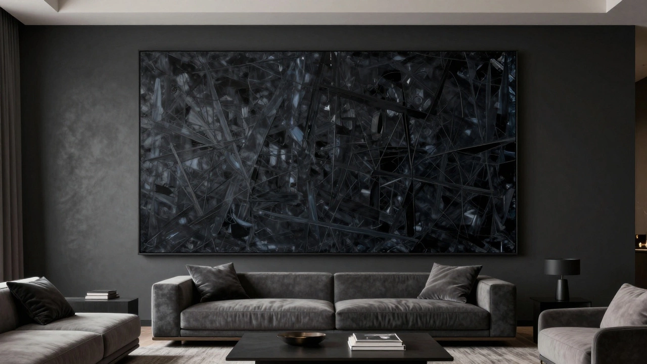
For a high-end look, your art should occupy roughly 60% to 75% of the available wall space.
Quick Wins for High-End Walls
- Go Big with Art: One oversized piece looks far more expensive than five small, cluttered frames.
- Add Architectural Detail: Adding molding or trim creates a custom, built-in feel.
- Upgrade Your Paint: Move away from standard 'off-white' and try a saturated, matte finish.
- Layer Your Lighting: Stop relying on a single ceiling light; use sconces to create depth.
- Focus on Texture: Use wallpaper or wood panels to break up flat surfaces.
The Secret of Scale and Proportion
One of the biggest mistakes I see in average living rooms is 'postage stamp syndrome.' This happens when someone hangs a tiny piece of art on a massive wall. It makes the room feel unfinished and the art look accidental. To make your walls look expensive, you have to embrace scale.Think about Wall Art is visual ornamentation applied to a wall, ranging from paintings and prints to sculptures and textiles. When you choose a piece, it should occupy about 60% to 75% of the available wall space. If you can't find one giant painting, create a 'grid gallery.' This means using identical frames with matching mats and spacing them exactly two inches apart. This precision mimics the look of a curated gallery rather than a random collection of photos.
If you're renting and can't drill a dozen holes, try leaning a large, heavy-framed mirror against the wall. This not only fills the space but also bounces light around, making the room feel larger and more airy, which is a hallmark of luxury design.
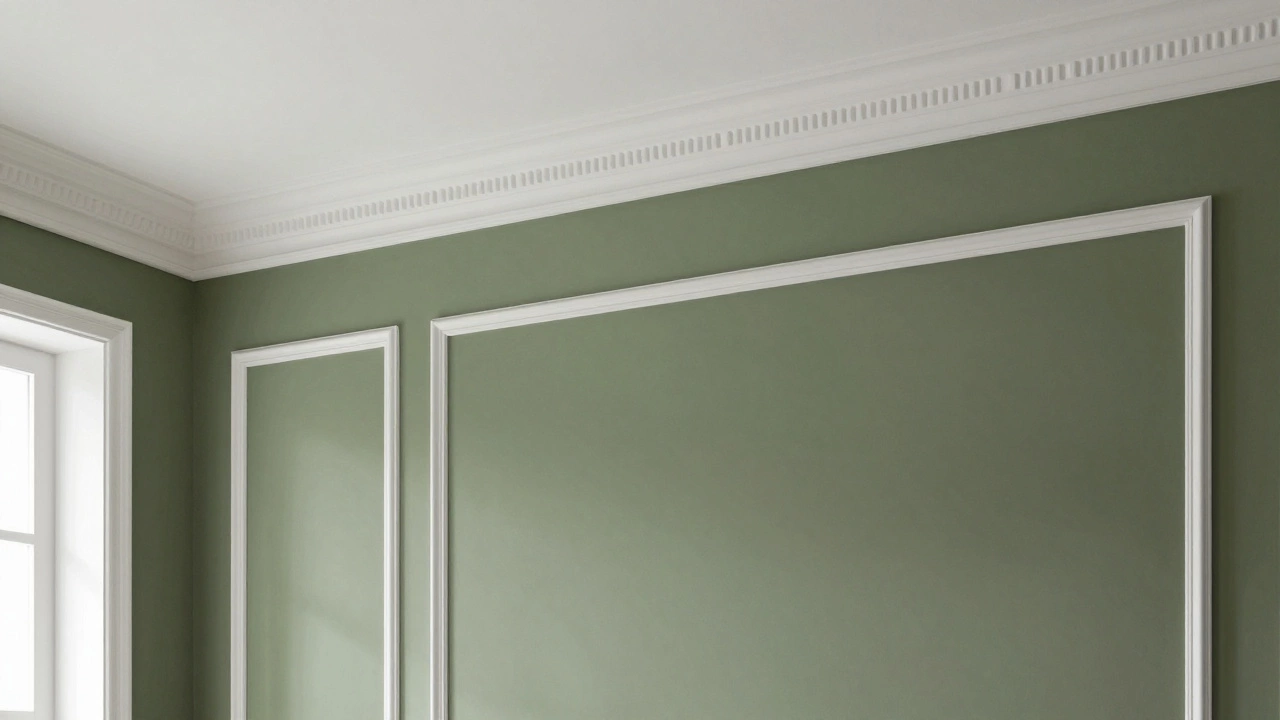
Adding Architectural Depth with Molding
Flat walls are common in modern builds, but luxury homes usually have depth. You can fake this by adding Wainscoting is wooden paneling applied to the lower half of a wall to protect it and add decorative flair. You don't need a master carpenter to do this anymore. Many home improvement stores sell pre-cut MDF strips that you can glue and nail to the wall to create a picture-frame effect.For a more contemporary look, consider Crown Molding is a decorative trim installed at the junction of a wall and a ceiling to hide gaps and add elegance. When you paint the molding the exact same color as the wall-a technique called 'color drenching'-it creates a seamless, sophisticated look that makes the ceilings feel higher. It shifts the room from looking like a 'box' to looking like a designed architectural space.
| Option | Cost | Impact | Best For |
|---|---|---|---|
| Paint | Low | Medium | Quick refreshes |
| Wallpaper | Medium | High | Accent walls/Texture |
| Molding/Trim | Medium | Very High | Classic elegance |
| Stone/Wood Slabs | High | Extreme | Feature walls |
Choosing Colors That Scream Luxury
Bright, stark white is often the default, but it can actually make a room look sterile and cheap if the lighting is harsh. To get a high-end feel, look into saturated tones or 'complex' neutrals. I'm talking about colors that have a hint of grey, green, or blue in them-think charcoal, navy, or a deep olive.The finish of the paint is just as important as the color. Avoid high-gloss finishes on walls, as they show every single bump and imperfection. Instead, go for a matte or eggshell finish. A matte finish absorbs light, which hides flaws and gives the wall a velvety, expensive appearance. If you want to be bold, paint one wall in a deep, dark hue and keep the others light. This creates a focal point and adds a sense of drama that you usually find in boutique hotels.
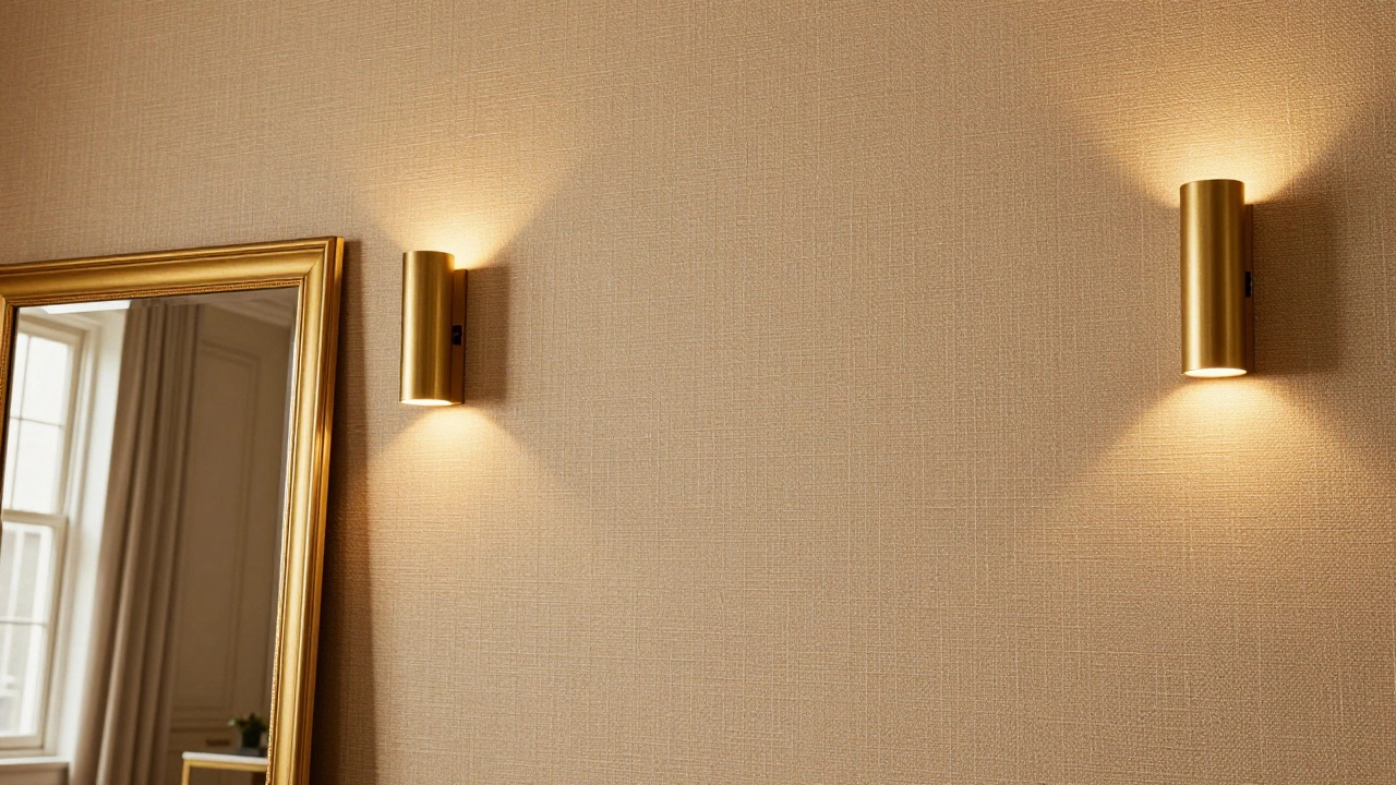
The Art of Lighting Your Walls
You can spend thousands on art and molding, but if you're lighting the room with a single boob-light in the center of the ceiling, it will still look cheap. Expensive rooms use layers of light. The goal is to pull the eye toward the walls, not just the floor.Install Sconces is light fixtures mounted directly onto a wall, providing ambient or accent lighting. If you aren't ready to hire an electrician, buy plug-in sconces and use cord covers to hide the wires. Placing these on either side of a piece of art or a mirror creates a high-end 'glow' that makes the space feel curated. Alternatively, use picture lights-those long, thin lamps that sit above a frame. They signal that the art is important and worth looking at, instantly elevating the perceived value of whatever is inside the frame, even if it's just a print from a local market.
Using Wallpaper for Visual Interest
Wallpaper has come a long way from the floral patterns of the 80s. To make a wall look expensive, avoid overly busy, small patterns. Instead, look for Grasscloth is a woven fabric wallpaper made from natural fibers like jute or hemp, offering a rich, organic texture. Because it's a physical texture rather than just a print, it catches the light differently and adds a layer of sophistication that paint simply cannot achieve.If you're nervous about committing to a whole room, try a 'half-wall' approach. Put wallpaper on the top half and add a chair rail molding at the bottom. This creates a structured, traditional look that is very common in high-end European apartments. Just make sure the colors coordinate; for example, a deep navy wallpaper paired with a crisp white wainscoting is a timeless combination that never looks cheap.
Avoiding Common 'Cheap' Traps
Sometimes, making a wall look expensive is more about what you *don't* do. Avoid these common mistakes that scream 'budget' decor:- Avoid 'Wall Fillers': Don't buy a set of three matching generic canvases from a big-box store. They look mass-produced. Instead, mix a vintage oil painting with a modern photograph.
- Stop the Clutter: Too many small shelves and trinkets make a wall look like a storage unit. Keep surfaces clean and let one or two high-quality items breathe.
- Skip the Peel-and-Stick Tiles: While convenient, the seams are often visible and the material looks like plastic. If you want a stone look, go for real stone veneers or a high-quality textured wallpaper.
- Don't Hang Art Too High: A common mistake is hanging art near the ceiling. The center of the piece should be at eye level (roughly 57 to 60 inches from the floor). When art is too high, it disconnects from the furniture and looks awkward.
Can I make my walls look expensive if I'm renting?
Yes. Focus on oversized art using Command strips, lean large mirrors against the wall, and use plug-in sconces for lighting. You can also use peel-and-stick wallpaper in high-quality textures like linen or grasscloth, which can be removed without damaging the paint.
What is the best paint color for a luxury look?
Avoid stark, cold whites. Instead, go for 'warm' neutrals like cream, greige, or deep, moody tones like charcoal, forest green, or navy. A matte finish is almost always preferred over gloss for a high-end feel.
How do I choose the right size wall art?
As a rule of thumb, your art should occupy about 60% to 75% of the wall space. If you are hanging art over a sofa, the piece should be roughly two-thirds the width of the sofa to maintain a balanced proportion.
Is adding molding worth the effort?
Absolutely. Molding adds architectural 'bones' to a room. Even simple picture-frame molding can transform a plain drywall room into something that looks custom-built, significantly increasing the perceived value of the space.
What is 'color drenching' and does it work?
Color drenching is painting your walls, trim, and ceiling the same color. It works exceptionally well in smaller rooms or rooms with unusual architecture because it removes the jarring contrast between walls and trim, creating a seamless, high-end gallery feel.
Final Steps for Your Wall Transformation
If you're feeling overwhelmed, start with the lighting. Adding a pair of sconces and swapping your bulbs for a warm, soft white (around 2700K) will instantly change how your current walls look. From there, pick one wall as your 'statement' wall. Whether you choose a bold paint color, a textured wallpaper, or a massive piece of art, focusing your effort on one area prevents the room from feeling over-decorated.
Once your focal point is set, look at the remaining walls. Keep them simple but cohesive. Use the same color palette throughout the room to tie everything together. Remember, luxury is as much about what you leave out as what you put in. Give your pieces room to breathe, and your living room will naturally feel more expensive and curated.