Flooring Luxury Estimator
You walk into a friend’s house, and the first thing you notice isn’t the sofa or the artwork. It’s the floor. It gleams, it feels solid underfoot, and it somehow makes the whole room feel twice as big and ten times more valuable. You ask yourself, "How can I make my floor look expensive?" The good news is that you don’t need a six-figure renovation budget to achieve that high-end aesthetic. In fact, some of the most stunning interiors I’ve seen in London use clever tricks rather than the most expensive materials.
Here is the truth about luxury: it’s rarely about the price tag of the material itself. It’s about proportion, finish, and maintenance. A cheap laminate laid with perfect precision looks better than a marble slab installed by a sloppy contractor. This guide breaks down exactly how to elevate your flooring perception without breaking the bank. We’ll look at materials, layout strategies, and the small details that separate "builder-grade" from "boutique hotel."
The Power of Large Format Tiles and Planks
If there is one rule that instantly signals wealth, it is minimalism. Small, busy patterns create visual noise. Luxury spaces breathe. To achieve this, go bigger. When we talk about large format tiles, we mean dimensions like 60x120cm or even larger slabs for porcelain. For wood, this means wide planks, ideally 200mm or wider.
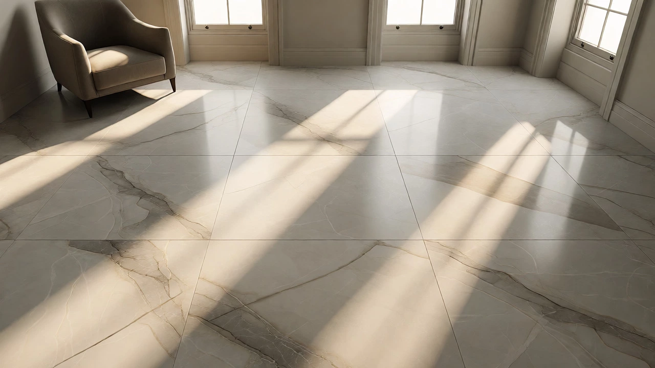
Why does size matter? Fewer grout lines. Grout is the enemy of elegance. It collects dirt, creates visual segmentation, and breaks up the flow of light across the surface. By using large-format options, you reduce those interruptions. The eye travels smoothly across the floor, creating an illusion of continuity and space. If you are working with a limited budget, consider large-format porcelain tiles that mimic natural stone. Modern digital printing technology has made these indistinguishable from real marble or slate to the naked eye, yet they cost a fraction of the price and require zero sealing.
| Material Type | Average Cost (UK) | Luxury Perception Factor | Maintenance Level |
|---|---|---|---|
| Natural Marble | £80 - £200+ per m² | Very High | High (requires sealing) |
| Large Format Porcelain | £30 - £70 per m² | High (if matte/natural finish) | Low |
| Engineered Oak (Wide Plank) | £50 - £90 per m² | Very High | Medium |
| High-Quality Vinyl (LVT) | £25 - £45 per m² | Medium-High (depends on texture) | Low |
Master the Art of Directional Laying
Most builders lay floorboards parallel to the longest wall because it’s the fastest way to install them. But if you want a custom, architect-designed look, change the angle. Running planks perpendicular to the window source or diagonally across a square room draws the eye outward. It adds dynamic movement to a static space.
Consider the herringbone pattern. Once reserved for palaces and grand estates, herringbone parquet is now accessible via engineered wood kits. It screams craftsmanship. However, be warned: herringbone requires precise cutting and a perfectly level subfloor. If you attempt this DIY, expect to buy 15% more material for waste. Alternatively, try a "chevron" pattern, which uses cut ends meeting at a sharp point, offering a sleeker, more modern take on the classic zigzag.
Light Control and Surface Finish
Have you ever noticed that shiny floors often look cheap? High-gloss finishes reflect overhead lights harshly, revealing every dust mote and imperfection. True luxury absorbs light softly. Aim for matte, satin, or brushed finishes. These textures hide wear and tear while giving the surface depth. With wood, a wire-brushed or hand-scraped finish adds tactile interest that flat, factory-smooth boards lack.
Lighting plays a massive role here. Recessed spotlights can cast long, unflattering shadows across uneven planks. Instead, use layered lighting. Wall washers that graze the floor surface highlight the texture of the grain or the subtle veining in stone. This technique, often used in gallery spaces, turns your floor into a feature rather than just a surface to walk on.

Strategic Transitions and Thresholds
Nothing ruins the illusion of seamless luxury faster than ugly metal transition strips between rooms. They break the visual line and signal "cheap installation." To fix this, plan your transitions before you buy the floor.
- Seamless Junctions: If possible, run the same flooring through multiple rooms. Open-plan living thrives on continuity.
- Flush Metal Profiles: If you must join two different heights (e.g., carpet to tile), use slim, flush-mounted brass or aluminum profiles. Avoid bulky plastic ramps.
- Shadow Gaps: For floating floors, leave a tiny expansion gap covered by a shadow gap skirting board. This makes the floor appear to float, adding architectural sophistication.
In older London terraces, retaining original features is key. If you have existing wooden floorboards, do not cover them up unless they are structurally unsound. Sanding and staining existing pine floors is often cheaper and more authentic than ripping them out and laying new chipboard. A dark walnut stain on old pine can look incredibly chic and expensive when paired with neutral walls.
The Importance of Skirting Boards and Baseboards
You might think the floor ends where the wall begins, but the transition zone defines the quality of the job. Standard white MDF skirting boards are fine for rentals, but for a premium feel, upgrade to solid wood painted to match the wall color. This blurs the boundary, making ceilings look higher and floors more expansive.
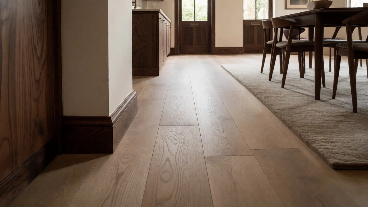
Alternatively, contrast works too. Dark stained wood skirting against light oak floors creates a crisp, defined edge that frames the room like a picture. Just ensure the profile is substantial-thin, flimsy skirting looks temporary. Height matters; 150mm to 200mm tall skirting provides a sense of gravity and permanence associated with high-end builds.
Coverage and Rug Strategy
Do not let furniture block your best assets. If you have beautiful hardwood, keep legs off the main traffic paths where possible. Use felt pads on all furniture legs immediately. Scratches destroy the "new" look faster than age does.
Rugs are powerful tools for zoning and hiding flaws. A large, high-pile wool rug can anchor a seating area and add acoustic dampening, which psychologically signals comfort and privacy. However, avoid small rugs that look like doormats. The front legs of your sofa should sit on the rug. This proportionality trick prevents the room from feeling cluttered and ensures the floor remains visible enough to appreciate its quality.
Professional Installation is Non-Negotiable
I cannot stress this enough: bad installation kills expensive materials. Even the most luxurious Italian marble will look tacky if the joints are uneven or the lippage (height difference between tiles) is noticeable. Invest in a specialist fitter who understands leveling compounds and laser alignment.
Ask to see their previous work in person. Check the corners of rooms. Are they straight? Is the caulking clean? A professional installer will also advise on acclimatization-letting wood sit in the room for days before laying it to prevent warping later. This attention to detail is what separates a "house" from a "home" in the eyes of potential buyers or guests.
What is the cheapest way to make floors look expensive?
The most cost-effective method is refinishing existing solid wood floors. Sanding and applying a matte polyurethane sealant costs significantly less than replacing the floor entirely. Additionally, painting concrete floors with a high-quality epoxy kit can mimic polished stone for a fraction of the price.
Does vinyl plank flooring look cheap?
Not necessarily. Low-quality vinyl looks fake due to repetitive patterns and glossy surfaces. However, high-end Luxury Vinyl Tile (LVT) with embossed textures and realistic wood grains can pass for real wood. Choose matte finishes and varied plank lengths to enhance realism.
Should I choose light or dark floors for a luxury look?
Both can look expensive depending on context. Light woods (oak, ash) make small rooms feel larger and airier, fitting Scandinavian or minimalist styles. Dark woods (walnut, ebony) add warmth and drama, suitable for traditional or moody interiors. The key is consistency in tone throughout the home.
How important is grout color for tiles?
Crucial. Matching the grout color closely to the tile minimizes visual interruption, making the floor look like a single slab of stone. Contrast grout highlights the grid pattern, which can look dated unless intentionally designed for effect. For a seamless, expensive look, always aim for tonal matching.
Can I mix different flooring types in one open-plan area?
Yes, but proceed with caution. Mixing materials requires clear zoning boundaries, such as a fireplace or structural column. Using too many materials in one sightline creates visual chaos. Stick to two complementary materials max, and ensure the transition is handled with a high-quality threshold strip or flush profile.