Living Room Color & Lighting Planner
Design a harmonious space by balancing colors and choosing the right light temperature.
Your living room is the heart of your home, but does it actually feel like one? Many people sit in a space that looks "fine" on paper but feels cold, cluttered, or disconnected from how they actually live. The gap between a functional room and a welcoming one usually comes down to three things: layout flow, visual balance, and lighting depth. You don’t need a full renovation or a massive budget to fix this. You just need to look at the room with fresh eyes and make a few strategic adjustments.
Quick Summary / Key Takeaways
- Furniture arrangement dictates the mood; ensure clear pathways and intimate conversation zones.
- Lighting layers (ambient, task, accent) transform a flat space into a cozy, dynamic environment.
- Color palettes should follow the 60-30-10 rule for visual harmony without feeling monotonous.
- Textiles and textures add warmth and soften hard architectural lines.
- Personalization through art and objects makes the space feel lived-in rather than staged.
Mastering Furniture Layout and Flow
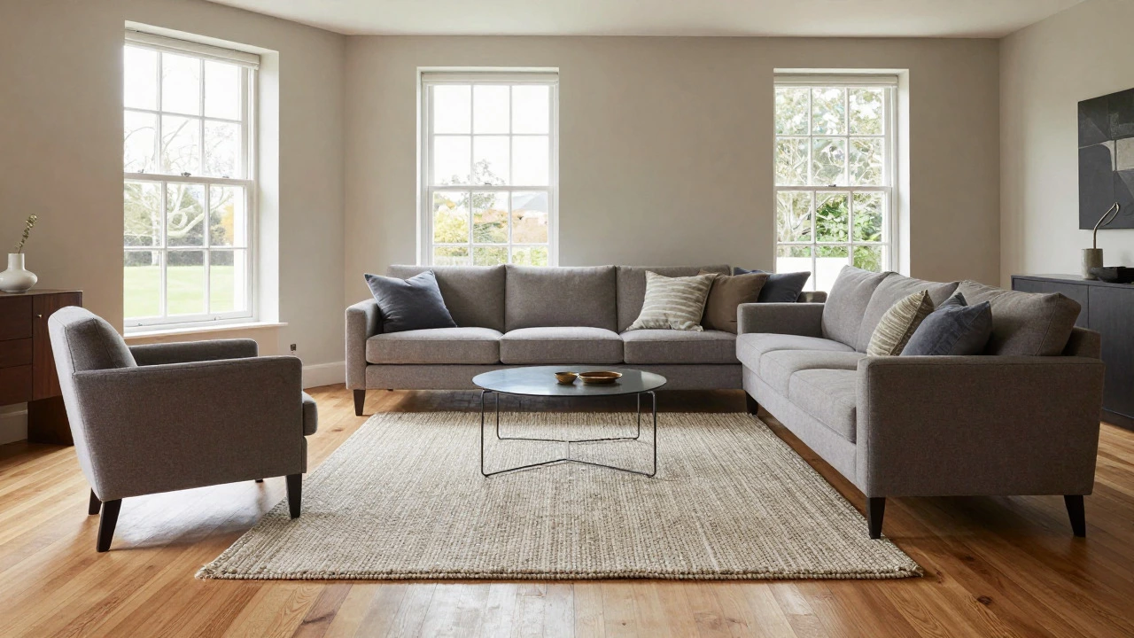
The biggest mistake homeowners make is pushing all furniture against the walls. This creates a large, empty void in the center that feels awkward to cross and leaves you with no real seating clusters. Instead, pull your sofa away from the wall by at least six inches if possible, or create distinct islands of seating. A Sofa is the anchor piece that defines the primary seating area and sets the scale for other furniture. When placing it, consider the focal point of the room-whether that’s a fireplace, a large window, or a media unit.
Think about traffic flow. You want clear paths between furniture pieces that are at least 18 inches wide so people can walk comfortably without bumping into legs. If you have a large sectional, pair it with two armchairs angled toward each other to encourage conversation. Avoid placing chairs directly opposite each other across a coffee table unless the distance is short enough to allow easy eye contact. The goal is to create "rooms within rooms." Even in an open-plan space, you can define the living area using rugs and furniture placement to separate it from the dining or kitchen zone.
Building Depth with Layered Lighting
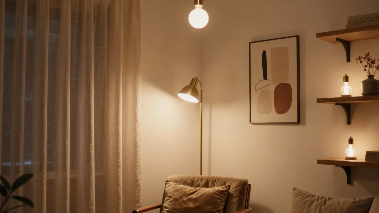
Most living rooms rely solely on overhead recessed lights or a single ceiling fixture. This is called "flat lighting," and it casts harsh shadows under your chin and makes the room feel sterile. To fix this, you need three distinct layers of light. First, ambient light provides general illumination; this could be a chandelier or track lighting. Second, task lighting helps with specific activities, such as a floor lamp next to a reading chair or under-cabinet lights if you have built-ins. Third, accent lighting highlights architectural features or artwork. Sconces, picture lights, or LED strips behind a TV create this final layer.
The temperature of your bulbs matters too. For a relaxing evening vibe, stick to warm white bulbs around 2700K. Cool daylight bulbs (5000K+) are better suited for kitchens or offices where you need alertness. In the living room, dimmers are essential. They allow you to adjust the intensity based on the time of day and the activity, shifting from bright and functional during the day to soft and moody at night. If you only have one overhead light, adding two table lamps on side tables and one floor lamp will instantly change the atmosphere.
Choosing a Cohesive Color Palette
Color sets the emotional tone of the room. Before buying paint or new cushions, identify the dominant colors already present in your permanent fixtures like flooring, cabinetry, and large furniture pieces. Use these as your base. Then, apply the 60-30-10 rule. Sixty percent of the room should be your dominant neutral color (walls, large rug). Thirty percent should be a secondary color (sofa, curtains, accent wall). Ten percent should be an accent color used sparingly (pillows, art, vases).
If you have small windows or limited natural light, avoid dark, heavy colors on the walls that absorb light. Instead, use lighter shades like off-white, pale gray, or soft beige to reflect what little sunlight you get. If you love bold colors, save them for the 10% accent category or use them on a single feature wall. Don’t be afraid to mix patterns, but keep the color family consistent. For example, a floral rug, a striped throw pillow, and a geometric print book all work together if they share the same blue and cream tones.
Adding Texture and Softening Hard Lines
Modern homes often have lots of hard surfaces: hardwood floors, stone countertops, metal fixtures, and glass. While sleek, these materials can feel cold. Textiles are the antidote. A thick wool rug anchors the seating area and adds warmth underfoot. Linen curtains filter light softly compared to sheer synthetics. Velvet or leather pillows add tactile interest. Mix different fabrics-chunky knits, smooth silks, rough jute-to create visual complexity. This technique, known as textural layering, makes a simple room feel rich and inviting without needing expensive decor items.
Plants also play a crucial role here. They introduce organic shapes and greenery that contrast beautifully with straight lines and industrial materials. A fiddle leaf fig or a snake plant in a woven basket adds life and improves air quality. Place plants in corners or on shelves to fill vertical dead space. Just remember to choose low-maintenance varieties if you’re not a green thumb; succulents and pothos are forgiving and stylish.
Personalizing with Art and Accessories
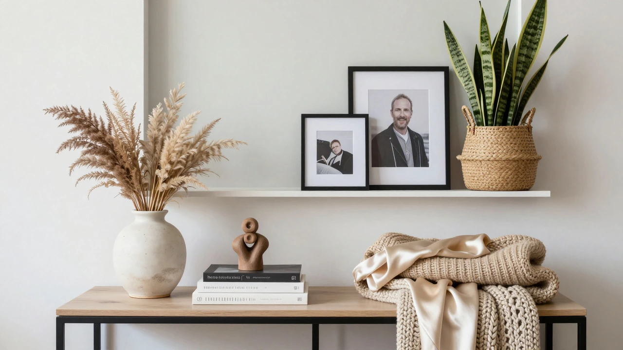
A living room shouldn’t look like a hotel lobby. It needs personality. Start with wall art. Instead of hanging many small frames randomly, try grouping three larger pieces or one oversized statement piece above the sofa. Ensure the width of the art group is roughly two-thirds the width of the furniture below it. Shelves are another great place to display personal items. Curate them carefully: alternate tall books with short stacks, add a small sculpture, a candle, or a framed photo. Leave negative space; overcrowded shelves look chaotic.
Accessories like vases, trays, and decorative bowls tie the room together. Use odd numbers for grouping objects on a console table-one vase, one tray, one stack of books. This is visually more pleasing than even numbers. Rotate your accessories seasonally to keep the space feeling fresh. Swap out summer linen throws for chunky winter knits, or change your pillow covers to match the current trend or your mood. These small changes require minimal effort but significantly impact how the room feels.
| Lighting Type | Primary Function | Best Placement | Bulb Temperature Recommendation |
|---|---|---|---|
| Ambient | General illumination | Ceiling center, track lighting | 2700K - 3000K (Warm White) |
| Task | Specific activities (reading, working) | Next to chairs, desk areas | 3000K - 4000K (Neutral White) |
| Accent | Highlighting art/architecture | Wall sconces, picture lights | 2700K (Warm White) |
Common Mistakes to Avoid
Even with good intentions, people trip up on a few recurring issues. One major error is ignoring the scale of furniture. A tiny lovesee in a huge room gets lost, while an oversized sectional in a compact space blocks movement. Measure your room and compare it to furniture dimensions before buying. Another common pitfall is matching everything perfectly. If your sofa, rug, and curtains are all the exact same shade of gray, the room feels flat. Introduce contrast with darker wood tones, metallics, or brighter accent colors.
Finally, don’t neglect storage. Clutter is the enemy of good design. If you have piles of magazines, remotes, or toys visible, the room feels messy regardless of how nice the paint job is. Invest in baskets, ottomans with hidden storage, or a stylish media console to hide the everyday chaos. A clean surface allows the intentional decor to shine. Remember, decoration isn’t just about adding things; it’s about curating what stays and hiding what doesn’t fit the aesthetic.
Frequently Asked Questions
How do I arrange furniture in a small living room?
Use multifunctional pieces like a storage ottoman or a drop-leaf table. Keep furniture legs exposed to show more floor space, which makes the room feel larger. Stick to a lighter color palette and avoid bulky, overstuffed sofas. Choose one large rug that fits under the front legs of the seating to unify the space rather than shrinking it with multiple small rugs.
What is the best color scheme for a living room with little natural light?
Opt for light, reflective neutrals like white, cream, or very pale gray on the walls. These colors bounce available light around the room. Add mirrors strategically opposite windows to double the effect of incoming light. Use warm-toned lighting to counteract any cool shadows cast by the lack of sun. Avoid dark, matte paints that absorb light.
How much floor space should I leave between furniture pieces?
For comfortable walking paths, maintain at least 18 inches of clearance. Between a sofa and a coffee table, aim for 12 to 18 inches to allow easy reach without straining. If you are creating a conversation area, keep the distance between facing seats close enough for eye contact but far enough to prevent elbows from touching, typically around 36 to 48 inches.
Should I match my curtains to my sofa?
Not necessarily. Matching exactly can look dated. Instead, coordinate the colors. If your sofa is a patterned fabric, choose solid-colored curtains that pick up one of the background colors from the pattern. This creates cohesion without being overly matchy. Alternatively, use contrasting textures, like linen curtains with a velvet sofa, to add visual interest.
How can I make my living room feel more expensive on a budget?
Focus on hardware and textiles. Replacing old cabinet knobs or light switch plates with brushed nickel or brass upgrades the look instantly. Investing in high-quality, plush throw pillows and a thick rug adds perceived luxury. Finally, declutter ruthlessly. Empty spaces and clean lines always read as more sophisticated than crowded, cheap-looking displays.