Wall Art Balance Calculator
Configuration
Visual Preview
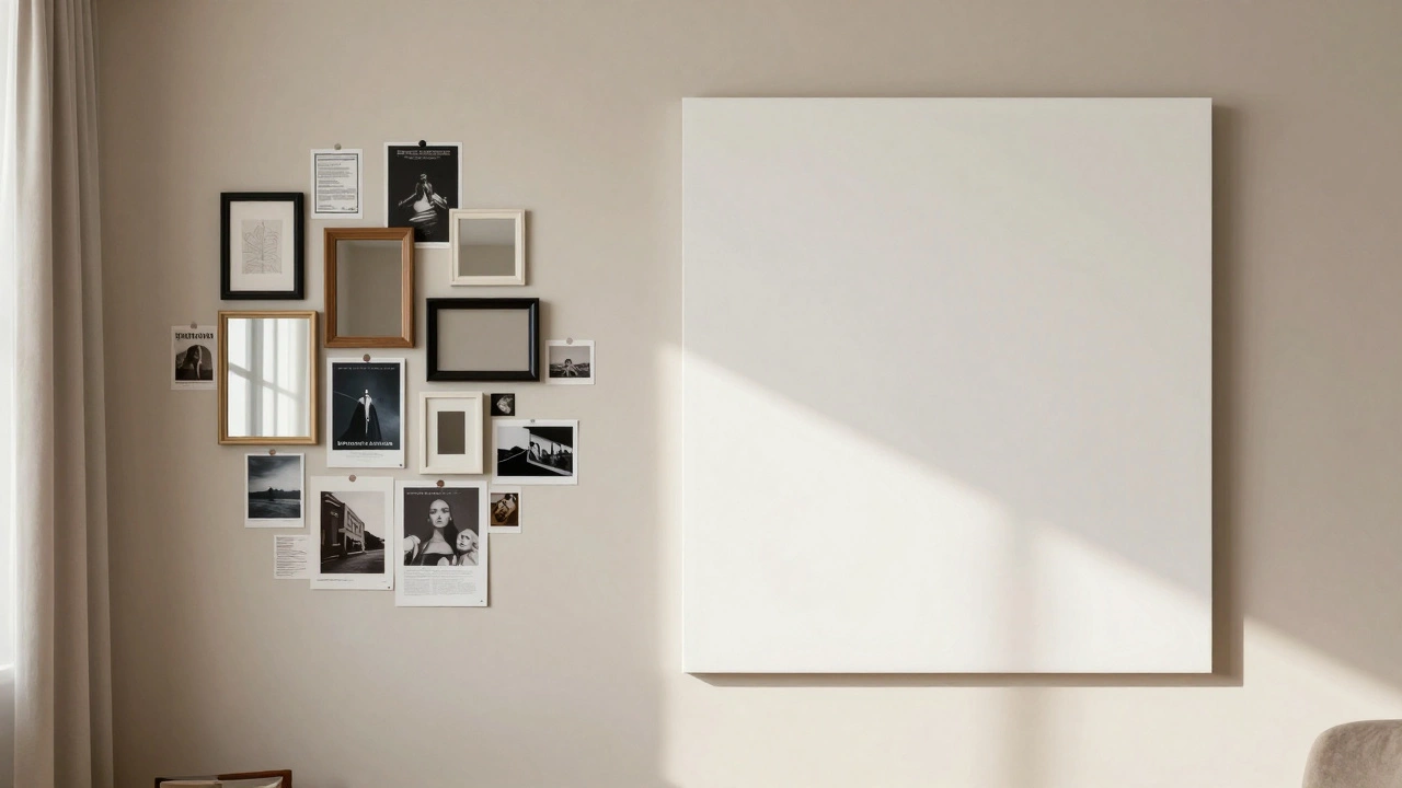
BalancedYou’ve just hung that stunning canvas you bought on a whim. It looks great. So you hang another one next to it. Then a mirror. Then a vintage poster. Suddenly, your living room feels less like a sanctuary and more like a chaotic museum overflow bin. You’re not alone. One of the most common questions I hear from clients isn’t about color palettes or furniture placement-it’s about density. How much is too much?
There is no single mathematical formula for wall art. If there were, every apartment would look identical. But there are rules of thumb, visual principles, and psychological cues that separate a curated collection from visual noise. Getting this right changes how people feel when they walk into your space. It shifts the vibe from cluttered to collected.
The Power of Negative Space
In design, empty space is not wasted space. We call it negative space. It is the breathing room between objects. When you cover every inch of wall with frames, prints, and shelves, you remove the ability of the eye to rest. This creates visual fatigue. Your brain has to process too much information at once, which leads to stress rather than relaxation.
Think about your favorite restaurant or hotel lobby. Do the walls scream for attention? Usually, no. They use large expanses of paint or wallpaper to let the focal points stand out. At home, you want the same effect. If you have a bold sofa or a busy rug, your walls should probably be quieter. If your furniture is neutral and simple, you can afford to be bolder with the walls.
- The 60-30-10 Rule: While often used for color, this applies to visual weight too. Let 60% of the wall remain "empty" (paint/plaster), 30% be occupied by major pieces (large art/mirrors), and 10% by accents (small frames/shelves).
- The Eye Level Test: Stand back. If your eyes dart around frantically trying to find a resting point, you have too much. If they land naturally on one or two key pieces, you have balance.
Room Size vs. Art Scale
A small piece of art on a massive wall doesn't mean you need to fill the gap with ten tiny photos. That is a recipe for disaster. Instead, consider scale. Large walls demand large statements. A single oversized print or a substantial mirror often works better than a crowded cluster of small frames.
| Room Type | Recommended Style | Risk of Overcrowding |
|---|---|---|
| Living Room | Gallery Wall or Single Statement Piece | High (if TV is present) |
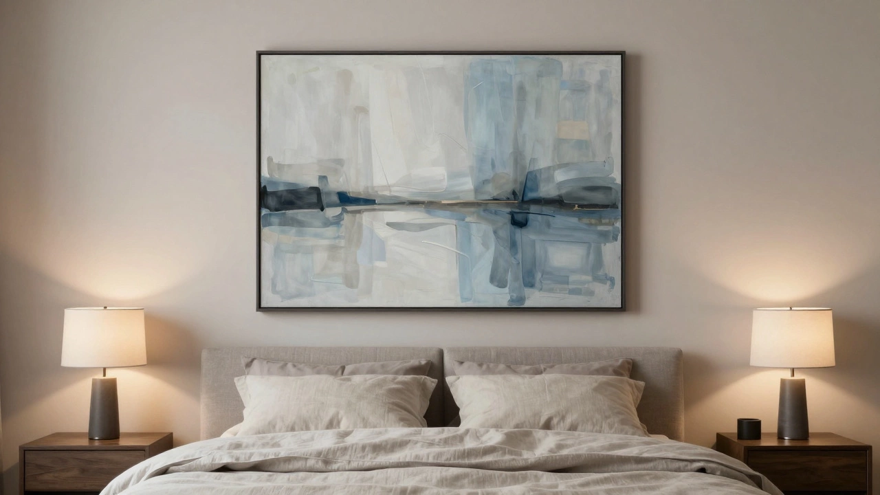
| Bedroom | Calm, Minimalist, Headboard Focus | Medium (can disrupt sleep ambiance) |
| Hallway | Vertical Gallery or Repeating Pattern | Low (walls are usually narrow/long) |
| Kitchen | Functional Art (Clocks, Chalkboards) | Low (high traffic, needs durability) |
If you have a long hallway, you can get away with more density because the eye travels along the path. In a bedroom, however, overcrowding can make the space feel claustrophobic. Keep the area above the bed focused. One large piece or a symmetrical pair is usually enough. Adding three rows of framed family photos might feel personal to you, but it can feel heavy to guests-and even to you when you’re trying to unwind.
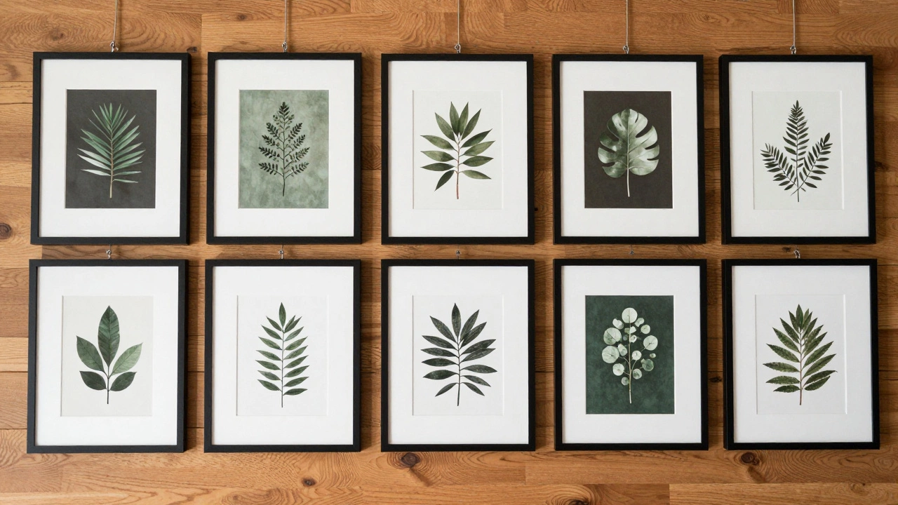
Creating Cohesion in a Gallery Wall
A gallery wall is the ultimate test of restraint. It allows for multiple pieces, but only if they talk to each other. Without cohesion, a gallery wall looks like a flea market stall. With cohesion, it looks intentional.
How do you achieve that cohesion? Start with a unifying element. This could be:
- Frame Color: Using all black, all white, or all natural wood frames ties disparate images together.
- Color Palette: Ensure the artwork shares at least one common color tone. If one piece is bright red, echo that red in another piece nearby.
- Subject Matter: Stick to a theme-botanicals, black-and-white photography, or abstract lines.
Before you drill holes, lay everything out on the floor. Take a photo. Look at it critically. Does it feel balanced? Are there gaps that are too wide or too tight? Adjust here. Once you start hanging, moving things becomes painful. A good rule of thumb is to keep the spacing between frames consistent-usually 2 to 3 inches. This grid-like consistency brings order to chaos.
The Clutter Trap: Objects vs. Art
We often forget that shelves count as wall decoration. Floating shelves filled with books, plants, knick-knacks, and framed photos add significant visual weight. If you have a heavily styled shelf unit, you should reduce the amount of hanging art nearby. Otherwise, the wall becomes a competition between vertical and horizontal clutter.
Ask yourself: What is the function of this object? Is it art, or is it storage disguised as decor? If it’s storage, treat it as such. Don’t try to make every book spine part of an aesthetic pattern unless you are willing to maintain that perfection daily. Real life involves reading books and moving them around. Embrace the messiness of lived-in spaces, but don’t mistake hoarding for styling.
Lighting Changes Everything
Art without light is just colored paper on a wall. Lighting affects perception of density. Bright, direct lighting can make a sparse wall feel stark and cold. Soft, ambient lighting can make a dense wall feel cozy and rich. However, poor lighting can also highlight every dust mote and uneven frame alignment, making a crowded wall look messy.
Consider using picture lights or adjustable track lighting. By directing light specifically onto your key pieces, you guide the viewer’s eye. This allows you to have more art on the wall without it feeling overwhelming, because the eye is drawn to the illuminated areas first. The darker corners recede, creating depth. Depth reduces the feeling of flatness and crowding.
When Less Is Actually More
Sometimes, the best design choice is to leave a wall bare. Or nearly bare. In open-plan living spaces, where the kitchen flows into the dining area and then into the lounge, walls serve as dividers. If every wall is covered, the entire space feels visually loud. Leaving one or two walls clean helps define zones. It gives the eye a place to pause before moving to the next area.
Also, consider the longevity of your taste. Trends change. Maximalism had its moment, but so did minimalism. If you hang twenty pieces today, removing five in three years will leave awkward gaps. Starting with fewer, high-quality pieces allows you to build a collection over time. It becomes a reflection of your journey, not just a snapshot of what was popular last year.
Practical Tips for Decision Making
Still unsure if you’ve gone too far? Try these quick checks:
- The Step-Back Test: Stand at the entrance of the room. Can you identify the main focal point within 5 seconds? If not, you have too many competing elements.
- The Sleep Test: In bedrooms, does the wall above the bed feel calming or stimulating? High-density art can raise cortisol levels by keeping the brain engaged. Opt for simplicity here.
- The Guest Reaction: Pay attention to where guests look. If they scan the walls nervously, looking for a spot to sit or relax, the visual noise is likely too high.
Remember, your home is for you. If you love maximalism and find joy in surrounding yourself with hundreds of memories, then do it. But do it intentionally. There is a difference between "I love all these things" and "I haven’t decided what to take down yet." The former is style; the latter is indecision. Curate ruthlessly. Edit constantly. Your walls will thank you.
How many pictures should I put on one wall?
There is no fixed number, but generally, 3 to 7 pieces work well for a standard-sized wall. For a large gallery wall, you might go up to 10-15, but ensure they are arranged in a cohesive grid or organic shape with consistent spacing. The key is balance, not quantity.
Is it bad to have too much art on the walls?
It depends on the context. In small rooms or spaces with busy furniture, too much art can cause visual clutter and stress. In larger rooms or dedicated galleries, higher density can create warmth and character. The issue arises when there is no negative space for the eye to rest.
What is the best way to arrange a gallery wall?
Start by laying out your pieces on the floor. Choose a central anchor piece (usually the largest) and build outward. Maintain consistent spacing (2-3 inches) between frames. Use a unifying element like frame color or matting to tie the collection together. Always check the arrangement from across the room before hanging.
Should I match my wall art to my furniture?
You don't need to match exactly, but you should complement. If your furniture is neutral, you can use art to add color and personality. If your furniture is bold or patterned, choose simpler art to avoid competition. Aim for harmony in color tones and style era.
How high should I hang wall art?
The center of the artwork should be at average eye level, which is typically 57 to 60 inches from the floor. If hanging art above a sofa or console table, leave 6 to 8 inches of space between the top of the furniture and the bottom of the frame.