Small Bathroom Color & Space Calculator
Select your design choices below to see how they impact the perceived spaciousness of your bathroom.
Analysis Results
Space Expansion Score: 0/100
Walk into a cramped, dark bathroom and you feel it immediately. The walls seem to close in, the mirror feels like a portal to nowhere, and even brushing your teeth feels like a chore. Now walk into a small bathroom painted in the right shade of soft white or pale blue, and suddenly that same square footage feels breathable, calm, and maybe even luxurious. It’s not magic-it’s physics and psychology working together.
The question isn’t just "what looks good?" It’s "what makes this tiny box feel bigger and better?" If you’re renovating or just repainting, choosing the wrong color can shrink your space visually. Choosing the right one expands it. Let’s cut through the noise and look at what actually works in real-world small bathrooms, based on how light behaves and how our eyes perceive depth.
Why Color Changes How Big a Room Feels
Before picking a swatch, you need to understand why some colors expand space while others compress it. This comes down to two things: light reflection and visual weight.
Light Reflectance Value (LRV) is a measurement of how much visible light a paint color reflects back into the room. White has an LRV near 85-90, meaning it bounces most light around. Dark navy might sit at 10-15, absorbing almost all light. In a small bathroom with limited natural light, high-LRV colors act like mirrors, scattering light and making surfaces recede visually.
Then there’s Visual Weight, which is how heavy or dominant a color appears to the human eye. Warm, saturated colors like deep reds or oranges advance toward you. Cool, muted tones like pale grays or soft blues retreat. When you want a wall to disappear into the background so the room feels larger, you pick colors with low visual weight.
So, the rule of thumb? High LRV + Low Visual Weight = Maximum perceived space. But that doesn’t mean you have to live in a sterile hospital. There are plenty of ways to add personality without shrinking your footprint.
The Top 3 Color Strategies for Small Bathrooms
If you’re standing in front of a paint rack feeling overwhelmed, narrow it down to these three proven approaches. Each solves the "small space" problem differently.
| Strategy | Best For | Pros | Cons |
|---|---|---|---|
| All-White Monochrome | Minimalist aesthetics, maximizing brightness | Makes room feel largest; timeless; easy to accessorize | Can feel cold or clinical; shows dirt/water spots easily |
| Soft Neutrals (Greige, Pale Gray) | Warmth without darkness; modern comfort | Hides minor imperfections; adds cozy texture; versatile | Wrong undertones can make room look dingy |
| Cool Pastels (Blue, Green, Lavender) | Adding character while maintaining openness | Psychologically calming; creates spa-like vibe; hides hard water stains better than white | Saturated pastels can still feel heavy if too dark |
1. The All-White Approach (But Not Just Any White)
White is the classic answer for a reason. But "white" isn’t one color. It’s a spectrum. A pure, stark white (like Benjamin Moore’s Chantilly Lace) can feel harsh under fluorescent lighting. Instead, opt for whites with slight warm or cool undertones depending on your lighting.
If your bathroom gets morning sun, a crisp cool white keeps it fresh. If it’s lit only by bulbs, a warm white (like Sherwin-Williams Alabaster) prevents the room from feeling icy. Pair white walls with white ceiling and trim to eliminate visual breaks. When the eye can’t find where the wall ends and the ceiling begins, the room feels taller.
2. Soft Neutrals: Greige and Light Gray
Not everyone wants white. That’s fine. Greige is a blend of gray and beige that offers warmth without darkness. It’s perfect for small bathrooms because it adds subtle depth without absorbing light. Look for shades with an LRV above 60. Avoid anything with strong yellow or pink undertones-they can clash with typical bathroom fixtures like chrome or brushed nickel.
Light gray works similarly but leans cooler. It pairs beautifully with wood accents (think a floating vanity or bamboo mats) to prevent the space from feeling too industrial. The key is keeping the saturation low. Think mist, not storm cloud.
3. Cool Pastels: Blue, Green, and Lavender
Want color? Go cool. Blues and greens mimic water and nature, creating a psychological sense of openness. A pale aqua or seafoam green can make a small bathroom feel like a coastal retreat. These colors work because they’re naturally associated with expansive environments (ocean, sky).
Lavender is another underrated option. It’s soft, calming, and surprisingly effective at hiding soap scum compared to bright white. Stick to very light tints-anything darker than a blush will start to weigh down the room.
What to Avoid in Small Bathrooms
Knowing what *not* to do is just as important as knowing what to do. Here are the common pitfalls that make small bathrooms feel smaller:
- Dark, Saturated Colors on All Walls: Navy, charcoal, or emerald green can be stunning in large bathrooms with lots of windows. In a small, windowless closet-bathroom, they create a cave effect. If you love dark colors, use them on a single accent wall or cabinetry, not everywhere.
- High-Contrast Trim: Painting your trim black or dark brown against light walls creates sharp visual boundaries. Your eye stops at each line, breaking up the flow. Keep trim within 2-3 shades of the wall color for seamless expansion.
- Busy Patterns:** Large floral wallpapers or bold geometric tiles distract the eye and clutter the visual field. Simple, large-format tiles or solid paint keep the space clean and open.
- Warm Reds and Oranges: These colors advance toward you. In a small room, they literally push the walls closer. Save terracotta and rust for kitchens or living rooms where you want coziness, not spaciousness.
How Lighting Changes Everything
You can pick the perfect color, but if your lighting fights it, the result falls flat. Most small bathrooms rely on artificial light, which varies wildly in temperature.
Color Temperature is measured in Kelvins (K), describing the hue of light emitted by a bulb. Standard household bulbs range from 2700K (warm yellow) to 5000K (cool daylight). Always test paint samples under your actual bathroom lighting. A gray that looks sophisticated in the store might turn greenish under warm incandescent lights.
Pro tip: Install dimmable LED bulbs with adjustable color temperature. This lets you shift from warm morning light to cool evening clarity, ensuring your paint color always looks its best. Also, place lights strategically-above the mirror, not just on the ceiling-to reduce shadows that make corners feel deeper and darker.
Beyond Paint: Materials and Accessories
Paint is only part of the equation. Your choice of tile, vanity, and accessories either supports or undermines your color strategy.
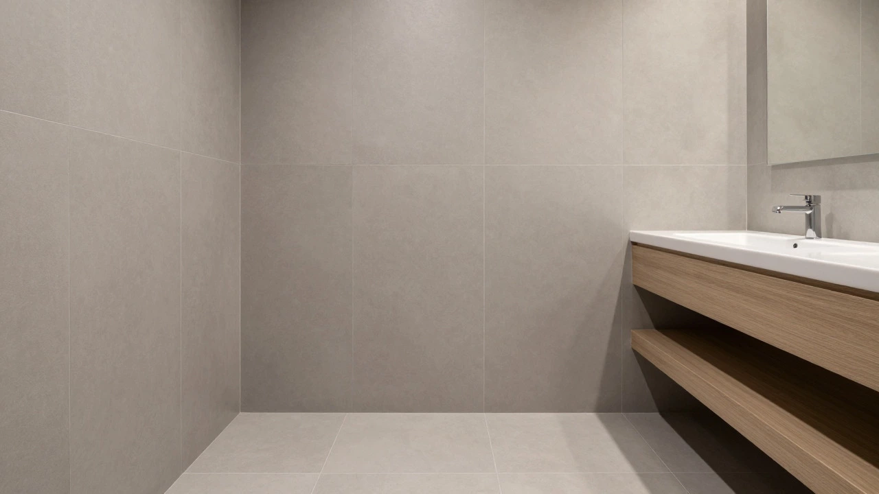
Tile Size Matters: Large-format tiles (12x24 inches or bigger) create fewer grout lines, reducing visual clutter. Fewer lines mean smoother surfaces, which read as more spacious. Stick to light-colored grout that matches the tile to minimize contrast.
Mirrors Are Force Multipliers: A large mirror opposite a window reflects light and doubles the visual depth of the room. Frameless mirrors blend seamlessly into the wall, enhancing the illusion of space. If you’re using colored walls, consider a framed mirror in a matching tone to tie the look together without breaking continuity.
Accessories Should Recede: Choose shower curtains, towels, and rugs in colors similar to your walls. Contrasting accessories draw attention to themselves, fragmenting the space. Monochromatic layering (e.g., light gray walls, medium gray towels, dark gray rug) adds dimension without shrinking the room.
Real-World Example: Transforming a 5x8 Foot Bathroom
Let’s say you have a standard small bathroom: 5 feet wide, 8 feet long, no window, one overhead light fixture. Before renovation, it’s painted a mid-tone beige with dark brown trim. It feels cramped and dated.
Here’s how to fix it:
- Paint walls and ceiling Sherwin-Williams Agreeable Gray (LRV ~60). This neutral warms up the space without darkening it.
- Keep trim white (Benjamin Moore Simply White) but ensure it’s only slightly lighter than the walls to avoid harsh lines.
- Replace small mosaic floor tiles with large-format porcelain slabs in light gray. Use matching grout.
- Install a frameless mirror spanning the width of the vanity.
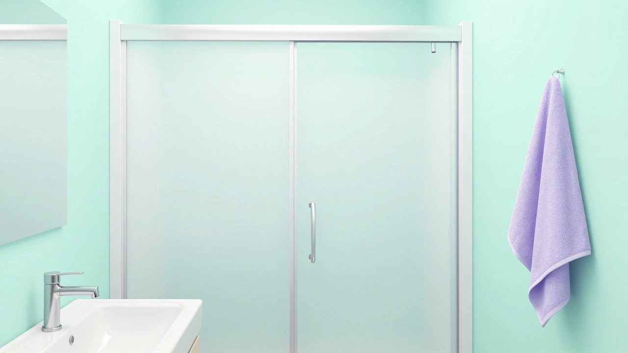
- Add a frosted glass shower door instead of a curtain to maintain sightlines.
- Use LED bulbs at 4000K for balanced, natural-looking light.
Frequently Asked Questions
What is the best paint color for a small bathroom with no window?
For windowless bathrooms, choose high-LRV colors like off-white, pale gray, or soft greige. These reflect artificial light effectively, preventing the room from feeling cave-like. Avoid dark or saturated tones unless used sparingly as accents.
Does painting the ceiling white make a small bathroom feel bigger?
Yes. A white or very light ceiling draws the eye upward and eliminates the horizontal line where wall meets ceiling. This vertical continuity makes the room feel taller and more open. Never paint ceilings darker than walls in small spaces.
Can I use dark colors in a small bathroom?
You can, but strategically. Use dark colors on cabinetry, a single accent wall, or lower wainscoting. Keep upper walls and ceilings light to maintain brightness. Dark floors can ground the space if paired with light walls and reflective surfaces.
What color hides water spots and soap scum best?
Pure white shows every stain. Opt for off-whites, light grays, or soft pastels like sage green or powder blue. These tones mask mineral deposits and soap residue better while still keeping the room bright and airy.
Should I match my bathroom color to the rest of the house?
Not necessarily. Bathrooms benefit from distinct palettes that prioritize function and mood over strict consistency. However, coordinating undertones (warm vs. cool) across rooms creates harmony. You can use a similar gray in the bedroom and bathroom while adjusting saturation for each space’s needs.